Fósforo
There’s a light…
Silver Award Creativity International Awards 2018
Selección Anuaria 2018 Award best logotype
Branding
Logo design
Art direction
Corporate identity
In Barcelona, there is a filmmaking company that tells short stories with light and movement. They observe their clients brand and purpose and tell this story with style. Where there is darkness, they bring the light. When things are blurry, they make it clear.
When a client like Fósforo is already comfortable with its tagline, we should elevate it, bring it into line with the brand and make sure that the whole concept is meaningful. We were asked for an identity with this objective in mind.
When graphic design teams up with sensations, it creates very strong and powerful emotional bonds. This is visual communication. Code and closeness.

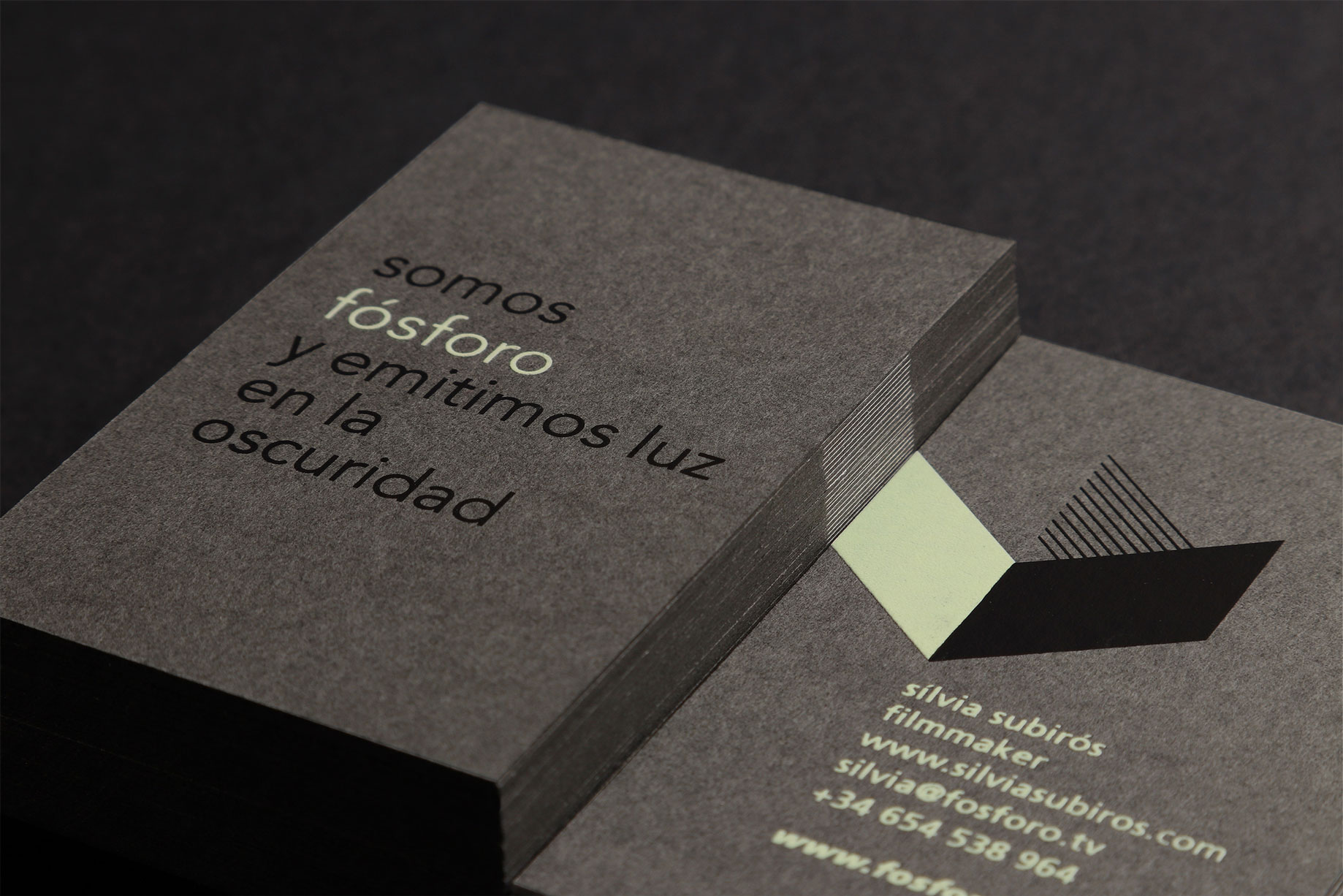
Foundations — Inspired by functionalist architecture, we designed a minimalistic logo with very few elements. The imagotype is constructed with a play of light and shadows that create a reversible figure: the ambiguous space where Fósforo exists.
It could be a film set, a darkroom or light seeping through a building by Mies van der Rohe. It could also be a room with half-open blinds, a projection screen or a cinema where you can see the company’s productions, or even a fallen F.
The typeface used is Avenir, which was designed in the 1920s the same decade in which cinema began to create masterpieces. It is clean and geometric but has an organic and humanistic touch.

To the stars — Once the logo was designed, we needed to tackle the business cards and we were on a high: if Fósforo “glows in the dark”, the imagotype has to (literally!) glow in the dark.
We started thinking about everything that shines in the dark and how, as children, we loved to have the bedroom full of stars; the phosphorescent sticker albums we made; the neon lights of the ’80s, and that episode of the Simpsons where Mr Burns glows like an alien.
The card is printed with a silkscreen luminescent ink so that you can see it shine in a projection room. The finish is on thick, cotton-based paper because a card with so much personality needs substance. Fósforo is an audiovisual production company that shines with its own light… and there are stars that never stop shining.


