Skip to content

Bundaberg

Tastes like the sea

Packaging and branding of Bundaberg

Branding
Logo design
Corporate identity
Packaging
Visual communication
Commercial material

Australian Seafood is a company from the region of Queensland (Australia) that specialises in processed seafood products. Its main product are Queensland scallops, and it wanted to launch them on the Australian mass consumption market and to take on the main domestic producer through a proposal with greater qualitative value. To this end, they contacted the Blue Harvest marketing agency, with whom Vibranding has joined forces to create the Bundaberg brand.

Differentiation and brand values are crucial in achieving a relevant position for your product in a highly competitive market.

Brand values  People’s philosophy and the way they do things define their business. And these are the attributes that should be conveyed as a brand. It is the essence of branding. In the case of Bundaberg, the brand managers take pride in contributing to the area’s economy and in offering a closer and local service.

Moreover, their processes and logistics capacity enable them to deliver a high-quality product in excellent conditions. The brand values become a value chain. And thanks to all of this, we know what this brand should be like.

Business card with new icon and branding of Bundaberg

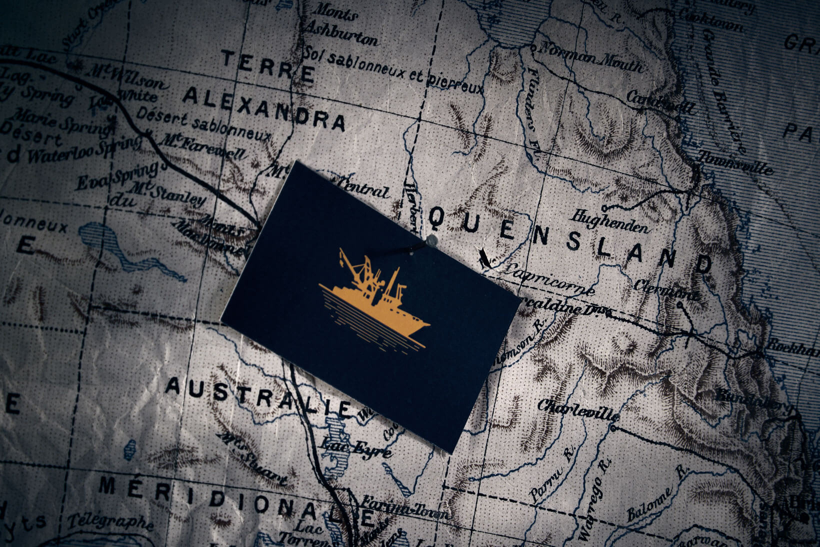
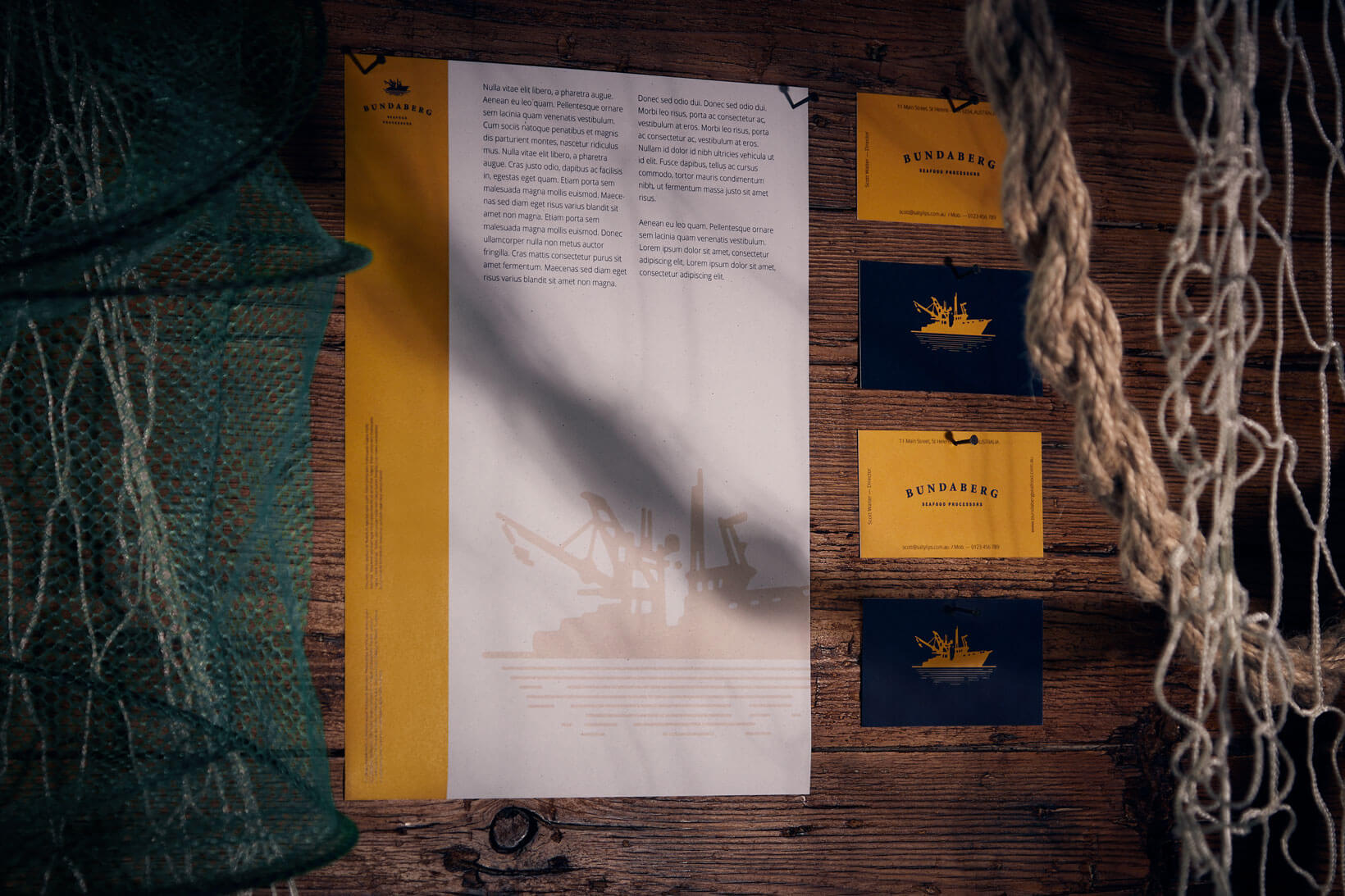
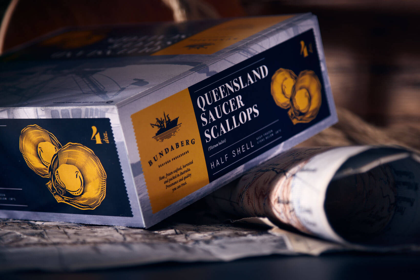
Describe — The brand’s logotype (imagotype) is clear and descriptive. It is neither contrived nor over-the-top. There is a fishing boat drawn on the horizon. And under this isotype is the name (Bundaberg) and the tagline (Seafood Processors). It is sober and elegant, and its visual style is modern and sea-like. There is no room for pomposity on the open sea.

Brand book with new corporate identity of Bundaberg

Distinguish — In order to steer the brand away from the processed fishery product imagery (huge freezers, packaging lines, transport and distribution logistics…), the visual corporate identity is deliberately sophisticated and brings an emotional contrast of items into play. The yellow evokes dawn, providing a romantic setting for working at sea. The blue relates to fresh products, and naturally to the sea. Both the colour combination and the typography or the visual treatment of the photographs were chosen to keep Bundaberg clear of cold and recurring colours, impersonal imagery and the industrial aesthetic associated with processed seafood product brands.

Position — The objective of any branding process is to communicate a brand efficiently. And Bundaberg has achieved recognition among consumers, thanks firstly to its quality products, and secondly, but no less important, because its brand has been built in a way that is consistent with its values. The applications on stationery, graphic and digital communication media and even the packaging convey exactly what Bundaberg is, what it means and what it offers. Quality seafood, with a local flavour, a modern product.

Bundaberg's new branding on stationary
Close-up of Bundaberg's new packaging
Bundaberg's packaging and stationary
Do you believe in the power of graphic design? We do too.
Drop us a line. We help you.

  • This field is for validation purposes and should be left unchanged.
Related works
Lacer
No brush-offs
Bundaberg
Tastes like the sea
Red Bat
Lust and luxury