Altcontrol
In high style
Branding
Naming
Logo design
Corporate identity
Visual communication
Web design
Sales material
Upwards — Jordi P. runs a repair and sales service for port and industrial cranes. It was called Service JP. Jordi is a true master at repairing and maintaining this type of equipment. He is also an expert on the best machines to meet the needs of any customer.
But his name and brand said nothing of all this. We helped him renew himself to better face the battle against his competitors.
Service JP was such an impersonal name (despite including his initials), and spoke so little of Jordi’s attributes and skill in repairing precision cranes, that he himself saw that a total overhaul of his identity was needed in order to grow. We gave him Alt Control.
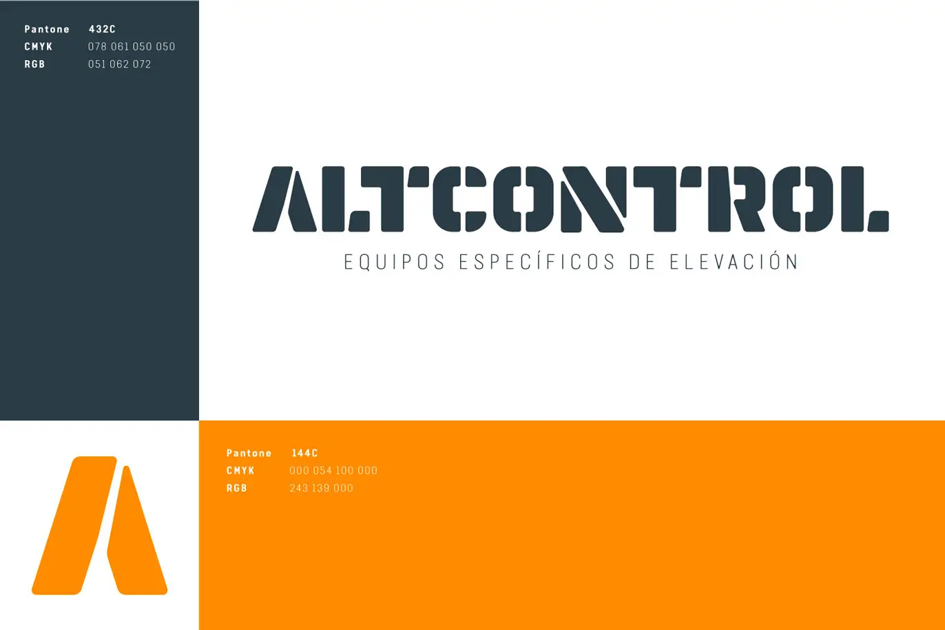
Personality — The naming plays with the height to which cranes lift things, plays with the control of the heavy equipment these cranes allow, and plays with a digital nomenclature to place the brand in the 21st century. Port and industrial cranes are no longer controlled only with levers but also with computer software. But when a lever, a motor or an axle breaks, or the software doesn’t respond, Jordi is there. Because Jordi is in control.
As for the brand’s visual identity, it is worth noting that the logo is built with heavy lettering, industrial forms and a stencil typographic style. The corporate colours (orange and grey) have also been carefully chosen to evoke both nautical-port and industrial aesthetics. The design of its website is highly functional and descriptive, emphasises the products and uses few frills or flourishes. Spare and hard and effective and under control.