Vermell Pastisseria
Designed with all the ingredients to tempt you.
Latidea 2026 Selection for Best Logo or Graphic Brand
Branding
Logo
Packaging
Naming
Vermell is a neighbourhood bakery with the soul of a grand maison, right in the heart of Gràcia, Barcelona. Every piece of pastry is the result of long processes, natural ingredients, and a healthy obsession with doing things properly. No shortcuts, no additives—and always with a smile (because we all know about the secret ingredient).
The challenge they brought us was every bit as tempting as the product: to build a visual identity capable of communicating the distance between handcrafted and industrial. In a market saturated with “artisan” butter croissants and bakeries with Nordic aesthetics, standing out required more than a beautiful typeface. It required a brand with character. With the same cheeky charm as the friend who knows exactly how to tempt you.
We set out to build Vermell’s identity with the same care they put into kneading their bread.
The Challenge — The brief excited us from the very beginning, perhaps because Marisol and Alex’s energy is contagious. Vermell needed to convey the superior quality of its cakes, pastries and bread; because we all know they have nothing to do with industrial competition (and you can tell within a minute of watching them work). That had to be combined with a young, approachable personality, just like theirs.
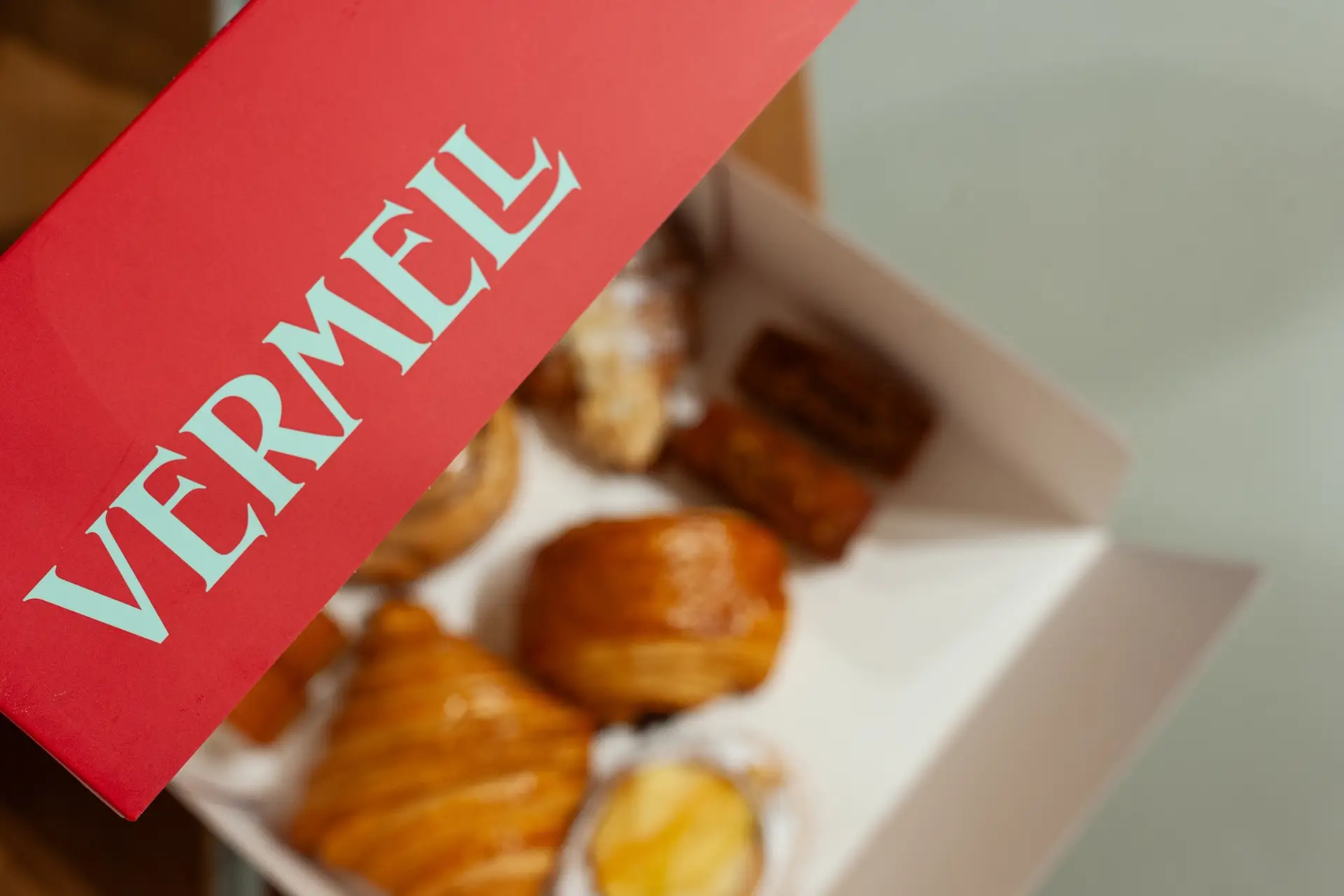
The logo: tradition with attitude — For the logo, we chose a serif typeface inspired by Catalan Modernisme. It wasn’t an arbitrary aesthetic choice: Modernisme is the architecture of Barcelona’s soul, and Vermell is, at heart, a neighbourhood bakery with the makings of an urban legend. The serifs bring weight, elegance and a certain solemnity that fits the artisanal seriousness of the product perfectly. But the typeface is interpreted in a contemporary way, with modern proportions and a drawing that avoids falling into folkloric clichés. The result: a logo that feels firmly in the present, even if it smells of tradition.
For body copy and corporate applications, the typographic contrast comes from Elza, a neo-grotesque sans serif by Blackletra. The tension between the two typefaces, the solemnity of the logo’s serifs and Elza’s modern clarity, creates a rich graphic language that allows us to establish clear hierarchies and a consistent brand voice across every touchpoint.
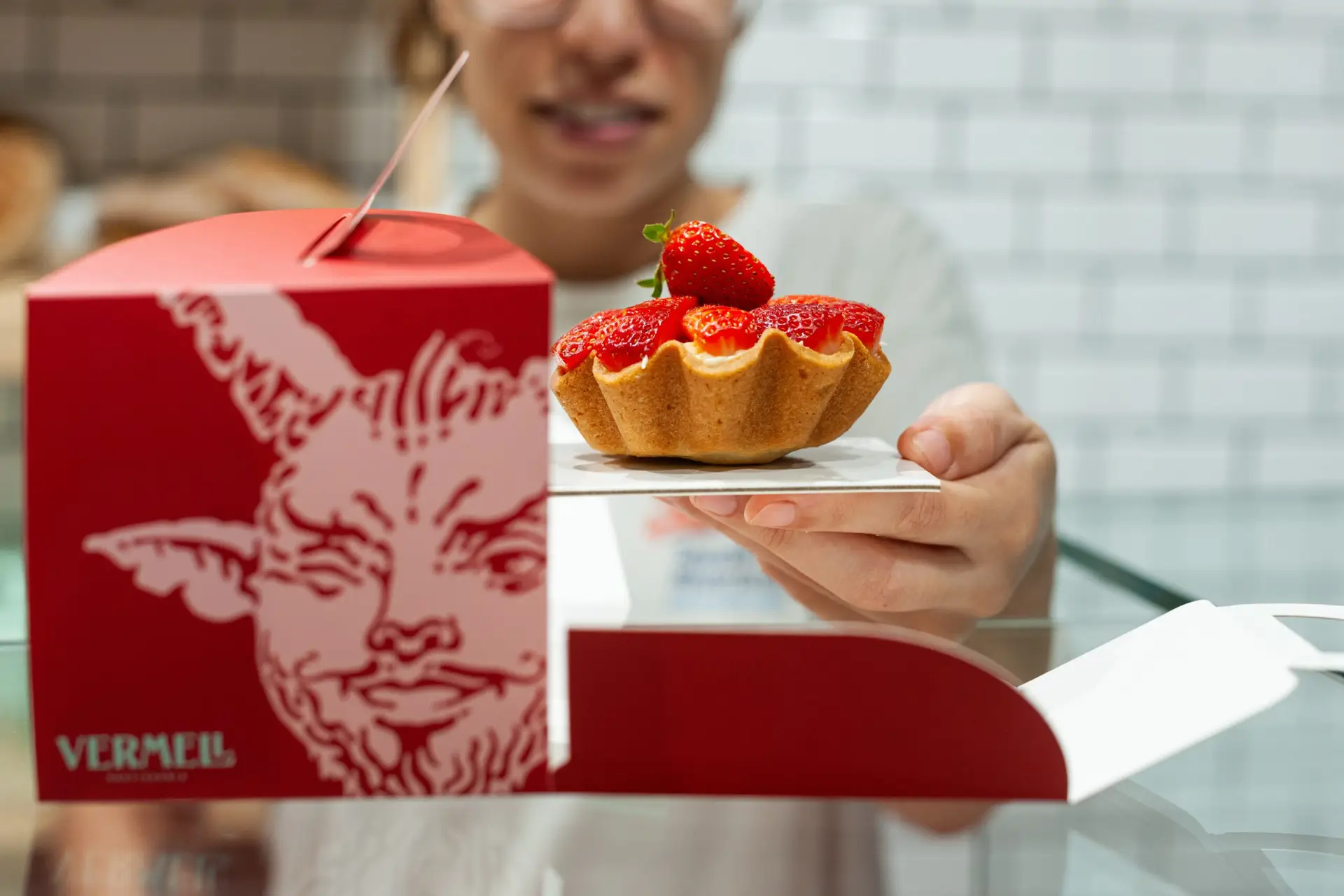
El Diable: temptation deserves a symbol A pastisseria called Vermell, based in Catalonia (vermell means red in Catalan), could hardly ignore the figure of El Diable. A deeply rooted icon of Catalan festive culture, present in correfocs, castellers and popular celebrations (always accompanied by sweets and pastries), the devil does not represent anything negative here. Quite the opposite: joy, festive transgression and unapologetic pleasure. The little devil’s wink suggests the complicity between friends: “I won’t tell if you don’t,” evoking that delicious feeling of childhood mischief that makes us smile. Vermell’s Diable, with its expressive line and popular illustrative character, is the perfect metaphor for irresistible pastries made with natural ingredients.
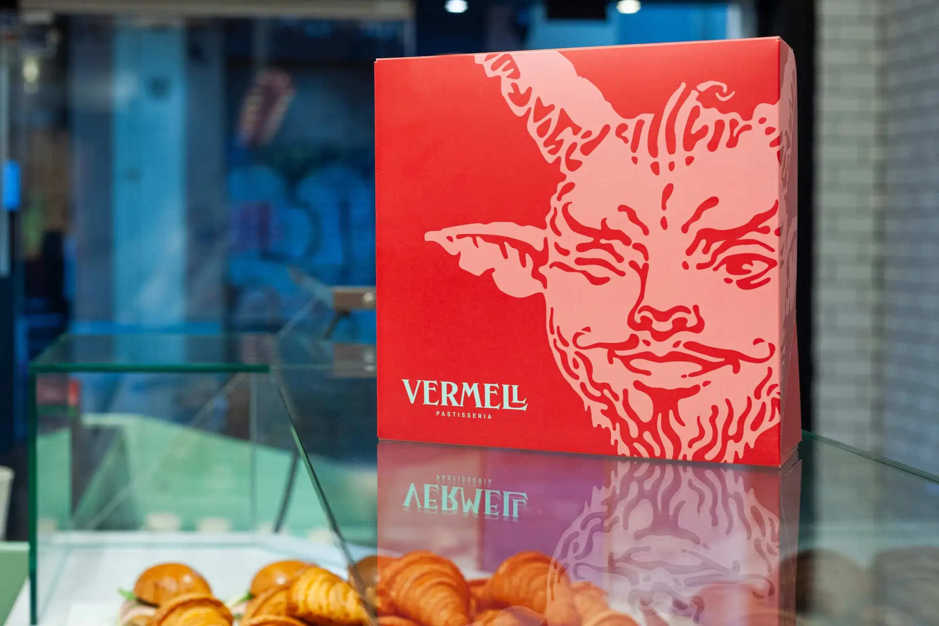
The symbol works as the brand’s second graphic element: when it accompanies the logo, it reinforces the overall composition; when it stands alone, it becomes an autonomous graphic element across packaging, bags and signage, filling the surface with festive energy.
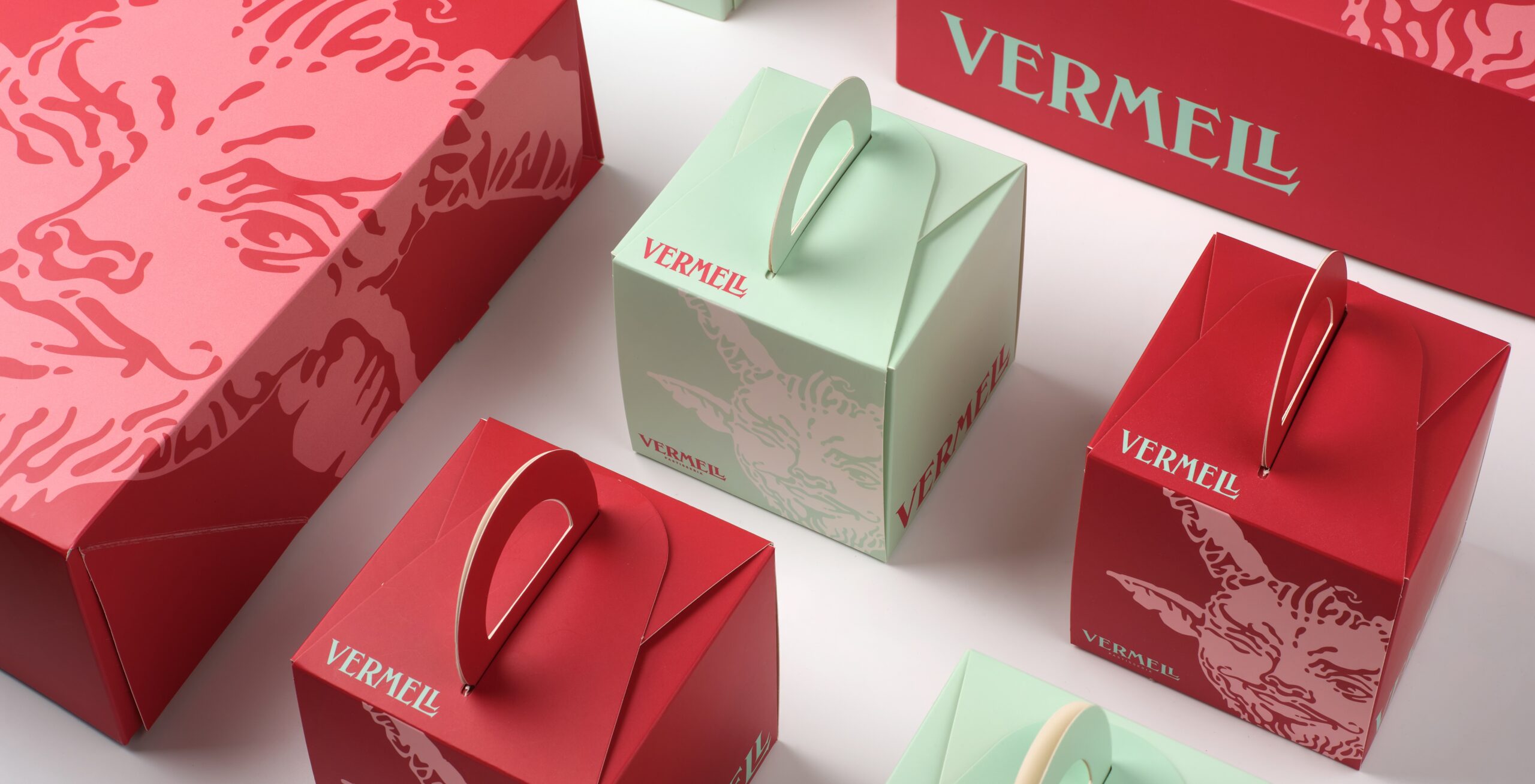
A colour palette with no shades of doubt — Vermell’s colours are as direct as its proposition. Crimson red (Pantone 7425), the same colour that gives the brand its name, brings character, appetite and presence. Alongside it, a mint green (Pantone 2253) balances and refreshes, adding a modern edge that keeps the brand away from traditional pastry-shop clichés. Black and white complete a palette that allows for multiple combinations without ever losing its identity.
The colour duality is not just visual; it is narrative. Red is passion, high standards and emotion. Green is fresh and natural. Together, they tell the complete story of Vermell.
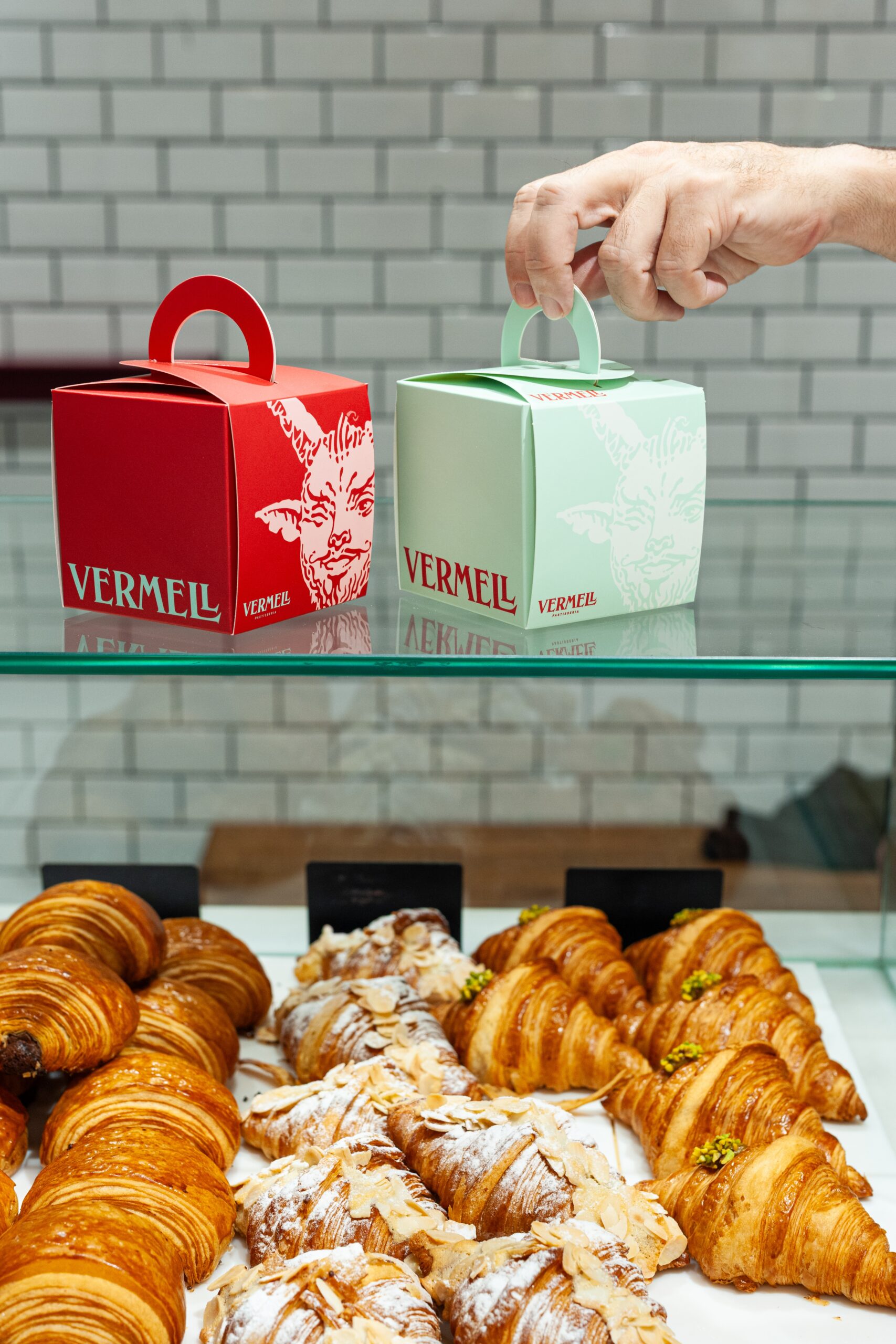
Packaging is also the brand — At Vermell, packaging is not an accessory. It is the first point of contact between the brand and whoever receives a butter pastry on a Sunday morning. That is why every touchpoint, from pastry paper bags and shopping bags to individual and gift boxes, takes the identity to its fullest expression. El Diable takes over the surfaces at large scale, combined with the logo in its two main colours. The result is packaging that does its job at the counter, on the street and at the breakfast table.
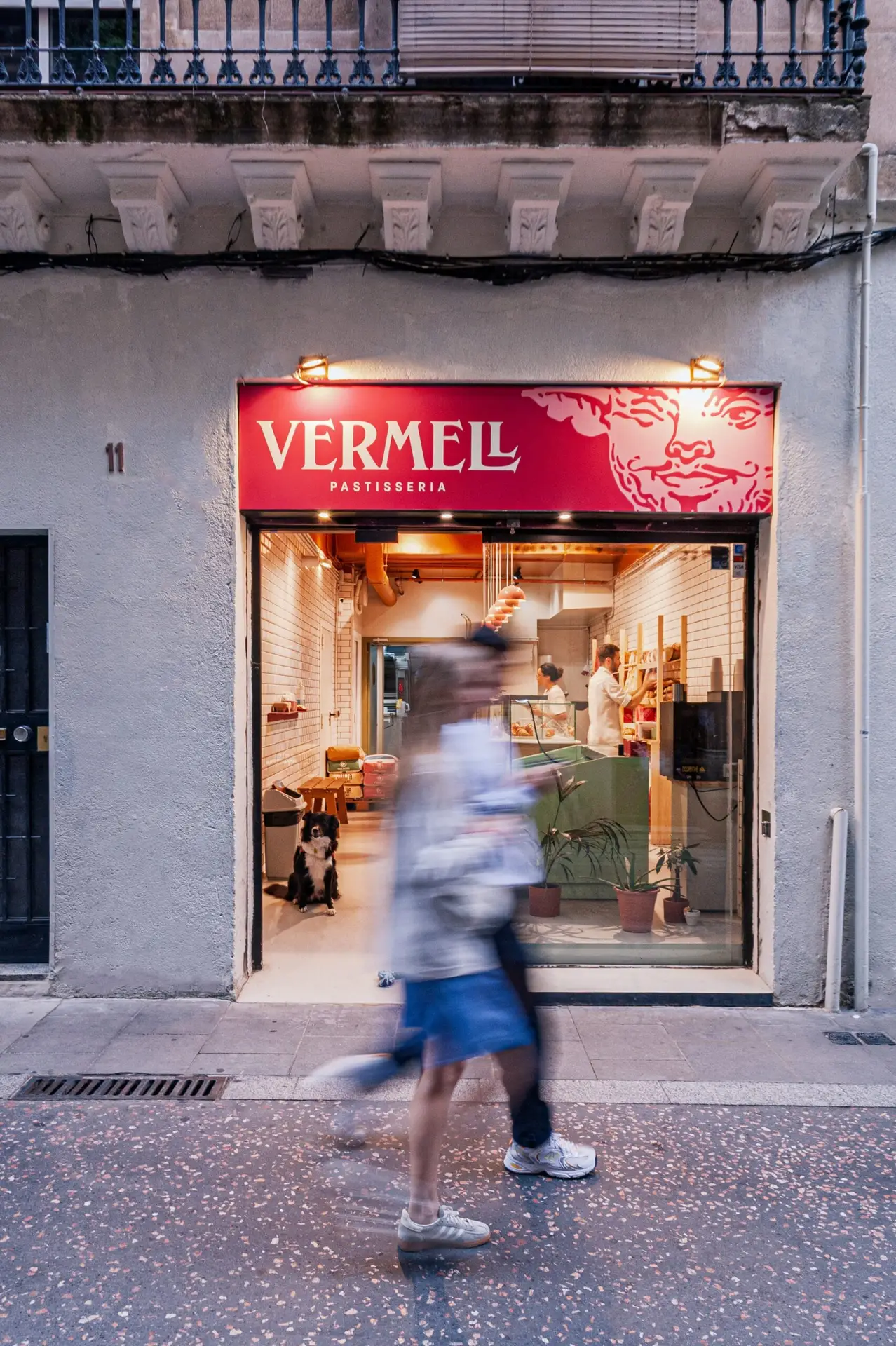
We did the shop sign in the corporate red, with the logo in white and El Diable spilling beyond the frame at the corner, announcing from the street that something different is happening here. The business cards, available in both colour variants, feature an enlarged Diable on the reverse as a background, turning a functional object into a little object of desire.
Vermell has a visual identity that represents the connection between gastronomic pleasure and Catalan cultural roots. And, just like Marisol and Alex’s pastries, it is made with first-rate ingredients and not a gram of industrial filler.