Kynd
Doing their own thing

Branding
Brand consultancy
Naming
Logo design
Corporate identity
Visual communication
Sales material
Web design
It will definitely ring a bell: the Montessori Method. The educational system that changed everything. Ever since Maria Montessori founded her Casa dei Bambini in 1907, her pedagogy has become possibly the most applied method in the world. In modern marketing language, her system would be called customer centric; albeit with kids as customers.
Kynd is a new-start Australian school in Wetherill Park, Sydney, state of New South Wales. Its founder and director, Yasemin Timtchev, needed a corporate identity to get it off the ground. Her idea was to call her business the “Montessori Learning Centre”, a name which, let’s be honest, was hardly alluring.
A branding strategy is grounded in the perfect harmony and alignment of the entire identity: from naming through to corporate visuals.
Interview

YASEMIN TIMTCHEV
FOUNDER DIRECTOR
What are the values of your business that are best reflected in the new corporate identity?
Many traditional classrooms contain brightly colored objects on the wall and other non-naturally composed but colorful materials, like plastics. The Montessori classroom takes a different approach, and the branding components reflects Maria Montessori’ vision of the beauty of nature and simplicity.
What part of the process of creating the new graphic identity did you find the most interesting?
The outcome of the first couple of meeting was absolute magic. The psychological questions asked and how the information was portrayed was the most fulfilling process.
And the most surprising?
Seeing the logo come to life..
What was the reaction of the school workers upon discovering the new identity?
Without even having to mention it we always get feedback on our amazing branding, especially the colours!
Total consulting – When we do brand consulting, our main aim is to help customers to take the best possible strategic decisions. And the name is an essential part of brand strategy. We guided Yasemin and her team in their search for a name that they were happy and felt comfortable with. Sometimes it is not a matter of just giving the customer a name as per the briefing, but rather of helping them to find it, analysing it together, thinking through it as a team… And that is what we did. And they came up with Kynd.
Kynd was definitely more suitable and better aligned with an educational philosophy such as the Montessori Method. In English it sounds like the word kind (pleasant, gentle, warm) albeit with the distinctive spelling, with a y. As if (mis)spelt by a child. If your business is children centric, referring to children is a good strategy for defining a clear and distinct brand image while also conveying the right message. We complemented it with the Montessori Learning Centre, which works well as a descriptive tagline and secures the positioning.
The children set the pace – This is one of the key aspects of the methodology applied at Kynd. The pace of education is not laid down by the educator. Development of the child’s personal initiative and natural skills is prioritised, particularly through practical games. This method lets children develop at their own pace and affords educators a new understanding of child development.
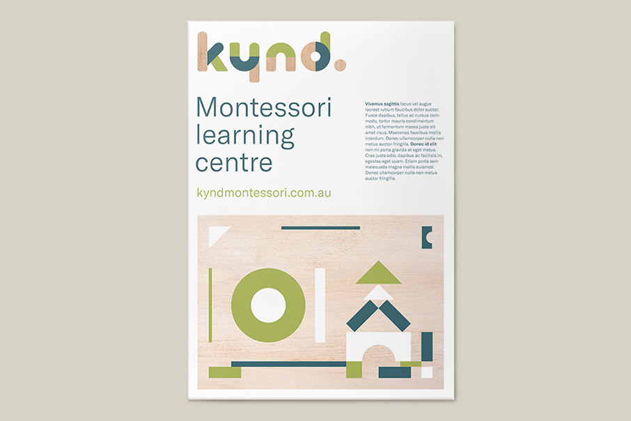
We decided to apply this same philosophy to our work in developing visual identity, and the educators’ work tools (the specific toys of the Montessori philosophy) provided us with the inspiration we needed to align message and form and to make sure that the form was appropriate: basic colours and geometries, natural materials, unprocessed wooden blocks, earth and clay… Both the lettering and the corporate visual elements tap into all these elements, their textures, forms and colours.

Colours and forms – We chose a colour pallet featuring green and wood, combining them in perfect harmony with blank spaces which, besides being the usual background for communication pieces, also play a major part in visual identity here.
The forms of the logo and the forms of the graphic communication elements follow the same pattern and also draw their inspiration from the shapes of children’s toys, the handling games with which the child describes the shape or form of the world. They could even play with the logo!


Applications – The adaptation of the Kynd identity to the different communication materials also followed the guidelines of the Montessori philosophy: allowing the harmony of forms and texts to find their own equilibrium, steering clear of compositional rigidity, generating spaces to allow everything to breathe, transmitting messages simply and clearly, using basic resources, illuminating without nuances or artificial devices. In all regards, from the web through to the signs used in all the spaces. One might call it Montessori design.


