Tesslach
Life the way you want it

Branding Logo design Corporate identity Visual communication Sales material
The director of Tesslach came to see us determined to take the bold step of devoting himself exclusively to his building company that specialises in the creation of custom design houses. His work does not consist of planning or designing (that is what architects and designers do), but rather of providing solutions about the choice of materials or building techniques, focusing on topics such as durability, soundproofing, sustainability, energy efficiency and, above all, improving the time taken to build them. The clerk of works that dreams are made of. Having amassed 30 years of experienced with the majors, he wanted to found an independent company, totally different to the Australian giants in the trade, with a clear brand positioning: the commitment to quality over quantity. It is not a question of doing a lot of projects, but rather of doing a few quality-driven projects that improve people’s life. Fine.
A brand is also a business, and a business is a life project. The people values that lie behind things seep through into branding.
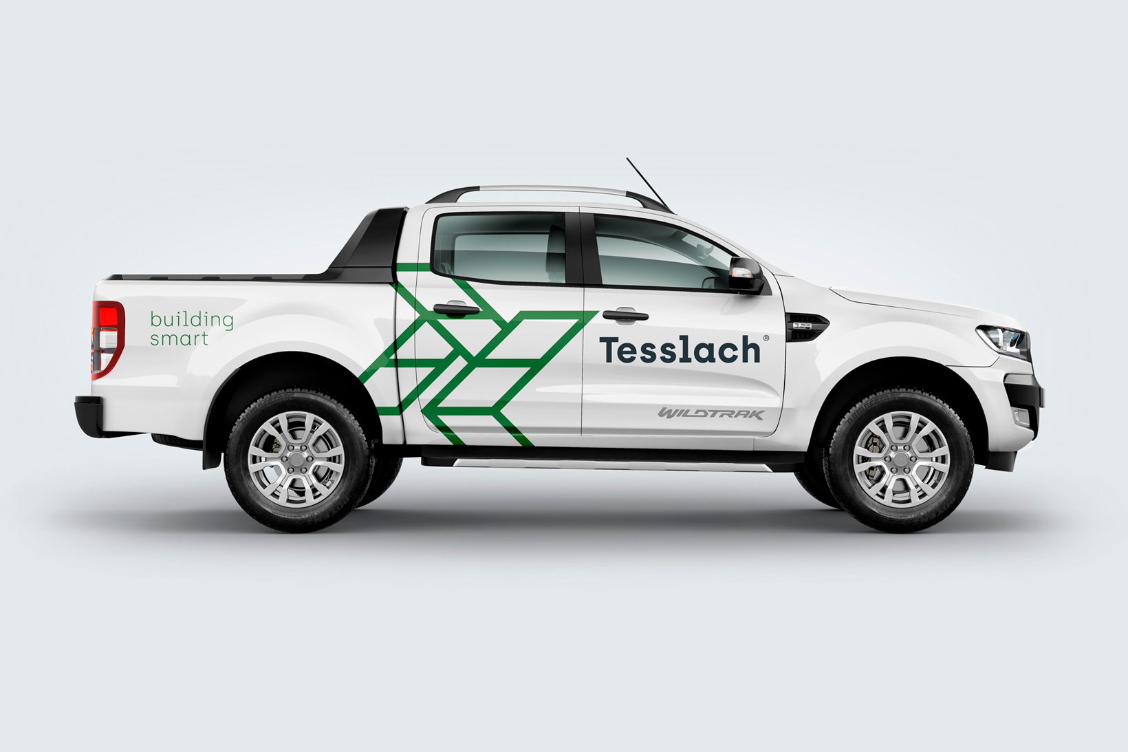
Together – Before actually starting to design anything, we proposed working as a team with the customer and invited him to participate in all the project phases. This enabled us to leverage his experience and create a brand for a very specific niche market. Basic material – We studied the language of the immediate competitors and did our homework about the sector’s visual codes. Working shoulder to shoulder with the client really helped us to find inspiration and ideas in building materials and techniques. What Tesslach wanted was an easy-to-recall logo. They wanted visually powerful and memorable icon.


Getting down to work – We began to build the brand with the isotype. The isotype consists of two letters (TL) based on an isometric perspective reminiscent of the framework of a house. We accentuated the composition with diagonal lines to afford it greater force and movement.
The logotype is based on a sober and rough geometric typography, a sans serif which nevertheless features decorative elements and blends right angles and rounded forms. It is visually powerful, clear, austere, and speaks to a technical, albeit not technological, universe. The same typography, this time light, was used for the attributes and descriptors. We defined a tagline (Building Smart) to reinforce the brand strategy in a simple, popular, pleasant, warm and of course, “homely” tone.


Panel and paint – Tesslach is a company that is staunchly committed to the environment and to energy efficiency, which prompted us to tap into the scenery and the colours of the Australian region of Victoria to choose the colour palette. Go green.


