


Related works

Bundaberg
Tastes like the sea
Tutete
Baby care and planet caring

Red Bat
Lust and luxury
Runner Up Best Brand Awards 2016 Oceania’s Best Brand
Selección Anuaria 2015 Award Best Logo Design
Golden Anuaria 2015 Award Best Naming
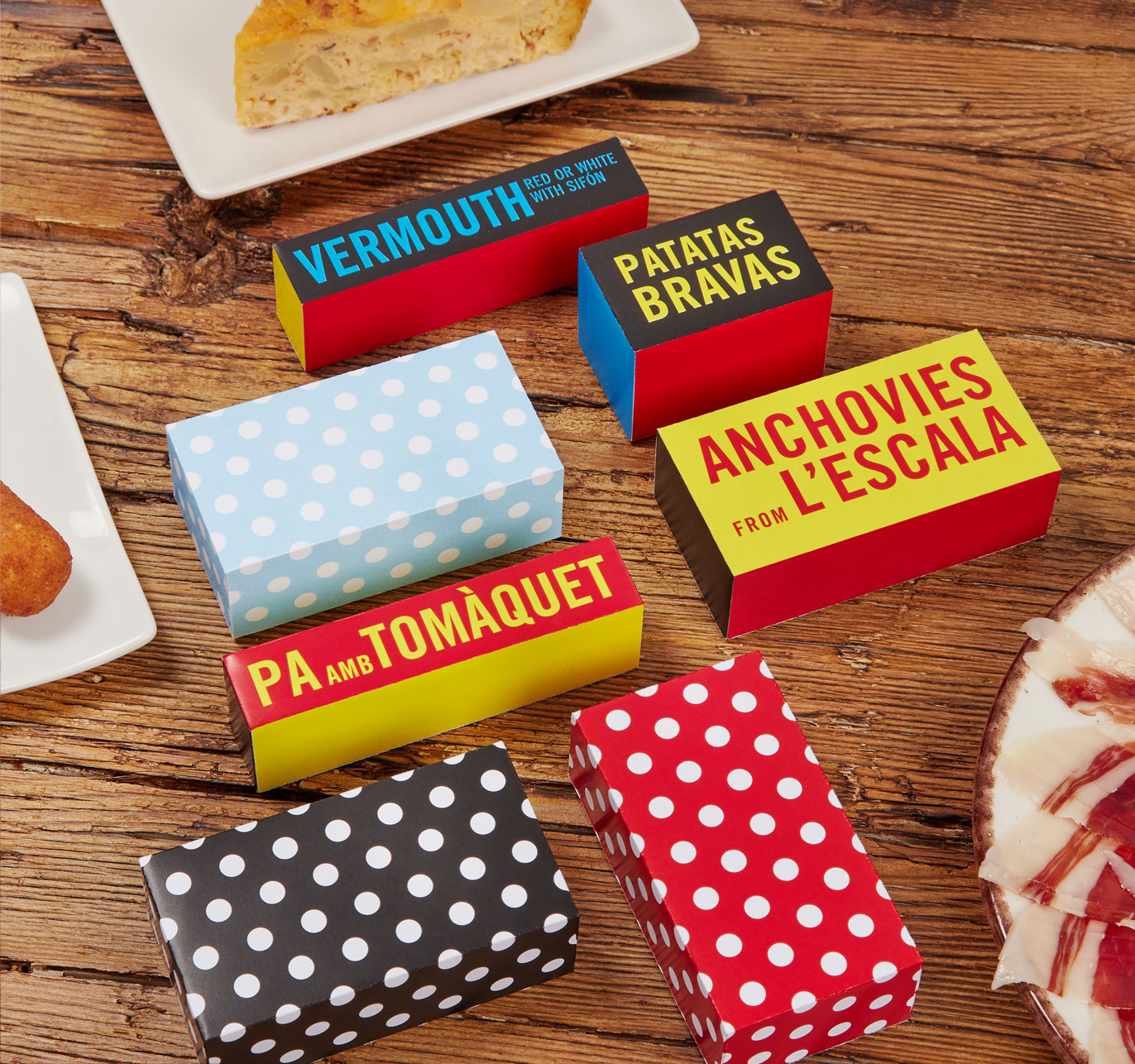
Delicacies — Everyone knows how well people eat in the Mediterranean. The diet, the dishes and the products from this part of the planet are admired the whole world over. Mónica Silva’s endeavour was to import Mediterranean delicacies into her new home, Australia.
She had the dream and asked us to give it a name, an image and a brand.
Home-alike — Touching down in the Australian market with Mediterranean products required a brand that transmitted familiarity and closeness. It had to be tasty, fun and have an authentic, stylish and memorable name. It had to have a Latin character but also be understandable to the Australian public and approach them with a smiling face.
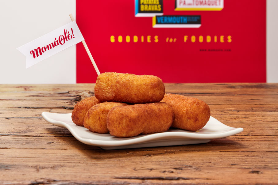
So we proposed the name Mamá Olé and the tagline “Goodies For Foodies”. The name describes its personality and the tagline describes the company’s business, the quality of its products and, most importantly, it was clear and attractive to a very wide audience. We are increasingly all foodies. Because who does not like eating well?
Give me passion — The artwork was developed using a very basic chromatic palette to imprint a strong, striking and passionate personality on it: red, yellow and blue. A wavy, elegant, lively typeface was created for the name and a drier one was made for the tagline. The logo was rounded off with a pictogram of a “mamá” based on highly recognisable commonplaces in the purest Spanish style, with the attractiveness of an Italian temperament, a plain Franco-Mediterranean elegance and breath-taking Greco-Latin beauty. The drawing, composition of the logo and brand artwork were also moulded based on all these parameters.
Branding — The architecture and voice of the Mamá Olé brand was built around three very basic, primary but powerful concepts: Good, Tasty, Fun.
Because it is a good brand (with good products and a good heart), a tasty brand (which appeals to our instincts and invites us to enjoy ourselves) and, above all, a fun brand (because meals should be parties).
| Cookie | Duration | Description |
|---|---|---|
| ARRAffinity | This cookie is set by websites that run on Windows Azure cloud platform. The cookie is used to affinitize a client to an instance of an Azure Web App. | |
| cookielawinfo-checbox-analytics | 11 months | This cookie is set by GDPR Cookie Consent plugin. The cookie is used to store the user consent for the cookies in the category "Analytics". |
| cookielawinfo-checbox-functional | 11 months | The cookie is set by GDPR cookie consent to record the user consent for the cookies in the category "Functional". |
| cookielawinfo-checkbox-advertisement | 1 year | The cookie is set by GDPR cookie consent to record the user consent for the cookies in the category "Advertisement". |
| cookielawinfo-checkbox-necessary | 11 months | This cookie is set by GDPR Cookie Consent plugin. The cookies is used to store the user consent for the cookies in the category "Necessary". |
| cookielawinfo-checkbox-performance | 11 months | This cookie is set by GDPR Cookie Consent plugin. The cookie is used to store the user consent for the cookies in the category "Performance". |
| PHPSESSID | session | This cookie is native to PHP applications. The cookie is used to store and identify a users' unique session ID for the purpose of managing user session on the website. The cookie is a session cookies and is deleted when all the browser windows are closed. |
| viewed_cookie_policy | 11 months | The cookie is set by the GDPR Cookie Consent plugin and is used to store whether or not user has consented to the use of cookies. It does not store any personal data. |
| wp-wpml_current_language | 1 day | Web language |
| Cookie | Duration | Description |
|---|---|---|
| player | 1 year | This cookie is used by Vimeo. This cookie is used to save the user's preferences when playing embedded videos from Vimeo. |
| sp_landing | 1 day | This cookie is set by the provider Spotify. This cookie is used to implement audio content from spotify on the website. It also helps in collecting information on user interaction with this audio content. |
| sp_t | 1 year | This cookie is set by the provider Spotify. This cookie is used to implement audio content from spotify on the website. It also helps in collecting information on user interaction with this audio content. |
| Cookie | Duration | Description |
|---|---|---|
| _ga | 2 years | This cookie is installed by Google Analytics. The cookie is used to calculate visitor, session, campaign data and keep track of site usage for the site's analytics report. The cookies store information anonymously and assign a randomly generated number to identify unique visitors. |
| _gat_UA-79013542-1 | 1 minute | Google Analytics |
| _gcl_au | 3 months | This cookie is used by Google Analytics to understand user interaction with the website. |
| _gid | 1 day | This cookie is installed by Google Analytics. The cookie is used to store information of how visitors use a website and helps in creating an analytics report of how the website is doing. The data collected including the number visitors, the source where they have come from, and the pages visted in an anonymous form. |
| vuid | 2 years | This domain of this cookie is owned by Vimeo. This cookie is used by vimeo to collect tracking information. It sets a unique ID to embed videos to the website. |