Ready for people
Teamwork

Branding
Logo design
Corporate identity
Visual communication
Sales material
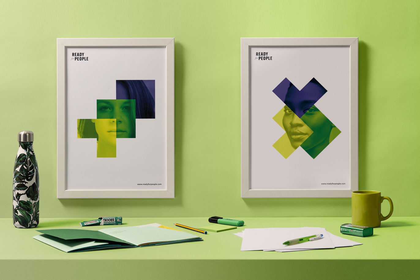
Infectious drive — When Silvia visits us she’s very excited about her new professional project: ready-to-use experiences for team-building and staff development in big (or medium-sized) companies. She’s got it all thought out, including the name, but she still needs to give it a powerful brand image. She commissions us to design a logo and an elastic graphic system as the basis of her corporate image. It’s all clear. Now we just have to do it. We approach the project with all the boundless energy that Silvia transmits to us. Of course – we’re Vibranding.


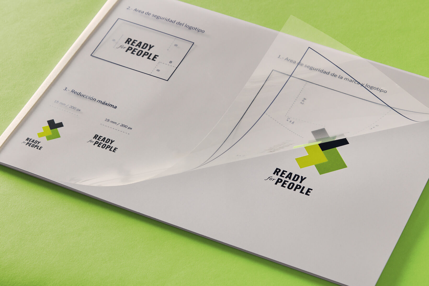
Rational design, useful design — As we always say, graphic design has a function. Graphic design pursues aims. Graphic design is not art. Graphic design is a job. Pumped with the excitement of the start-up, we design the logo and the visual identity for Ready For People meticulously and rationally. The result is a logotype that works alone or together with the different possible forms of a logomark that comes apart so that its parts can be used as resources for the graphic system. The angles in the main typography and the logomark are sharp, to transmit rationality and connect with personnel and human resources managers, executives and professionals. At the same time, the insertion of a script typography in the logotype, the colours chosen and the dynamic compositions of the logomark serve to connect to the people in these positions. Like this we managed to avoid making the brand rigid, cold or distant. For Silvia, people come before professionals.


