Red Bat
Lust and luxury

Branding
Naming
Logo design
Illustration
Packaging
Label design
Some vineyards work by following biodynamic agriculture methods, which is nothing more than taking advantage of the dynamics of nature itself in order to avoid chemical or artificial crop treatments. Red Bat is a Pinord wine made according to such principles.
A species of bat was introduced into the ecosystem of the vineyards where they grow their grapes that feeds precisely on the insects that attack the vines. This enabled them to avoid the use of pesticides and produce a wine which was not only environmentally sustainable but also biodynamic.
How much can you label tell you about a product? In this case, the storytelling behind it is much more than a simple graphic resource.


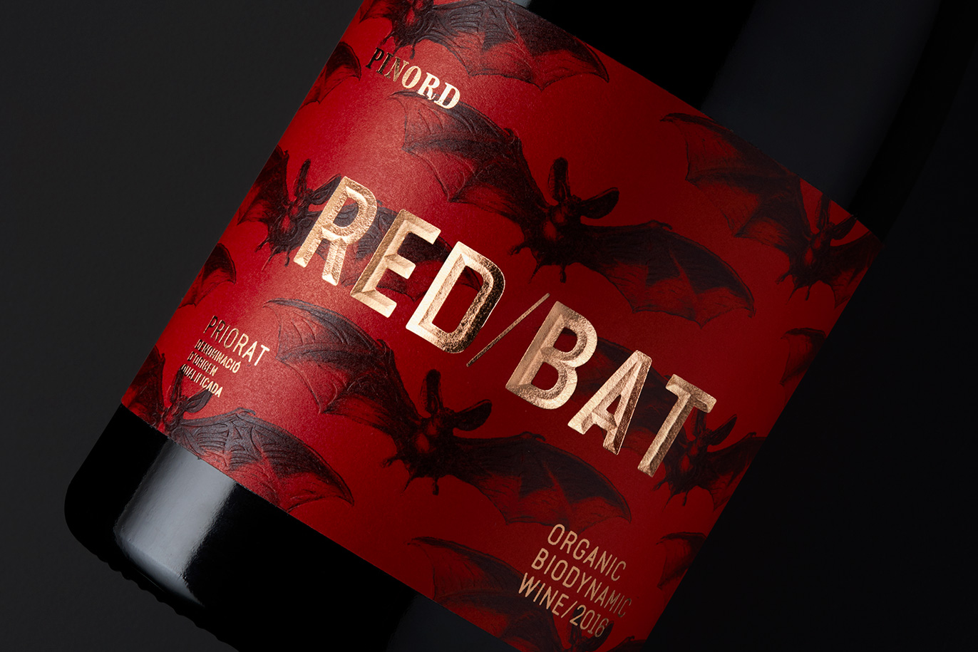
Despite that winemaking process, Pinord did not want a label for an eco-aware target. That was an extra value for a wine aimed at an epicurean, refined and bon vivant audience.They asked us for a design that felt cheerful, daring and wild, for it to be groundbreaking and even a bit seductive.
Both the quality of the print and the label paper as well as other resources, such as blind embossing and metallic inks with pink iridescent effects, sought an effect which was not only visual but also tactile.
It is almost an artisan work, with a handmade illustration, traditional typographic tools and a formal, but not mathematics, composition. A warm design that’s enticing and alluring. We sought to convey the voluptuousness of the wine in an equally lustful graphic design.


