


Related works

Cambridge School
It's branding, omg!

Taste NSW
Oysteralia

Nayadel
Connections
Silver Award Muse Creativity 2021 Best Brand Identity
Global Trend Awards 2019 Triumph Winner for Best Industrial Photography
Branding
Logo design
Corporate identity
Visual communication
Sales material
Web design
Photography
Art direction
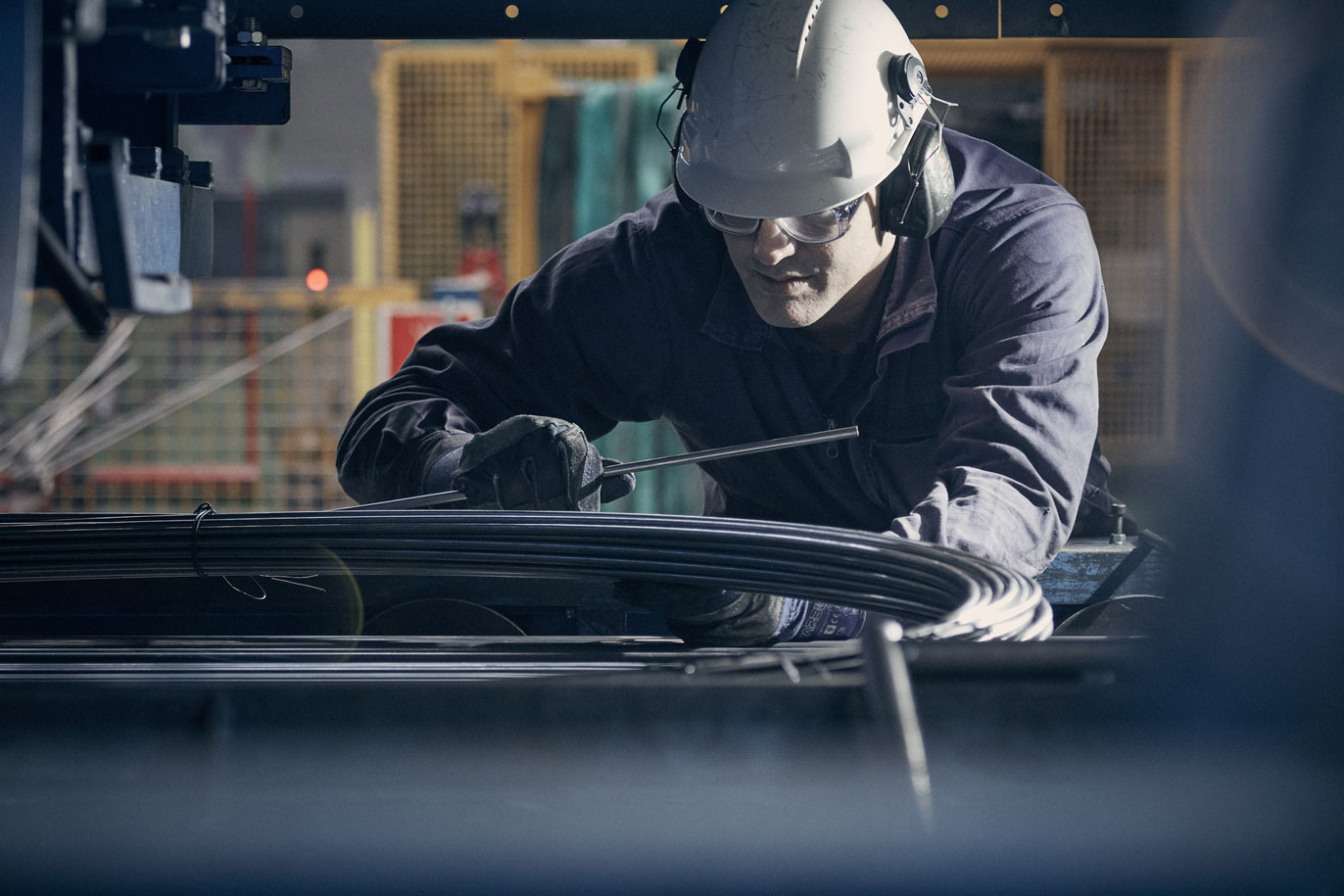
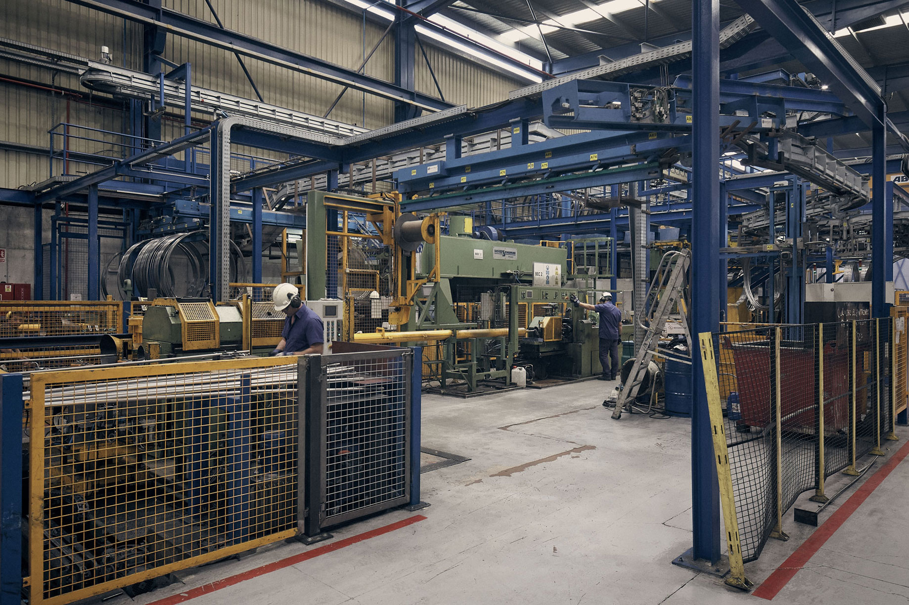
Transmesa is a company that has been manufacturing cold-drawn tubes for 75 years. After so long, its logotype had become obsolete, it was static, coarse and clumsy-looking. But Transmesa is none of these things. Yes, it is an industrial company. But it is not heavy industry. It makes precision-drawn tubes. They are thin and very ductile. They are also very strong. Transmesa is not even half the size of the holdings that it competes against. This makes it closer and more human, it has its own special way of doing things and its own identity.
Good branding transcends the logotype, which is why we have created a rich visual world that conveys the brand’s positive values in each and every one of its embodiments.
Transmesa is “industrious” and hard-working, agile and adaptable, smart, efficient and pre-emptive. We translated all this into the company values: tenacity, ductility, wisdom.
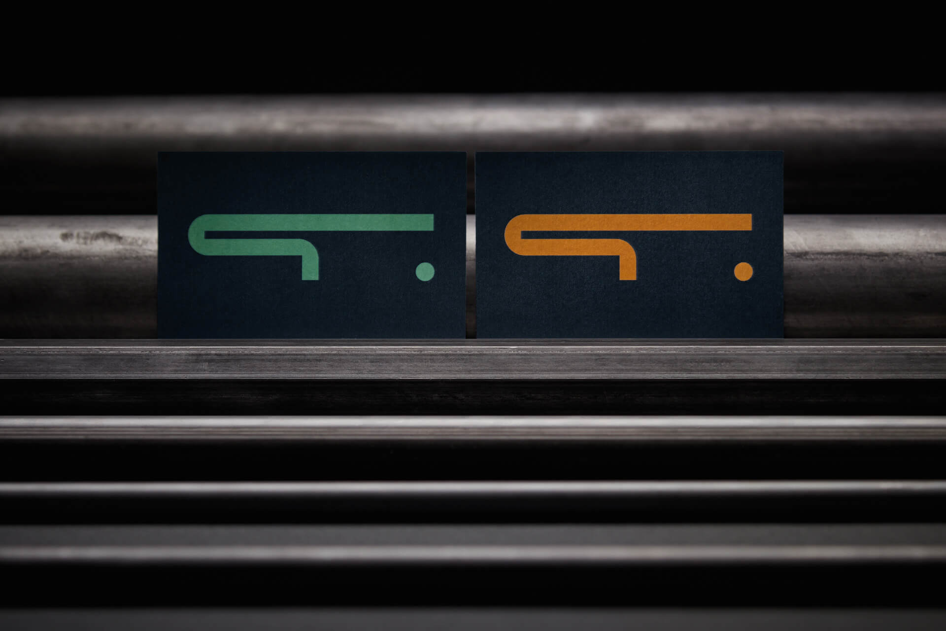
We designed the logotype focussing on the graphical aspect. As we gradually worked on possible logotypes, we tested them on posters or on other sales material. The identity and the logotype had to “be born” in parallel. We read up on brutalism, avant-gardes and classic logotypes, unchanging over time.
We were amazed at just how long the plant, the tubes and the brand name were. Transmesa draws out everything. We embodied this in the isotype, a very long T which stands for a tube. This in turn is complemented by a dot, which is a tube seen from the front. The logotype is made using a geometric typography that we build to make the negative shapes round as the frontal view of tubes. Always tubes. Moreover, the logotype is a contrast between lines (ductility) and right angles (tenacity).
The colours chosen are a triad closely related to industry, machinery and the company’s cold-drawing plants. These colours were already present at its facility, and now they also preside the corporate identity and the website.
We decided to go for a very clear, direct and visual website. With plenty of photographs. The photo shoot was a bit of a challenge because taking photographs of such a vast area is no easy task. That said, it was very rewarding, because the factory and the warehouse pack a stunning visual plasticity. This photo shoot was indispensable in explaining what Transemsa is like on the inside. A clean, efficient and colourful factory.
Industrial companies also deserve a good branding, or what is more, they need it. Transmesa was well aware of this, which is why they allowed us to turn their brand on its head, using strategy and creativity. Now the brand is ready to compete for at least another 75 years.
| Cookie | Duration | Description |
|---|---|---|
| ARRAffinity | This cookie is set by websites that run on Windows Azure cloud platform. The cookie is used to affinitize a client to an instance of an Azure Web App. | |
| cookielawinfo-checbox-analytics | 11 months | This cookie is set by GDPR Cookie Consent plugin. The cookie is used to store the user consent for the cookies in the category "Analytics". |
| cookielawinfo-checbox-functional | 11 months | The cookie is set by GDPR cookie consent to record the user consent for the cookies in the category "Functional". |
| cookielawinfo-checkbox-advertisement | 1 year | The cookie is set by GDPR cookie consent to record the user consent for the cookies in the category "Advertisement". |
| cookielawinfo-checkbox-necessary | 11 months | This cookie is set by GDPR Cookie Consent plugin. The cookies is used to store the user consent for the cookies in the category "Necessary". |
| cookielawinfo-checkbox-performance | 11 months | This cookie is set by GDPR Cookie Consent plugin. The cookie is used to store the user consent for the cookies in the category "Performance". |
| PHPSESSID | session | This cookie is native to PHP applications. The cookie is used to store and identify a users' unique session ID for the purpose of managing user session on the website. The cookie is a session cookies and is deleted when all the browser windows are closed. |
| viewed_cookie_policy | 11 months | The cookie is set by the GDPR Cookie Consent plugin and is used to store whether or not user has consented to the use of cookies. It does not store any personal data. |
| wp-wpml_current_language | 1 day | Web language |
| Cookie | Duration | Description |
|---|---|---|
| player | 1 year | This cookie is used by Vimeo. This cookie is used to save the user's preferences when playing embedded videos from Vimeo. |
| sp_landing | 1 day | This cookie is set by the provider Spotify. This cookie is used to implement audio content from spotify on the website. It also helps in collecting information on user interaction with this audio content. |
| sp_t | 1 year | This cookie is set by the provider Spotify. This cookie is used to implement audio content from spotify on the website. It also helps in collecting information on user interaction with this audio content. |
| Cookie | Duration | Description |
|---|---|---|
| _ga | 2 years | This cookie is installed by Google Analytics. The cookie is used to calculate visitor, session, campaign data and keep track of site usage for the site's analytics report. The cookies store information anonymously and assign a randomly generated number to identify unique visitors. |
| _gat_UA-79013542-1 | 1 minute | Google Analytics |
| _gcl_au | 3 months | This cookie is used by Google Analytics to understand user interaction with the website. |
| _gid | 1 day | This cookie is installed by Google Analytics. The cookie is used to store information of how visitors use a website and helps in creating an analytics report of how the website is doing. The data collected including the number visitors, the source where they have come from, and the pages visted in an anonymous form. |
| vuid | 2 years | This domain of this cookie is owned by Vimeo. This cookie is used by vimeo to collect tracking information. It sets a unique ID to embed videos to the website. |