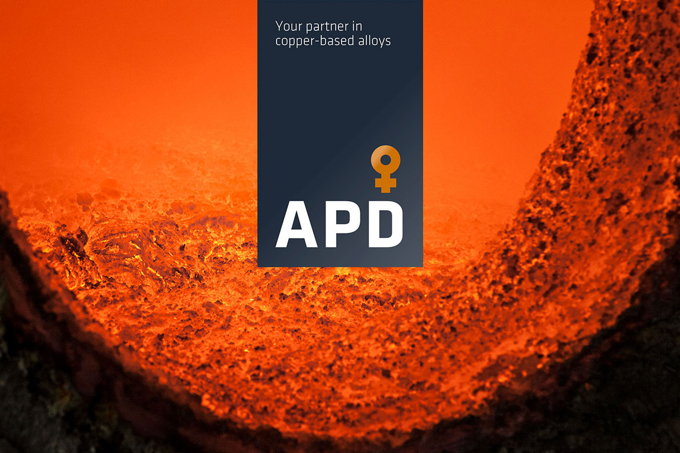
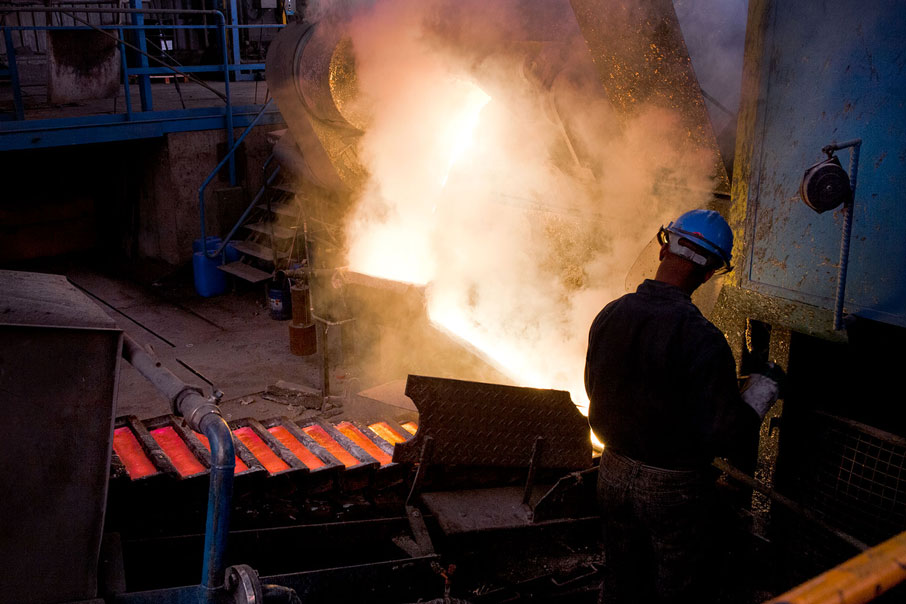
Solution — We employed a two-fold approach revitalising APD’s brand presence: reworking the logo and corporate image, and redesigning the website. A modern, elegant, solid and intelligible geometric typeface was used for its new logo together with the symbol for copper (which is also the symbol for Venus and refers to harmony, beauty, love and life) to reinforce both APD’s technological and human profile.


Related works

Emo Cap
Fluid mechanics
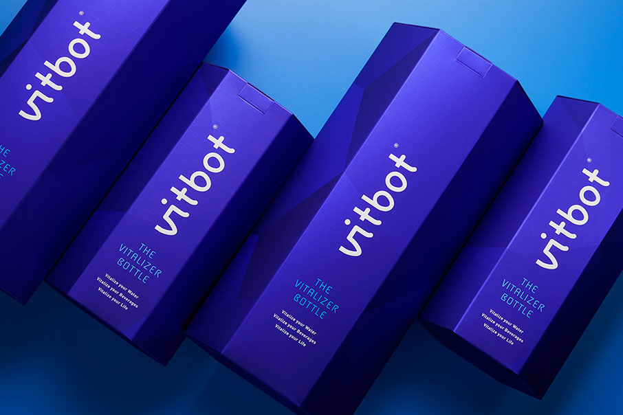
Vitbot
Inspired by nature
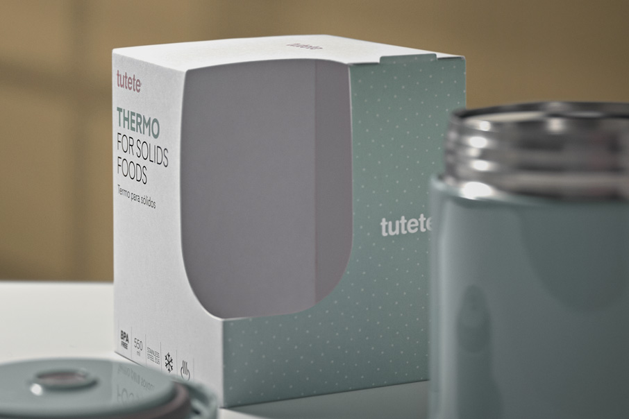
Tutete
Baby care and planet caring