Skip to content

The Capsule by Uriach

Tell me more

Pages of The Capsule, Uriach Laboratories corporate magazine with new naming and design

Editorial design
Naming
Logo design
Visual communication
Art direction

Corporate Communication The Uriach pharmaceutical group is the oldest pharmaceutical manufacturer in Spain and the second-oldest in Europe. Like many major companies, it used to have an internal publication that focused on corporate content. However (and also like many other major companies), this publication had become outmoded, both design and content-wise.

The design of a corporate publication is a fascinating mix of graphic creativity, visual communication, advertising and commercial action.

Our commission was to give it a new lease of life: a new name, a new masthead, a new design, a new editorial line, new content, a new approach… A company that had pioneered pharmaceutical innovation over 180 years was duty-bound to innovate in its in-company magazine as well.

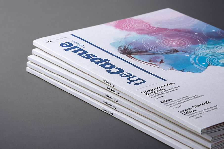
Cover of The Capsule, Uriach Laboratories corporate magazine first issue

Naming and personalityFollowing the dictates of good branding, a name must mirror certain attributes. People might have a name that does not really fit their personality, but this is something brands cannot afford. We worked in parallel on a new name for the magazine (formerly known as Uriactual), as well as a new editorial line ( which used to be based on based on vertical and one-way communication) We chose a name related to both the world of pharmaceuticals and journalism. A capsule is a pill, but it is also a small block of information. The technological imagery also struck us as interesting, since for almost two centuries now Uriach as a company has also been a cut above the rest on account of its scientific innovation. A capsule can also be a spaceship. Or a time-travel machine. All of these cases stand for progress and future.

The magazine’s new personality is also modern. It shuns institutional declarations and corporate spiel and focuses on one of Uriach’s greatest assets: the conviction that a great group of people are the core of a great company. And they all share the limelight in The Capsule.

Section of The Capsule, Uriach Laboratories corporate magazine
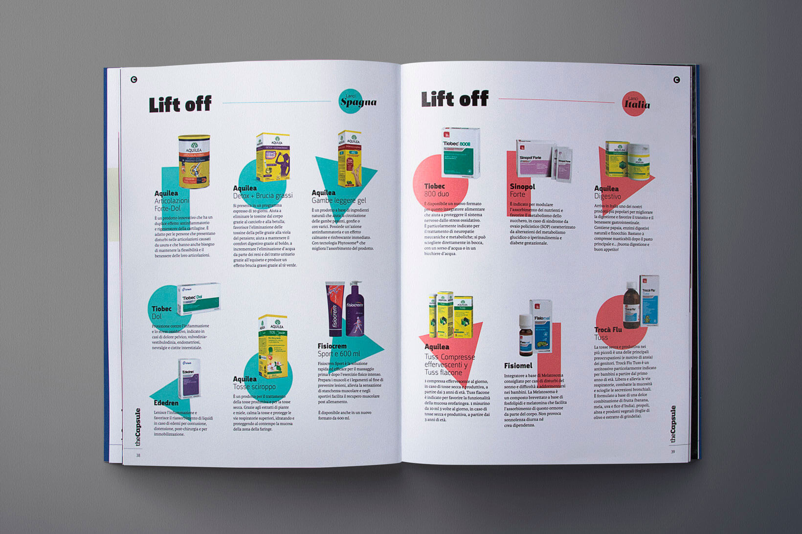
New products section of The Capsule, Uriach Laboratories corporate magazine

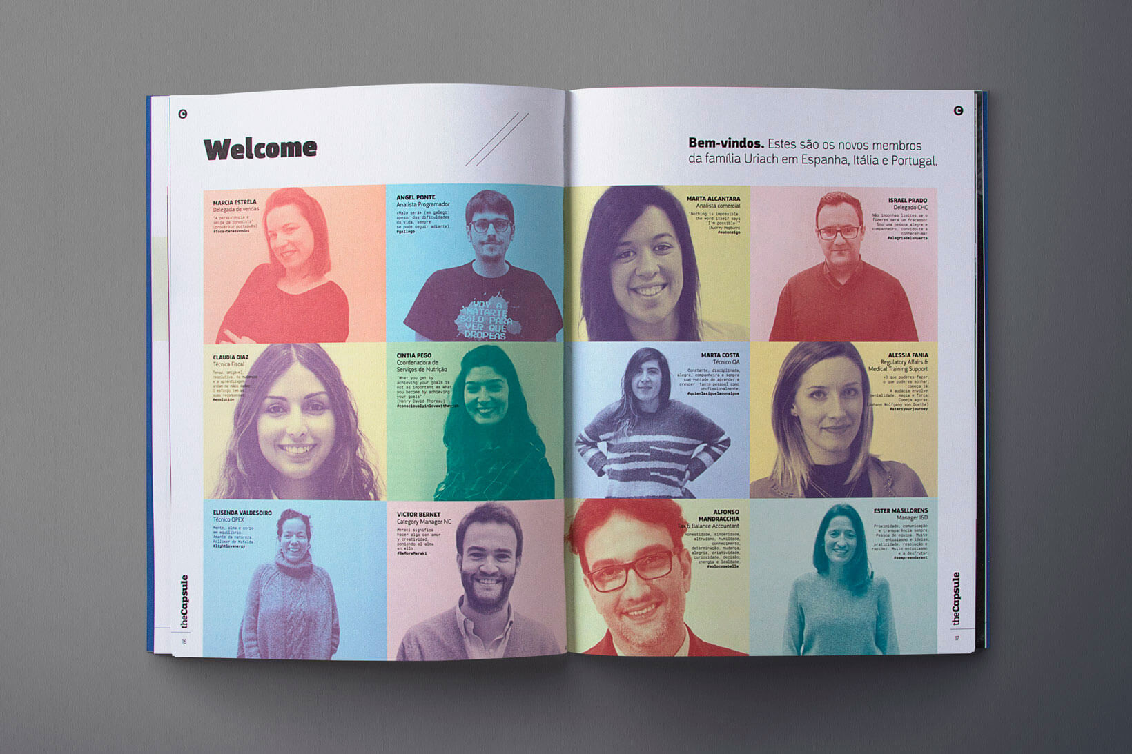
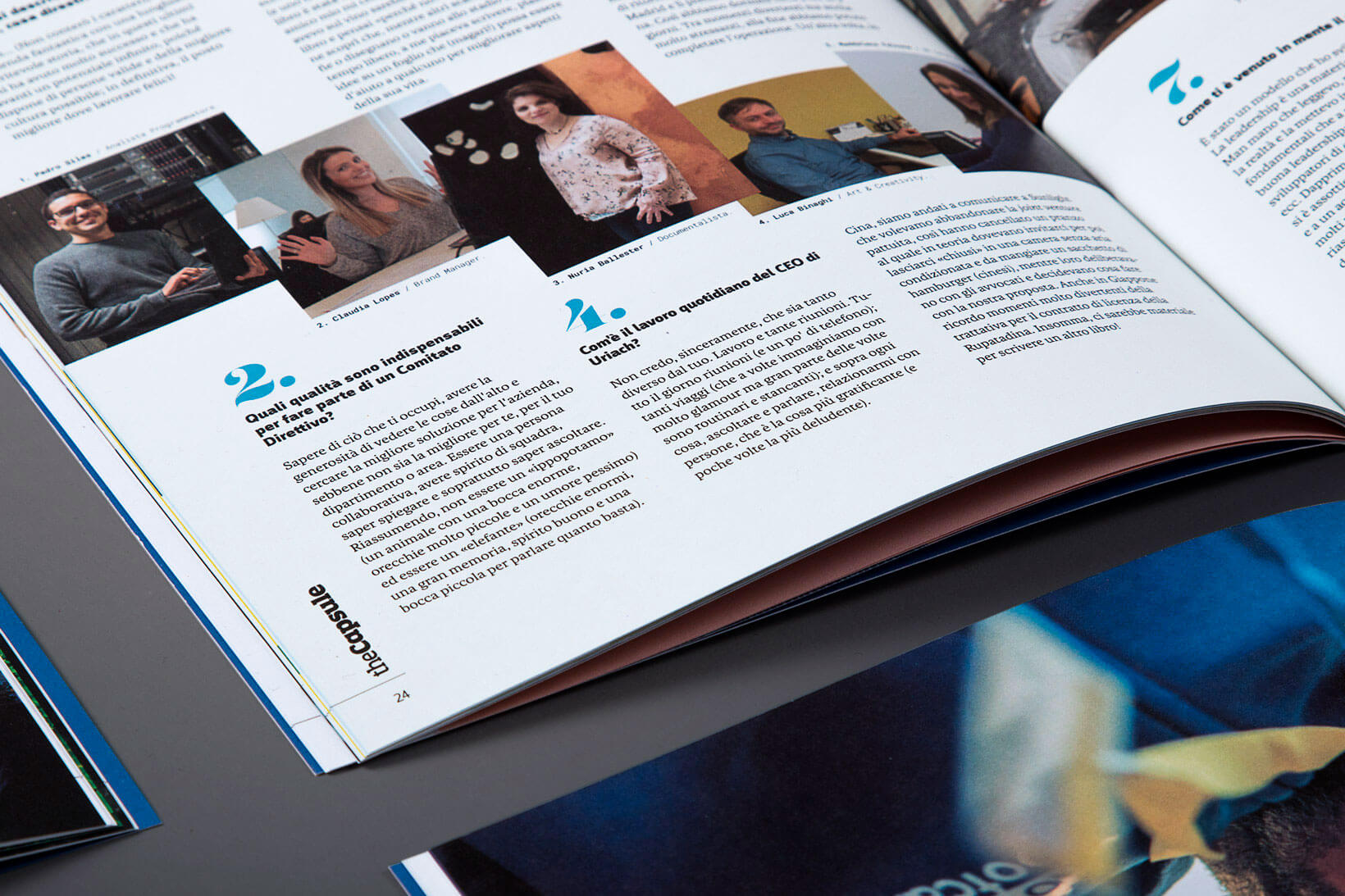
Sections and contents — The content structure is one of this editorial work’s greatest achievements. Section such as Welcome (new recruits to the company), Capsules (news and new developments), In & Out (joint interviews) or articles about actions, events and activities involving the workers have all been designed to highlight the importance of these human assets. Moreover, there are other sections conceived for everyone to find them interesting: a short story penned by well-known writers, personal health tips, the Did you know? section about pharmaceutical and medical trivia…

Close-up on page of The Capsule, Uriach Laboratories corporate magazine
Interview section of The Capsule, Uriach Laboratories corporate magazine
Texts and outlines with new editorial design on The Capsule, Uriach Laboratories corporate magazine
Close-up of new editorial design on The Capsule, Uriach Laboratories corporate magazine
New editorial design and illustrations of The Capsule, Uriach Laboratories corporate magazine

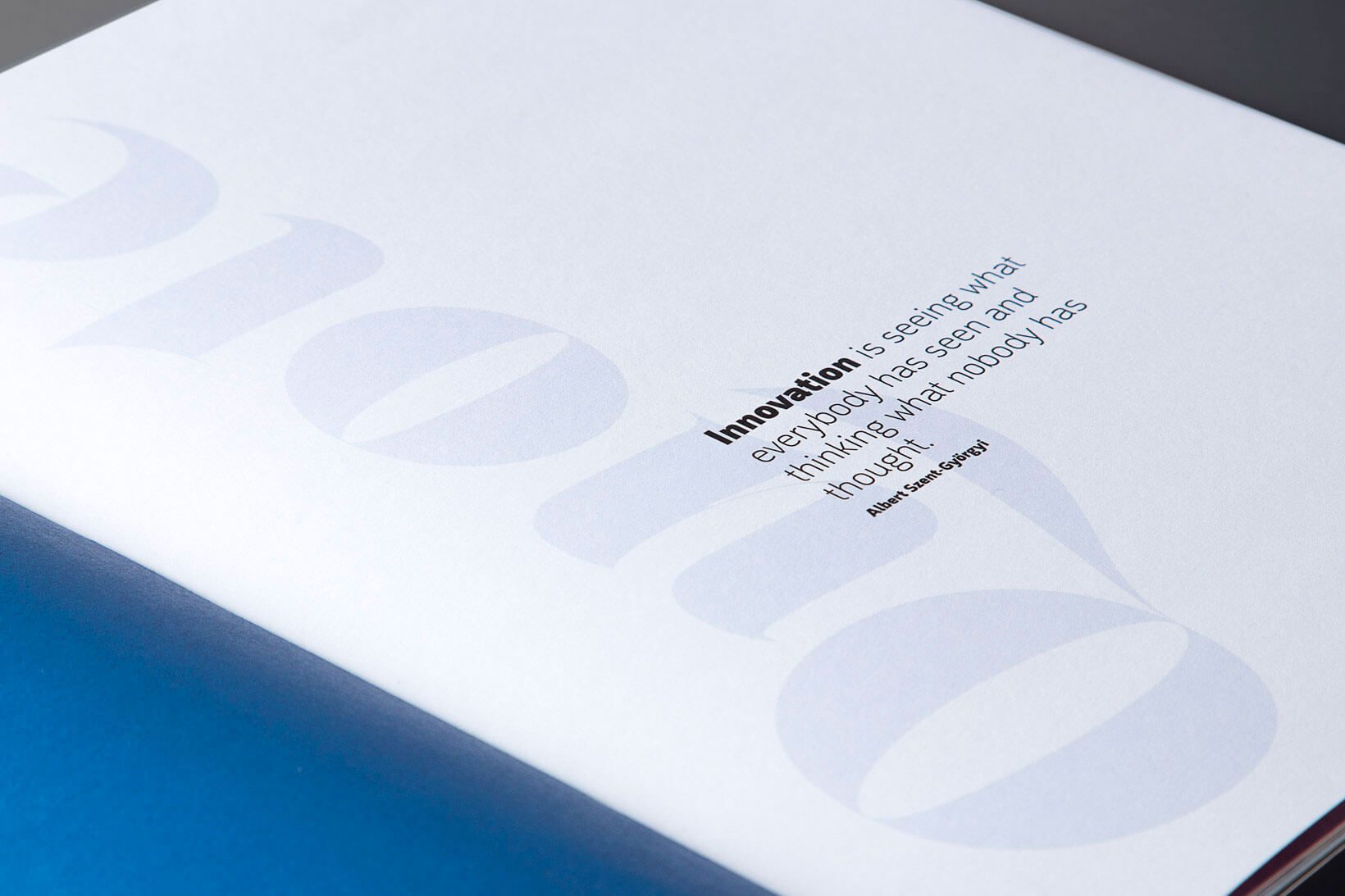
Masthead  The magazine’s masthead is comprised of an exclusive lettering developed from a geometric Slab Serif with counter-forms inspired by the shape of capsules. It is a modern and rugged typeface, but it is also pleasant and user-friendly. It echoes the typographic tradition prevailing in the press at the beginning of the 19th Century (the era when Uriach was founded), albeit never losing sight of modernity. A timeless masthead for a company projected from the past into the future, driven by an identical spirit.

Logo design and naming for the new corporate magazine headline The Capsule of Uriach Laboratories

It looks great  Editorial design is perhaps one of the graphic design disciplines with greatest possibilities. Many pages, however small and limited they may be in terms of physical space, have myriad possibilities. However, it is always necessary to maintain an important formal consistency to achieve unity (but never uniformity). The Capsule’s design is based on the use of a handful of simple and clean graphic resources that boost its readability and understandability. Basic forms and elementary geometry. The photographs are descriptive and harmonious. Composition is always rational and tidy. In a nutshell, a design that is aligned with the pharmaceutical aesthetic, but contemporary with it.

Close-up of design and composition on The Capsule, Uriach Laboratories corporate magazine
The Capsule, Uriach Laboratories corporate magazine

Resources — In the course of its long-standing history, Uriach has always enjoyed a very close relationship with the best Spanish poster designers, illustrators, graphic experts, designers and publicists: Antonio Utrillo, Josep Baqués, Enric Huguet, Antonio Morillas, Francesc Graus or Josep Pla-Narbona, to name but some. We wanted them to be very prominent. This is why the back cover of The Capsule always features one of their pieces. And to make sure that they do not feel lonely, they are accompanied by some of the best contemporary illustrators and graphic designers, who take care of the front covers or the inner pages. Some at the front, others in the middle and others at the back. Some of them from yesteryear, others from today and some from tomorrow.

Back of first issue of The Capsule, Uriach Laboratories corporate magazine
Your logo is outdated? Give it a new life.
Drop us a line. We help you.

  • This field is for validation purposes and should be left unchanged.
Related works
Fósforo
There’s a light…
Taste NSW
Oysteralia
Altcontrol
In high style