


Related works

Transmesa
Tubes ad infinitum

APD
Brand visibility as solid as metal

Vibranding
On paper
Branding
Logo design
Visual communication
Sales material
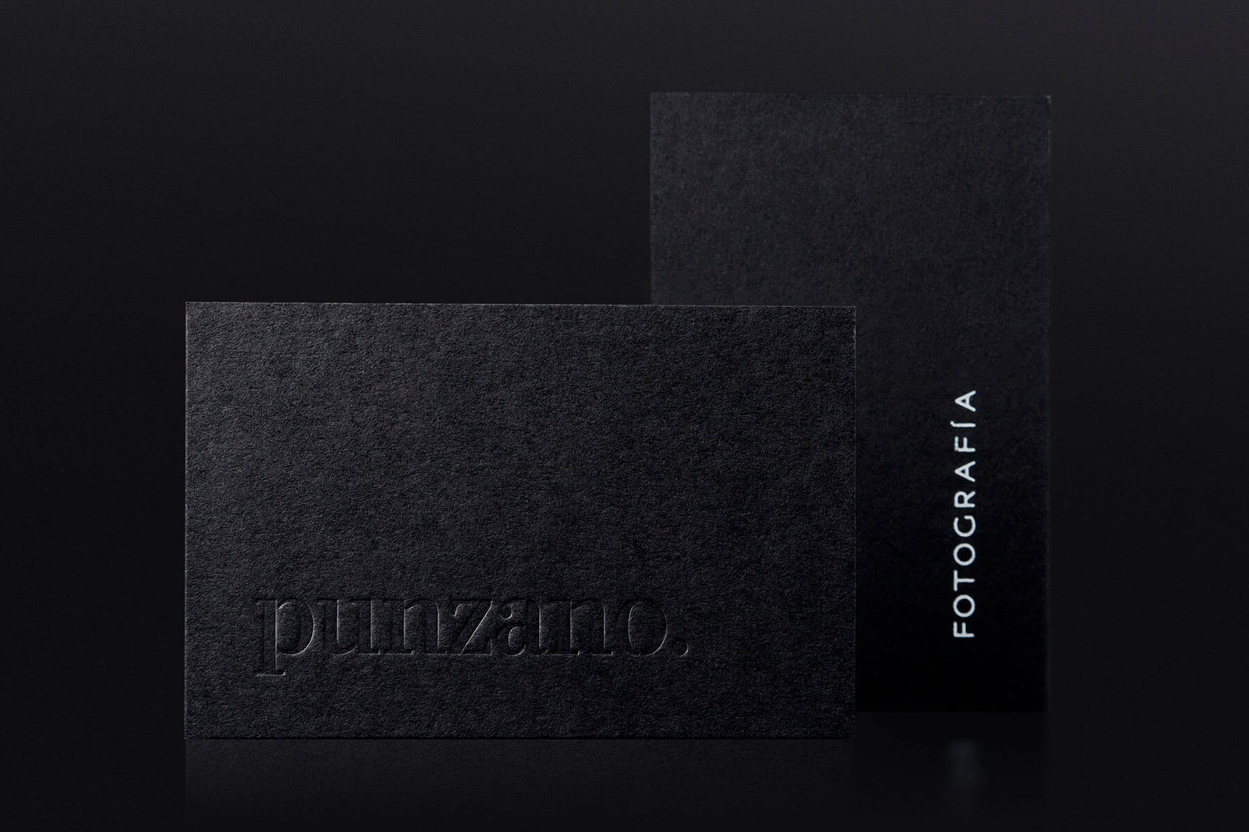
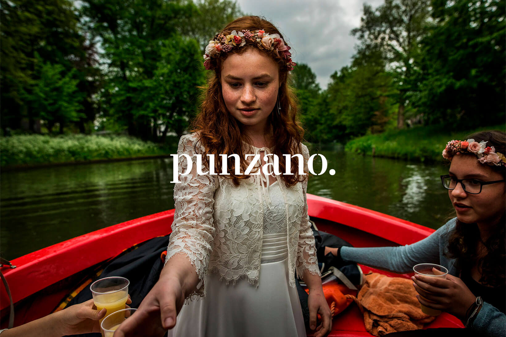
Juan Punzano takes verité photos. His style is highly documentary and realistic, and he has that marvellous ability of being where he needs to be without actually appearing to be there. Thanks to this skill, he can take aim and shoot in order to capture very intimate and private scenes in a gigantic and epic way. The result is not only beautiful; it is enormous. A client like that does not need a barrel-load of corporate items. He needs a calling card. And evidently a good logotype.
Something apparently as simple as designing a logotype is a gigantic graphic challenge, but it is also a passionate one. And we are in love with design.
It is a meticulous and perfectionist lettering job. We know (because we have worked with Juan for years) that he is a painstaking, hard-working, meticulous, elegant, outstanding and energetic photographer with an eye for detail. But he is also very genuine. And his logotype is all these things too. It is elegant and rugged because it uses a typeface with an accentuated contrast which even so does not go to the delicate lengths of the didonas. It is clear and legible. It is utterly devoid of superfluous decorative items and is both easy to read and memorable.
The letters are drawn on a vertical axis and use simple and dynamic curves. This all conveys technical rationality and honesty. Good photographs that portray sincere moments. Finally, the stencil-like appearance affords an up-to-date character and modernity, which are also outstanding values in the photographic style of Juan Punzano.
We are happy to have come up with a logotype that sits very well with the numerous and varied instants, episodes, events and scenarios that Juan usually portrays without contaminating or invading them. And all of it without foregoing personality and autonomy.
| Cookie | Duration | Description |
|---|---|---|
| ARRAffinity | This cookie is set by websites that run on Windows Azure cloud platform. The cookie is used to affinitize a client to an instance of an Azure Web App. | |
| cookielawinfo-checbox-analytics | 11 months | This cookie is set by GDPR Cookie Consent plugin. The cookie is used to store the user consent for the cookies in the category "Analytics". |
| cookielawinfo-checbox-functional | 11 months | The cookie is set by GDPR cookie consent to record the user consent for the cookies in the category "Functional". |
| cookielawinfo-checkbox-advertisement | 1 year | The cookie is set by GDPR cookie consent to record the user consent for the cookies in the category "Advertisement". |
| cookielawinfo-checkbox-necessary | 11 months | This cookie is set by GDPR Cookie Consent plugin. The cookies is used to store the user consent for the cookies in the category "Necessary". |
| cookielawinfo-checkbox-performance | 11 months | This cookie is set by GDPR Cookie Consent plugin. The cookie is used to store the user consent for the cookies in the category "Performance". |
| PHPSESSID | session | This cookie is native to PHP applications. The cookie is used to store and identify a users' unique session ID for the purpose of managing user session on the website. The cookie is a session cookies and is deleted when all the browser windows are closed. |
| viewed_cookie_policy | 11 months | The cookie is set by the GDPR Cookie Consent plugin and is used to store whether or not user has consented to the use of cookies. It does not store any personal data. |
| wp-wpml_current_language | 1 day | Web language |
| Cookie | Duration | Description |
|---|---|---|
| player | 1 year | This cookie is used by Vimeo. This cookie is used to save the user's preferences when playing embedded videos from Vimeo. |
| sp_landing | 1 day | This cookie is set by the provider Spotify. This cookie is used to implement audio content from spotify on the website. It also helps in collecting information on user interaction with this audio content. |
| sp_t | 1 year | This cookie is set by the provider Spotify. This cookie is used to implement audio content from spotify on the website. It also helps in collecting information on user interaction with this audio content. |
| Cookie | Duration | Description |
|---|---|---|
| _ga | 2 years | This cookie is installed by Google Analytics. The cookie is used to calculate visitor, session, campaign data and keep track of site usage for the site's analytics report. The cookies store information anonymously and assign a randomly generated number to identify unique visitors. |
| _gat_UA-79013542-1 | 1 minute | Google Analytics |
| _gcl_au | 3 months | This cookie is used by Google Analytics to understand user interaction with the website. |
| _gid | 1 day | This cookie is installed by Google Analytics. The cookie is used to store information of how visitors use a website and helps in creating an analytics report of how the website is doing. The data collected including the number visitors, the source where they have come from, and the pages visted in an anonymous form. |
| vuid | 2 years | This domain of this cookie is owned by Vimeo. This cookie is used by vimeo to collect tracking information. It sets a unique ID to embed videos to the website. |