Brasería Milana
Grill thrills

Branding
Logo Design
Corporate identity
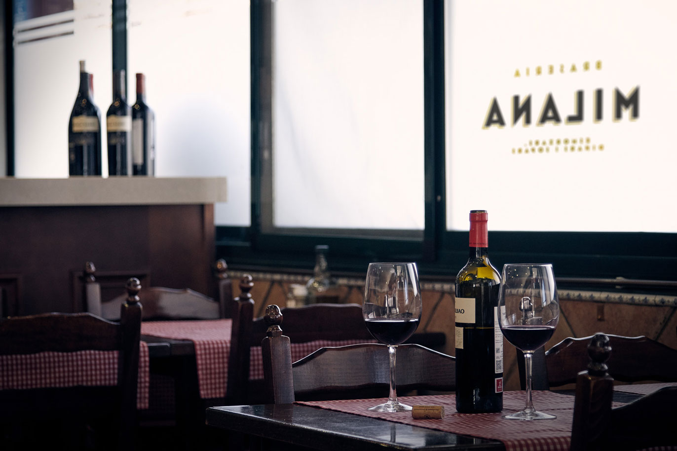
There is a brasserie near our agency. Not only do they serve set meals at lunchtime with tons of grilled dishes and home cooking, they also do grilled sandwiches. If you have never tried a grilled pork ‘n’ cheese, a bacon ‘n’ cheese or a Spanish ham sandwich then you have no idea what you’re missing. And we never miss out on anything that goes on at Brasería Milana. In fact we go there every day. No wonder…
Like any good local restaurant, visual identity was not really a priority. Because if business is good, then why worry about it? But María José is a person who places great value on her business’s image.
Visual communication has great evocative power. And this says a lot about the brand, which is why the graphic universe that it evokes is so important.
When we “grilled” her about updating the logotype to give the brand some more personality and attributes, she could easily have retorted “Just pay for your steak and don’t hassle me”. But she said yes, that she loved the idea and that it was a step that needed to be taken in order to grow. So… One branding coming up!

Strong-flavoured — We love old posters. Hand-made, on wood, on glass, brush-painted or finished off with gold leaf, all of them with awesome lettering. And if there is one thing that Spain has never been short of then it is bars, pubs, small restaurants, taverns, canteens, steakhouses, cafés, beer bars, restaurants, eateries (eateries), snacks… (a good few synonyms for the same thing!).

We revisited this universe and created a classic and genuine logotype based on the Mostra Nuova lettering, with elements in relief to afford it volume, a sober and elegant composition, distinguished colours and retro-style geographic motifs.


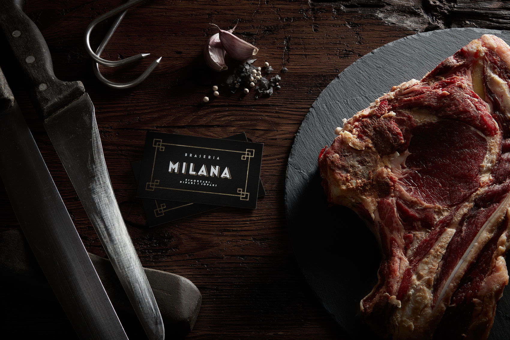
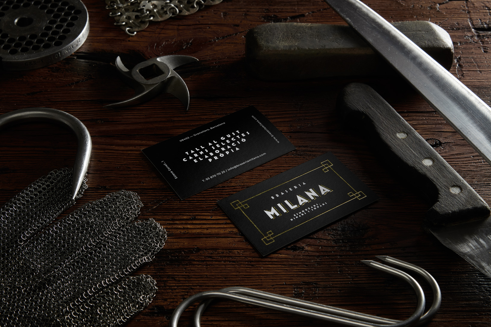
Side-dish — In order to enhance the brand attributes further, we also took care of some of the communication elements. The calling cards include an elegant gilt stamping. The menus, in which we used different font weights from the logotype, are printed on a highly tactile-textured fibrous paper. And to present them we came up with laser-engraved wooden plates on which the logotype takes on new nuances. Finally, the establishment’s outside signs feature two formats. First of all, the actual sign, which includes gold leaf-like paint. Secondly, wooden slates to highlight the Brasería Milana’s tasty specials, just like shops used to do in the olden days, and which are really good at pulling people in. Pop in for a bite one day, you won’t regret it.


