


Related works
Nou Niu
Just like home
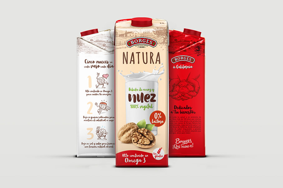
Borges Natura
Something new

APD
Brand visibility as solid as metal
Golden Anuaria Award 2020 Best Advertising Campaign
Platinum CLAP 2020 Award Best Campaign In Street
Platinum CLAP 2020 Award Best Brochure
Selección Agripina 2020 Award Best Street Marketing Campaign
At long last, a new briefing is here. We had been doing the branding of the Cambridge School for 4 years, with a very specific aesthetic approach: flat design, drawings and somewhat childlike characters, colourful designs, highly descriptive slogans… Look: This all changed in 2019, and we were given new guidelines that allowed us to create a new visual universe and a new communication tone for this Language Academy which already has 9 schools in Catalonia.
First of all, the message — We were sent an initial moodboard about the visual style and the tone that Cambridge School wants for its new communication. They know exactly what they want. They are after an aesthetic and a language suited to a new target, now young people rather children. We started with the official slogan for the campaign. They wanted us to come up with something that gets young people and teenagers to really want to study and learn languages. Not an easy task!
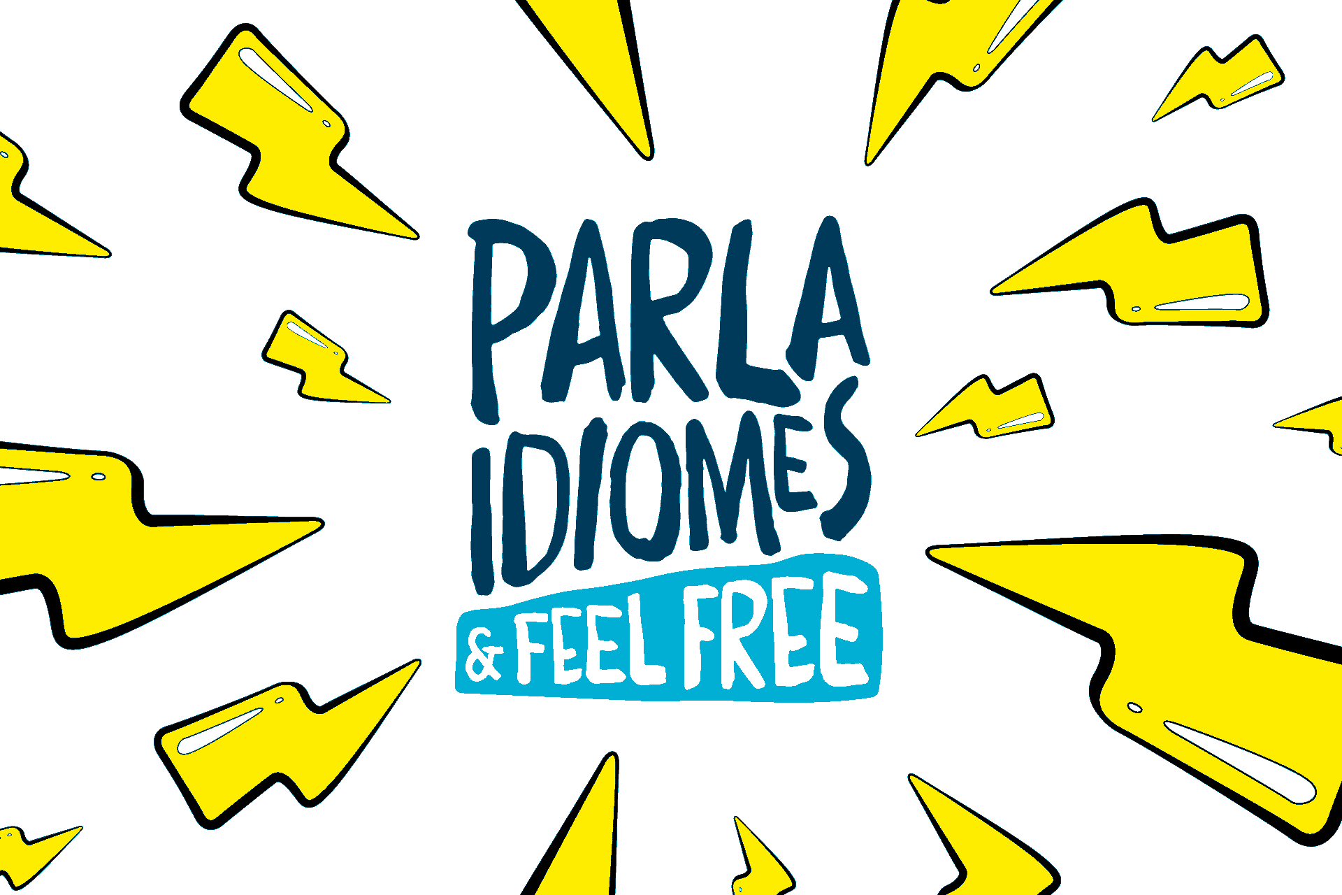
To tie in with the previous campaign, we recovered the idea of a slogan that combines languages, and to connect with the target we took a common expression from their vocabulary and appealed to their most basic desire: freedom. The slogan had to be descriptive, alluding to the services offered by Cambridge School, but also one that stimulated the target. And this is how “Parla Idiomes & Feel Free” (Speak Languages and Feel Free), a call to action that shows young people and teenagers the advantages of speaking different languages, saw the light. That by speaking languages they can do whatever they want. Or almost…
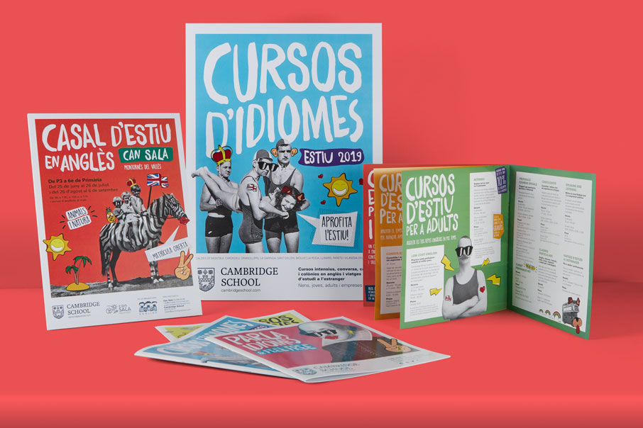
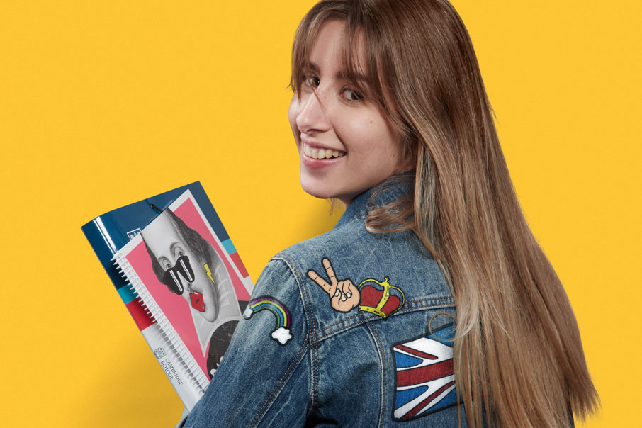
More message — The verbal message must be reinforced by the visual message. Both messages, in order to fit in properly and be effective, needed to use the target’s own language and vocabulary. For this purpose, we chose the visual universe of stickers of apps such as such as Snapchat or Instagram. We designed an exclusive collection of stickers to be applied to an oldish-looking graphic (black-and-white photographs and illustrations and etchings), and thus convey this message of freedom (and a rebellious, and even somewhat unruly, spirit). In this way, we created very descriptive, and even very clichéd and conventional designs, affording them humour, happiness and a decidedly young spirit.
Another one of the advantages of this idea is that any graphic item that we might develop will inevitably be associated with the brand and its new visual identity merely through these four elements: a plain background, a white frame, a black-and-white image and a set of stickers arranged with a sense of humour. It adapts to any message that you might want to communicate and also to any medium or format. And it never loses its identity. It is always a brand.
A selfie — Competition in the sector is extensive and very stiff, hence the briefing also included (besides attracting the target’s attention) the need to stand out and be different. Our solution not only achieves this (the visual treatment is utterly unique and original), but also reinforces the brand’s values. Cambridge School’s educational system is as different and relaxed as its communication conveys. Well done!
| Cookie | Duration | Description |
|---|---|---|
| ARRAffinity | This cookie is set by websites that run on Windows Azure cloud platform. The cookie is used to affinitize a client to an instance of an Azure Web App. | |
| cookielawinfo-checbox-analytics | 11 months | This cookie is set by GDPR Cookie Consent plugin. The cookie is used to store the user consent for the cookies in the category "Analytics". |
| cookielawinfo-checbox-functional | 11 months | The cookie is set by GDPR cookie consent to record the user consent for the cookies in the category "Functional". |
| cookielawinfo-checkbox-advertisement | 1 year | The cookie is set by GDPR cookie consent to record the user consent for the cookies in the category "Advertisement". |
| cookielawinfo-checkbox-necessary | 11 months | This cookie is set by GDPR Cookie Consent plugin. The cookies is used to store the user consent for the cookies in the category "Necessary". |
| cookielawinfo-checkbox-performance | 11 months | This cookie is set by GDPR Cookie Consent plugin. The cookie is used to store the user consent for the cookies in the category "Performance". |
| PHPSESSID | session | This cookie is native to PHP applications. The cookie is used to store and identify a users' unique session ID for the purpose of managing user session on the website. The cookie is a session cookies and is deleted when all the browser windows are closed. |
| viewed_cookie_policy | 11 months | The cookie is set by the GDPR Cookie Consent plugin and is used to store whether or not user has consented to the use of cookies. It does not store any personal data. |
| wp-wpml_current_language | 1 day | Web language |
| Cookie | Duration | Description |
|---|---|---|
| player | 1 year | This cookie is used by Vimeo. This cookie is used to save the user's preferences when playing embedded videos from Vimeo. |
| sp_landing | 1 day | This cookie is set by the provider Spotify. This cookie is used to implement audio content from spotify on the website. It also helps in collecting information on user interaction with this audio content. |
| sp_t | 1 year | This cookie is set by the provider Spotify. This cookie is used to implement audio content from spotify on the website. It also helps in collecting information on user interaction with this audio content. |
| Cookie | Duration | Description |
|---|---|---|
| _ga | 2 years | This cookie is installed by Google Analytics. The cookie is used to calculate visitor, session, campaign data and keep track of site usage for the site's analytics report. The cookies store information anonymously and assign a randomly generated number to identify unique visitors. |
| _gat_UA-79013542-1 | 1 minute | Google Analytics |
| _gcl_au | 3 months | This cookie is used by Google Analytics to understand user interaction with the website. |
| _gid | 1 day | This cookie is installed by Google Analytics. The cookie is used to store information of how visitors use a website and helps in creating an analytics report of how the website is doing. The data collected including the number visitors, the source where they have come from, and the pages visted in an anonymous form. |
| vuid | 2 years | This domain of this cookie is owned by Vimeo. This cookie is used by vimeo to collect tracking information. It sets a unique ID to embed videos to the website. |