

Related works

Bokaverde
A perfectly round logo in every sense

Punzano
A genuine logtype

Fósforo
There’s a light…
Premio IGDEA 2017 Mejor Naming
Anuaria Selection Award 2016 Best Naming
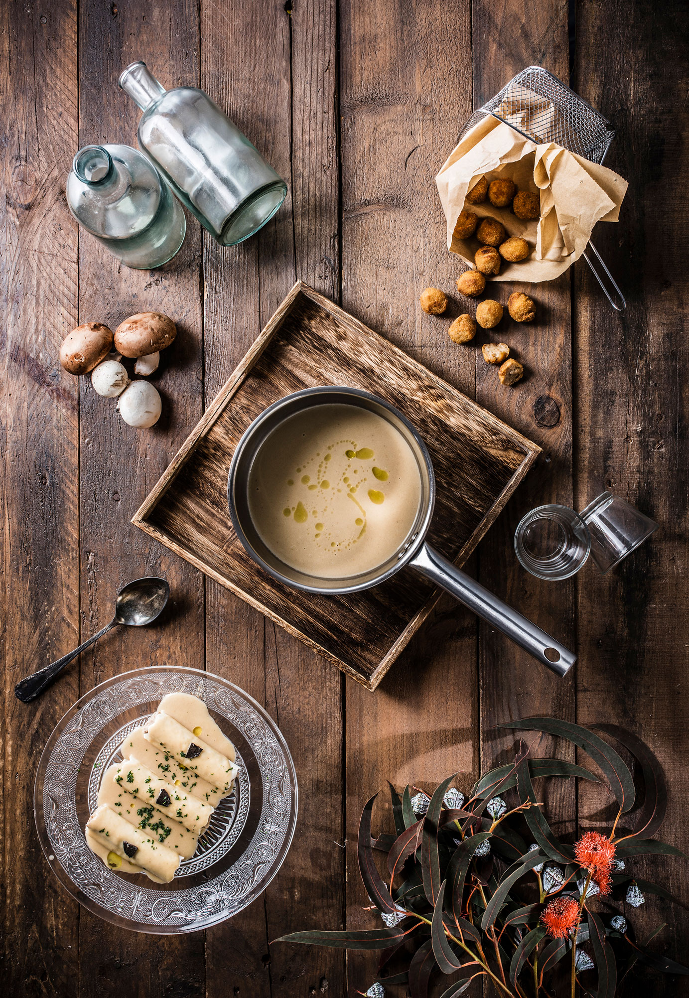
In the beginning was the word — This agency specialising in food photography and products is highly characteristic, exclusive and personal.
They asked us to produce a robust, elegant, chic and memorable brand.
We suggested a very clear and direct name (Food Shot), reinforced with a tagline that is just as clear and direct: Still Life Photography.
Food Shot’s photographs are practically paintings, like 16th and 17th century still life. So rather than use overused descriptors like “gastronomy” and “gourmet” we decided to go for something clear and unequivocal: “Still Life”. Since the entire brand had to exude a classical, academic air. Developing the brand language further, “photography” was preferred to “photo” and “portrait” to “picture”.
After all, we had already used “shot” and “food” in the name. The “humble/select” duality of pictorial still life (in which formal elegance is used to portray everyday scenes) is present throughout the brand.
And then, the shape — Since the name actually weighs more than the tagline, the “popular-select” duality was unbalanced. So we compensated by composing the logo in a very purist and harmonious way. And we maintained the play on dualities in the fonts. Thus, the name is an exclusive lettering with a humanist spirit developed from a Roman typeface; and the tagline, a geometric and formal but very modern Raleway, which even serves as a regular typeface for corporate texts on the website and stationery.
| Cookie | Duration | Description |
|---|---|---|
| ARRAffinity | This cookie is set by websites that run on Windows Azure cloud platform. The cookie is used to affinitize a client to an instance of an Azure Web App. | |
| cookielawinfo-checbox-analytics | 11 months | This cookie is set by GDPR Cookie Consent plugin. The cookie is used to store the user consent for the cookies in the category "Analytics". |
| cookielawinfo-checbox-functional | 11 months | The cookie is set by GDPR cookie consent to record the user consent for the cookies in the category "Functional". |
| cookielawinfo-checkbox-advertisement | 1 year | The cookie is set by GDPR cookie consent to record the user consent for the cookies in the category "Advertisement". |
| cookielawinfo-checkbox-necessary | 11 months | This cookie is set by GDPR Cookie Consent plugin. The cookies is used to store the user consent for the cookies in the category "Necessary". |
| cookielawinfo-checkbox-performance | 11 months | This cookie is set by GDPR Cookie Consent plugin. The cookie is used to store the user consent for the cookies in the category "Performance". |
| PHPSESSID | session | This cookie is native to PHP applications. The cookie is used to store and identify a users' unique session ID for the purpose of managing user session on the website. The cookie is a session cookies and is deleted when all the browser windows are closed. |
| viewed_cookie_policy | 11 months | The cookie is set by the GDPR Cookie Consent plugin and is used to store whether or not user has consented to the use of cookies. It does not store any personal data. |
| wp-wpml_current_language | 1 day | Web language |
| Cookie | Duration | Description |
|---|---|---|
| player | 1 year | This cookie is used by Vimeo. This cookie is used to save the user's preferences when playing embedded videos from Vimeo. |
| sp_landing | 1 day | This cookie is set by the provider Spotify. This cookie is used to implement audio content from spotify on the website. It also helps in collecting information on user interaction with this audio content. |
| sp_t | 1 year | This cookie is set by the provider Spotify. This cookie is used to implement audio content from spotify on the website. It also helps in collecting information on user interaction with this audio content. |
| Cookie | Duration | Description |
|---|---|---|
| _ga | 2 years | This cookie is installed by Google Analytics. The cookie is used to calculate visitor, session, campaign data and keep track of site usage for the site's analytics report. The cookies store information anonymously and assign a randomly generated number to identify unique visitors. |
| _gat_UA-79013542-1 | 1 minute | Google Analytics |
| _gcl_au | 3 months | This cookie is used by Google Analytics to understand user interaction with the website. |
| _gid | 1 day | This cookie is installed by Google Analytics. The cookie is used to store information of how visitors use a website and helps in creating an analytics report of how the website is doing. The data collected including the number visitors, the source where they have come from, and the pages visted in an anonymous form. |
| vuid | 2 years | This domain of this cookie is owned by Vimeo. This cookie is used by vimeo to collect tracking information. It sets a unique ID to embed videos to the website. |