Mushroom Forestry
Quality that grows
Global Trend Awards 2019 Ascent Winner for Best Logotype

Branding
Logo design
Corporate identity
Packaging
Labels
Sales material
Mushrooms are becoming more and more of a delicatessen item. Mushroom Forestry is a company specialising in cultivating high-quality organically-grown mushrooms. It is located on the Mornington Peninsula in Australia, world-famous for its wines and a foodie tourism destination thanks to the prestige it is earning with its other premium products.
When a brand’s main value is quality, the design of its corporate identity and packaging must be, put simply, excellent and refined.
Mushroom Forestry aims to become the premier supplier of the top restaurants of Melbourne and the Mornington Peninsula, as well as shops selling gourmet produce in the area. To do this it needed a brand that would transmit clearly and powerfully the attributes of its products: natural, contemporary and high-quality.
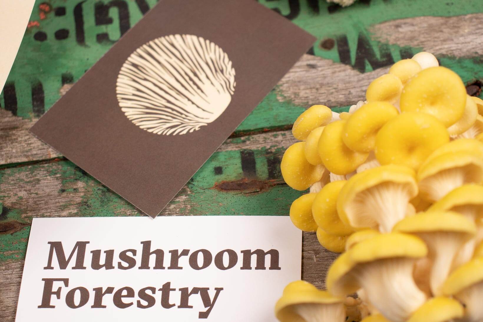
Substrate — In Australia, not many people. It’s a country with very little culture of mushrooms. Everything to do with looking for mushrooms in the countryside and eating anything other than mass-produced mushrooms has always been directly related with psychedelic culture. Fortunately, this is changing due to the fascinating effervescence of fine cuisine and the mixing of cultures.

Cata — We are a studio that love to immerse ourselves 100% in projects to learn in depth about brands. True to this philosophy, we visited Mushroom Forestry, learnt a lot about their product and the health benefits their different varieties offer, and we took away a block of substrate inoculated with shiitake spores to cultivate for a couple of weeks. It was wonderful to watch them grow, but even better to eat them in a lightly-fried omelette with olive oil, a pinch of salt and another of black pepper. Yummy!
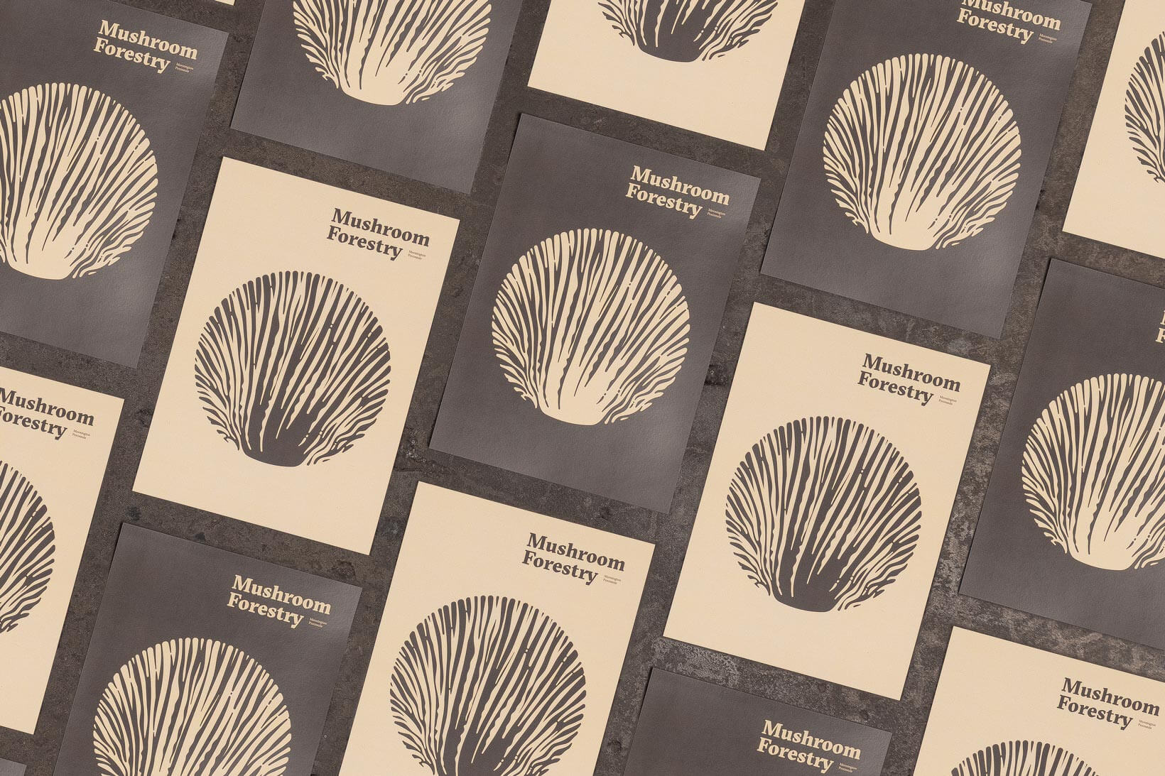
The spore — The undersides of some varieties form shapes of great visual power: the gills form ranges of mountains, meadows, trees and landscapes. The most incredible of all is that this is where the spores come from, essential to create new mushrooms. We fell in love.
As well as sinuous gills, what these mushrooms offer is tender, delicate-looking flesh. We wanted to put all these nuances into the design of the brand icon.


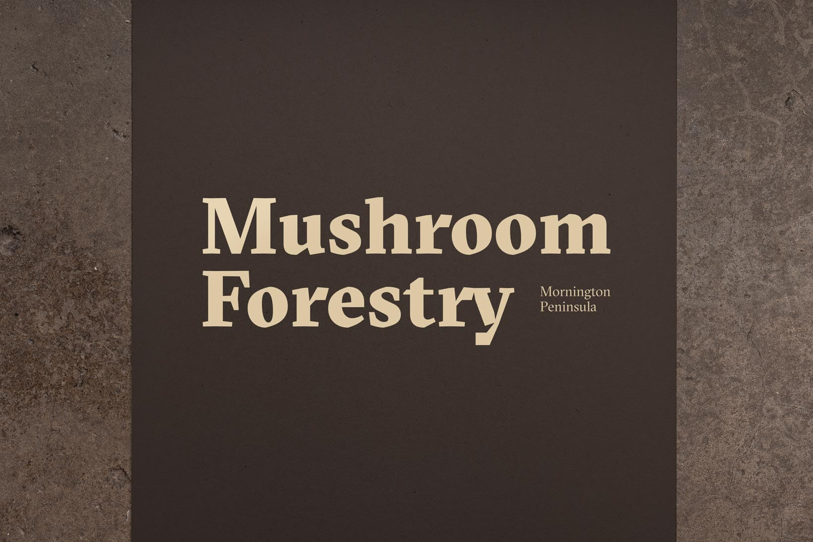
El sombrero — In any corporate identity project, typography plays a fundamental role because it defines many aspects and transmits many attributes and nuances of a brand. We therefore used a serif typeface with the contrast and depth necessary to go with a warm background. A traditional typography but with angular forms to denote modernity. A winning typography with the character necessary to boost the brand’s ambitions.
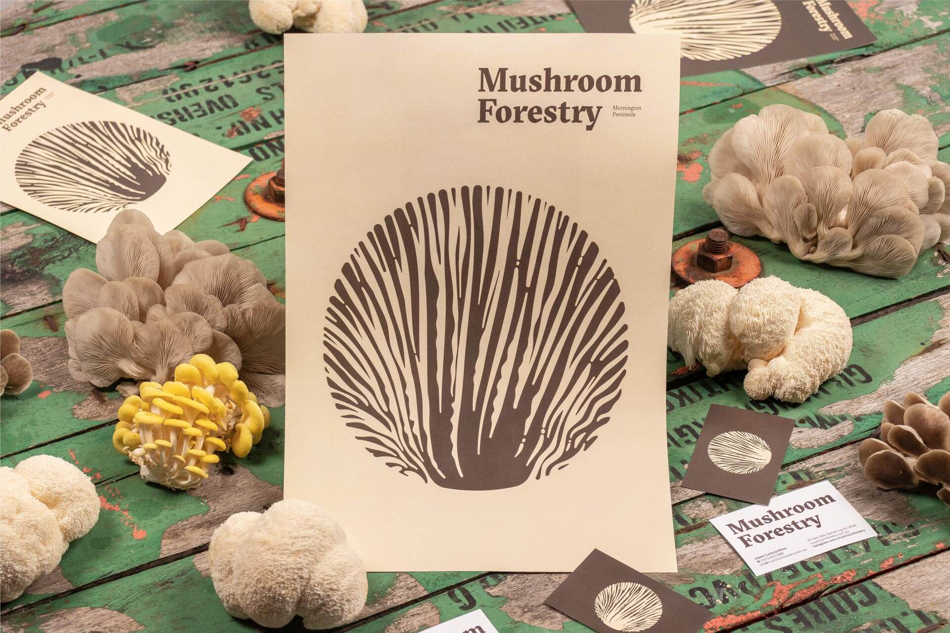
The ring — The palette of colours used for the whole identity is sober and elegant, so that there can be no mistake: this is a premium product. The mixture of different tones, browns, oranges, yellows and blues, recalls the colours of the mushrooms themselves, the colours of the forest, the colours of nature…


