
Related works

Movex
A useful website

Cambridge School
A new world
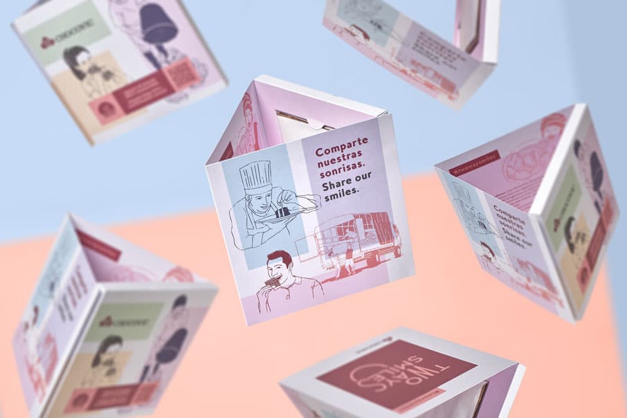
Chocovic
100% sustainable cocoa
Anuaria 2019 Selection Award for Best Logo
Once upon a time, there was a music producer who had the opportunity to grow his business and buy some historic recording studios in Barcelona to take that big step. Until then, Pau Romero made his productions in a small studio sublet within another small studio. The opportunity for growth that presented itself also required his brand to grow. Both he and his partner, Jordi Solans, were clear about it. First step, improve the image to consolidate its identity.
Support your local bands — For the creative development of the Beat Garden logo (the assignment) we focused on two references: Scandinavian design (which the client asked us for) and the typographic compositions of the musicals of the 50s (our contribution). All this coated with an aesthetic coverage of pop culture. Because, in addition to music production for bands, Beat Garden also offers audio post-production services for documentaries, film and advertising. The moodboard we created brought together music, audiovisual and design.
In the briefing, one of the key points to take into account was the familiarity with which they work at Beat Garden. Any project is approached from an intense closeness. “We want clients to feel at home”, they told us. As part of the creative process we came up with a phrase that helped us synthesize this spirit and guided us visually: Our Sound, Your Home. It was just a guide, a creative support point; but when we presented it to Pau and Jordi, they liked it so much that it has ended up being their tagline and fully integrated into the brand.
The pentagon — From the very beginning (possibly carried away by the need to be as Scandinavian as possible and for Alvar Aalto and Arne Jacobsen to consider us worthy of their Olympus), we were convinced that we should work with a pentagon as an isotype. Its shape reminded us of a house. And music is written on pentagrams, so there was a connection there. The first pentagons of the first sketches were simple outlines.
Little by little we got closer to the idea of concentric pentagons of flat colors that broke the two-dimensionality of simple geometric shapes and gave it rhythm and depth. The irregular arrangement of the different pentagons, finally, made the whole vibrate with great intensity. The color combinations reinforced that vibration. We liked all that very much.
Morphology — The Beat Garden logo was tough to crack. First of all, Beat Garden is a long word. Yes, I mean it: a word. For Pau and Jordi, BeatGarden is one word. But in all the tests we did with one word, the logo was too horizontal. And by separating the two words into two lines, the feeling that it was a single word was lost. In some cases, it even seemed that we were designing the logo of a garden called Beat. That is, bad. We couldn’t find a way.
The solution came from a very simple reflection: “What if we separate it by syllables? Syllables are phonemes. Phonemes are the smallest units of vocal sound. Phonemes are the notes of linguistics”. Eureka! In this way we could maintain the visual appearance of a single word (with an evident syllabic separation) and at the same time not betray the orthographic reality (which is none other than Beat Garden, after all, are two words). And we also got three visually homogeneous graphic blocks, which made it much easier for us to work on the typographic composition.
A couple of types — We chose a Univers Black for the logo, a grotesque typeface that offers us rigor and objectivity. While it is true that the issue of closeness and familiarity was important and that creativity is the background noise of the studio, we could not ignore that at Beat Garden precise work is carried out, and that Pau and Jordi approach it methodically. That’s why a Univers.
Also because it allowed us to give musicality to the logo without ceasing to be austere. If we imprinted rhythm on it, we achieved a powerful contrast: dynamism and musicality in a very stable composition. The large whites that the counter-forms give us ensure reading, favor a lively typographic game and the italic A inside shakes everything up. Good.
On the other hand, the great variety of weights that this family presents was very useful for the tagline, which is built with a Univers Light of the same characteristics as its older sister and an extra of Nordic fineness and order. And all, of course, within a typographic system in perfect harmony.
Finally, for the rest of the corporate texts (names, positions, addresses, telephones, stationery, website…) we chose a Roboto Mono. A free font of easy use and retro-technological characteristics that helped to consolidate the idea that Beat Garden is your home, yes, but an orderly house where sound is worked on meticulously.
| Cookie | Duration | Description |
|---|---|---|
| ARRAffinity | This cookie is set by websites that run on Windows Azure cloud platform. The cookie is used to affinitize a client to an instance of an Azure Web App. | |
| cookielawinfo-checbox-analytics | 11 months | This cookie is set by GDPR Cookie Consent plugin. The cookie is used to store the user consent for the cookies in the category "Analytics". |
| cookielawinfo-checbox-functional | 11 months | The cookie is set by GDPR cookie consent to record the user consent for the cookies in the category "Functional". |
| cookielawinfo-checkbox-advertisement | 1 year | The cookie is set by GDPR cookie consent to record the user consent for the cookies in the category "Advertisement". |
| cookielawinfo-checkbox-necessary | 11 months | This cookie is set by GDPR Cookie Consent plugin. The cookies is used to store the user consent for the cookies in the category "Necessary". |
| cookielawinfo-checkbox-performance | 11 months | This cookie is set by GDPR Cookie Consent plugin. The cookie is used to store the user consent for the cookies in the category "Performance". |
| PHPSESSID | session | This cookie is native to PHP applications. The cookie is used to store and identify a users' unique session ID for the purpose of managing user session on the website. The cookie is a session cookies and is deleted when all the browser windows are closed. |
| viewed_cookie_policy | 11 months | The cookie is set by the GDPR Cookie Consent plugin and is used to store whether or not user has consented to the use of cookies. It does not store any personal data. |
| wp-wpml_current_language | 1 day | Web language |
| Cookie | Duration | Description |
|---|---|---|
| player | 1 year | This cookie is used by Vimeo. This cookie is used to save the user's preferences when playing embedded videos from Vimeo. |
| sp_landing | 1 day | This cookie is set by the provider Spotify. This cookie is used to implement audio content from spotify on the website. It also helps in collecting information on user interaction with this audio content. |
| sp_t | 1 year | This cookie is set by the provider Spotify. This cookie is used to implement audio content from spotify on the website. It also helps in collecting information on user interaction with this audio content. |
| Cookie | Duration | Description |
|---|---|---|
| _ga | 2 years | This cookie is installed by Google Analytics. The cookie is used to calculate visitor, session, campaign data and keep track of site usage for the site's analytics report. The cookies store information anonymously and assign a randomly generated number to identify unique visitors. |
| _gat_UA-79013542-1 | 1 minute | Google Analytics |
| _gcl_au | 3 months | This cookie is used by Google Analytics to understand user interaction with the website. |
| _gid | 1 day | This cookie is installed by Google Analytics. The cookie is used to store information of how visitors use a website and helps in creating an analytics report of how the website is doing. The data collected including the number visitors, the source where they have come from, and the pages visted in an anonymous form. |
| vuid | 2 years | This domain of this cookie is owned by Vimeo. This cookie is used by vimeo to collect tracking information. It sets a unique ID to embed videos to the website. |