


Related works
Loué
Luxury never goes out of fashion

APD
Brand visibility as solid as metal

Cambridge School
A new world
A, B, C — In children’s education, the physical environment is just as important as the actual educational system. The relationship between both (environment and system) can never be random. Some people (and naturally this client) regard the education of young children as a cumulus of more or less supervised impressions and impacts in a specific environment. La Cabana. A very personal and particular system that mixes the free school with Montessori, Pikler, Waldorf and Reggio Emilia.
The brand name and values were a given. So was the space. It only remained for us to build something around it with consistency. The first precaution we had to take when addressing a branding project for a children’s’ school was to create a visual identity that would fit into the physical environment and was aligned with the school’s educational method. We explored the most modern educational trends and methods, which are the ones that La Cabana’s project taps into.
A lovely story — Our client told us that when he had the idea for this children’s school, his own daughter (10 years old) drew the logo that she would like. This mapped out our path. We could not get away from the teepee. First of all, on account of the emotional importance it had for the client, and secondly because it actually did sit very well with the brand’s spirit.
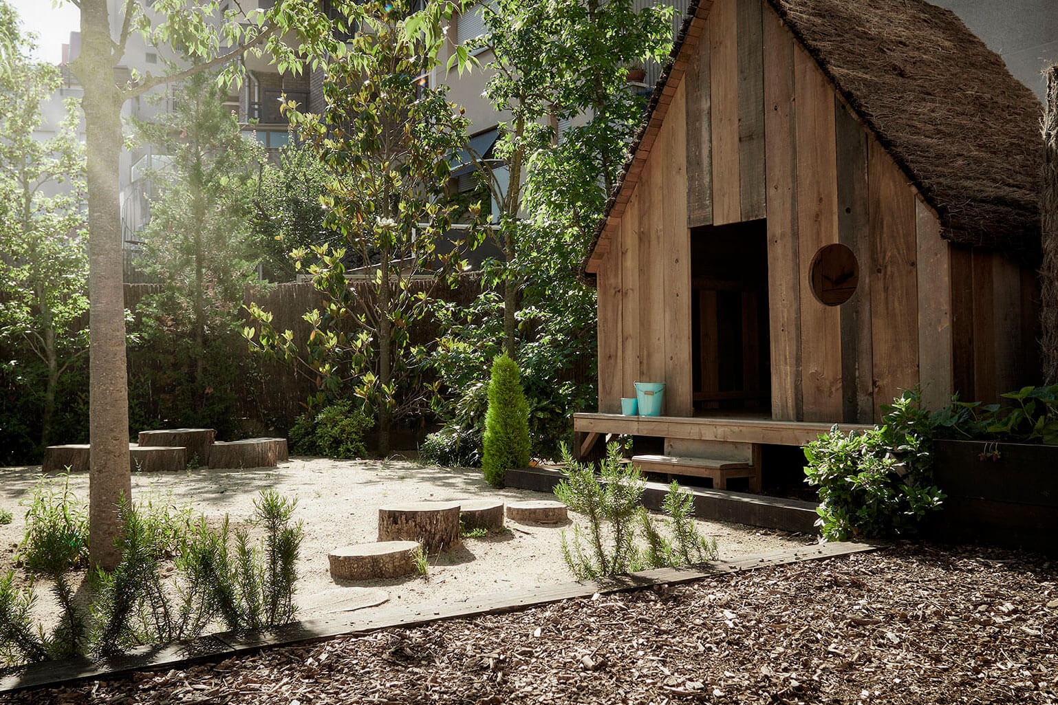
Teepees are for the open air. Teepees are Indian tents (wigwams). The Indians lived in close touch with their natural environment. And as we all know, kids like playing at cowboys and Indians (or at least they used to)… Otherwise they wouldn’t be kids. And this type of educational approach tied in well with the band’s values. Sometimes even things that are very self-evident are just so right that you cannot ignore them.
Growth — Fortunately, our client realised that embarking upon an educational project with a logotype produced by his 10-year-old daughter was not a good idea. In actual fact it was an awful idea. This is why design professionals exist. He also (luckily again) understood that a brand is more than a logo and that there is something called “visual identity” that also has a role to play in brand communication. Therefore, we kept the girl’s idea in mind and started to play… we mean build.
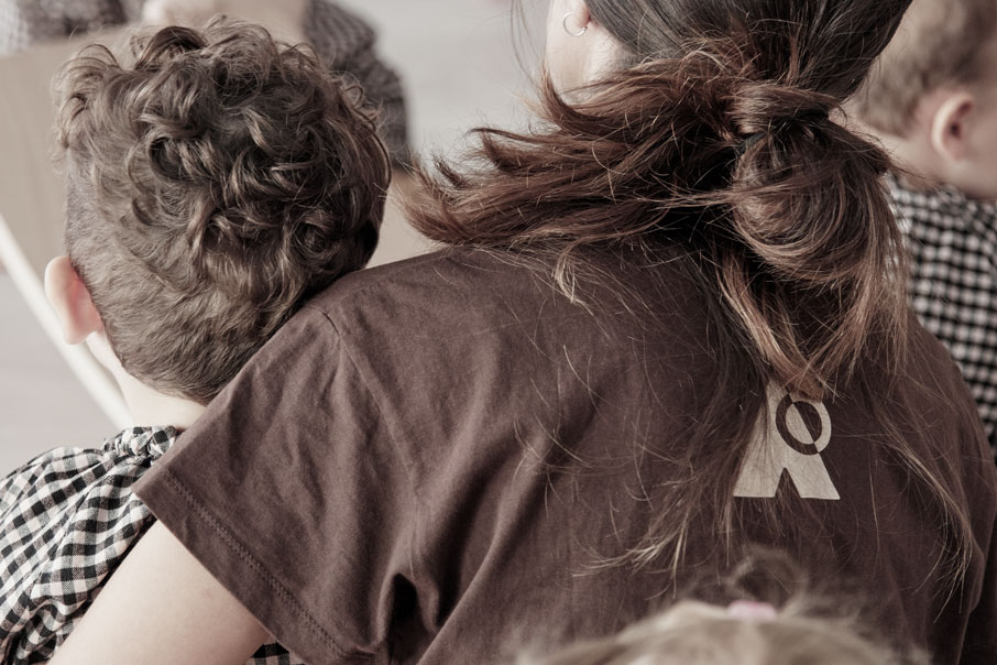
Building and playing — The logotype was designed using different kinds of typography in order to transmit the diverse range of profiles and personalities to be found in a school, where all the children express themselves the way they are, with their different personalities. Therefore, the logotype had to be different for such a place. We also wanted it to be playful, so the form is not only reminiscent of a game, a three-dimensional letter puzzle, it also changes tone depending on how it is used.
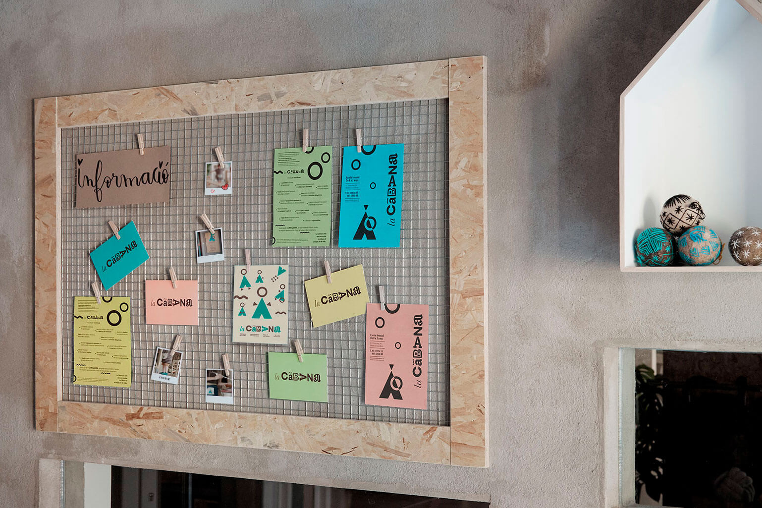
In some cases, we play with the position of certain letters, depending on whether the logotype was placed vertically or horizontally; in others, the symbol logo (the teepee) is part of the logo. And both elements (the symbol logo and the logotype) are an essential part of the construction of visual identity. If we take it apart, we achieve a highly recognisable system of corporate graphic elements with myriad possibilities.
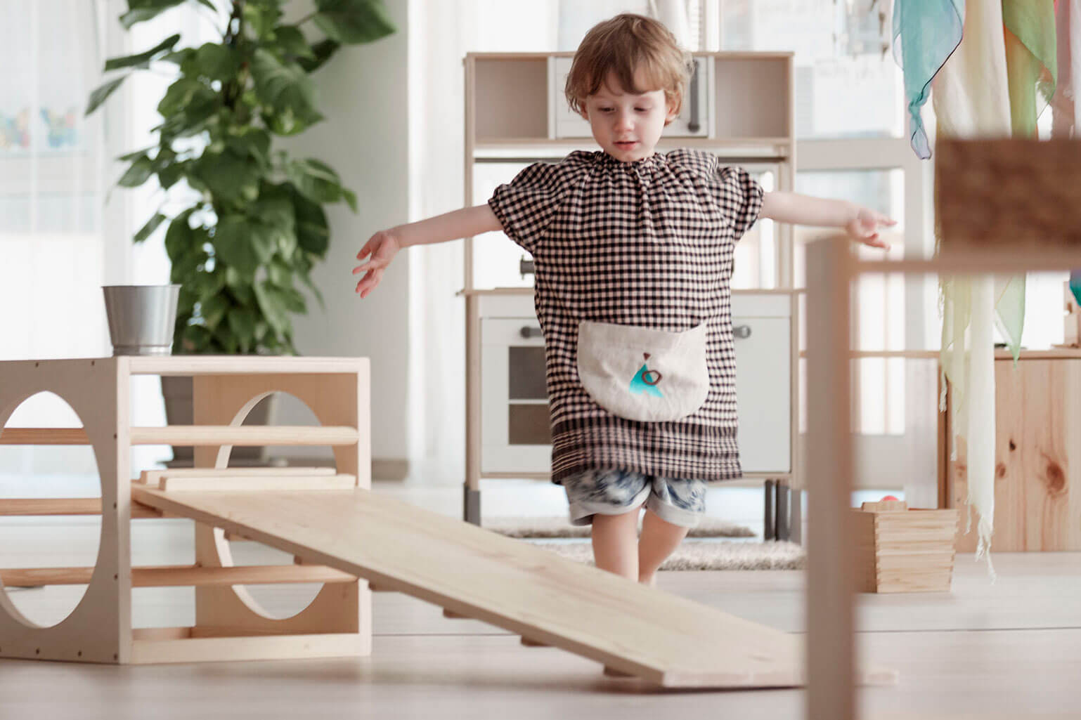
In order to accomplish a contrast and to stand out in this ocean of sensations, we chose a highly distinct and natural turquoise green that has gone a long way for us. Imagination is very important in children’s education, so thanks to this variety of forms, colours, textures and visual elements, we achieved a graphic entity that allowed us to be inventive and fantastic.
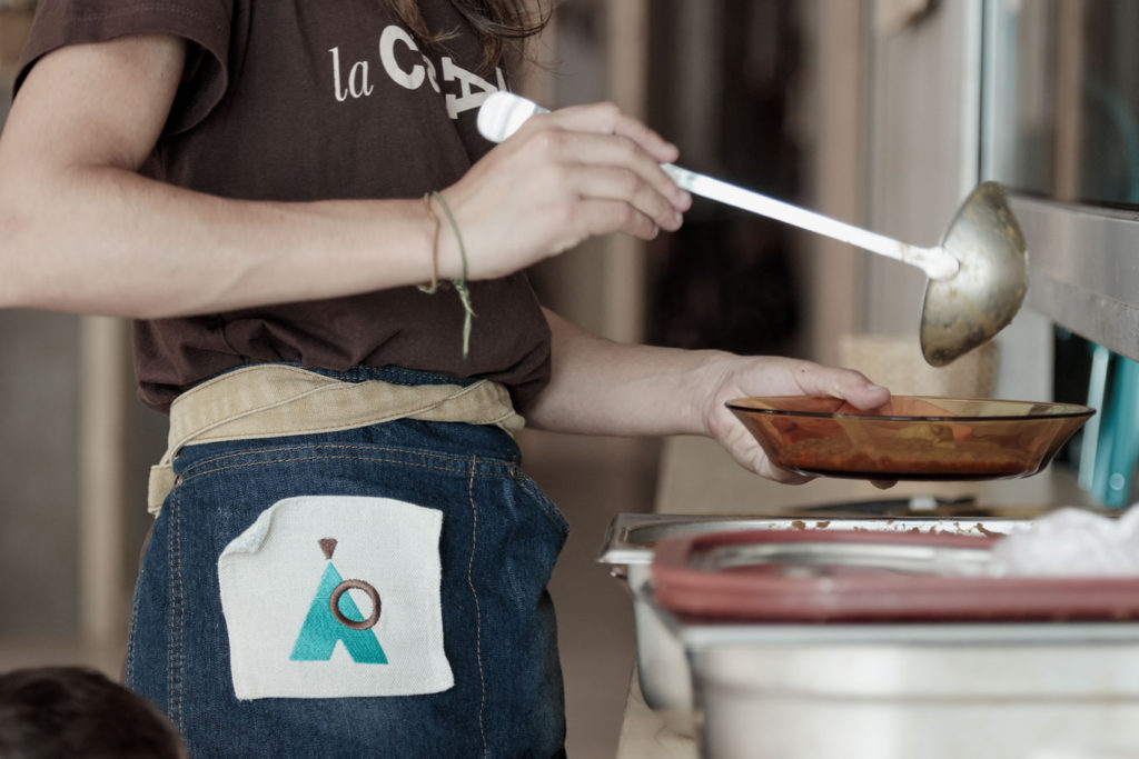
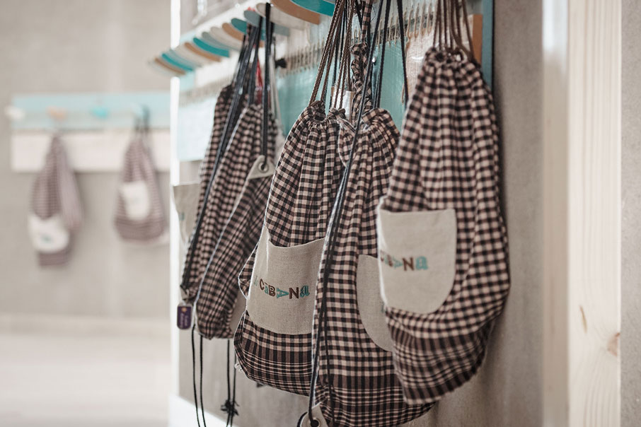
The colours and the textures are another key element in achieving a consistent and powerful visual identity. The telluric colours (an earthy brown, a sandy ochre) are taken from the traditional Catalan cloth, which the client insisted on including in his visual code. Moreover, the brand also had to fit in with an amalgam of natural colours, materials and objects (from wood to metal, from cotton to flowers, from yellow to violet), that would be very common and greatly used in La Cabana.
Even mischievous. We applied this magic to the signage of the spaces, corporate communication items, uniforms, gowns, bags…, always trying to make sure that their relationship with the environment was natural, harmonious and honest.
Beauty, simplicity and order.
| Cookie | Duration | Description |
|---|---|---|
| ARRAffinity | This cookie is set by websites that run on Windows Azure cloud platform. The cookie is used to affinitize a client to an instance of an Azure Web App. | |
| cookielawinfo-checbox-analytics | 11 months | This cookie is set by GDPR Cookie Consent plugin. The cookie is used to store the user consent for the cookies in the category "Analytics". |
| cookielawinfo-checbox-functional | 11 months | The cookie is set by GDPR cookie consent to record the user consent for the cookies in the category "Functional". |
| cookielawinfo-checkbox-advertisement | 1 year | The cookie is set by GDPR cookie consent to record the user consent for the cookies in the category "Advertisement". |
| cookielawinfo-checkbox-necessary | 11 months | This cookie is set by GDPR Cookie Consent plugin. The cookies is used to store the user consent for the cookies in the category "Necessary". |
| cookielawinfo-checkbox-performance | 11 months | This cookie is set by GDPR Cookie Consent plugin. The cookie is used to store the user consent for the cookies in the category "Performance". |
| PHPSESSID | session | This cookie is native to PHP applications. The cookie is used to store and identify a users' unique session ID for the purpose of managing user session on the website. The cookie is a session cookies and is deleted when all the browser windows are closed. |
| viewed_cookie_policy | 11 months | The cookie is set by the GDPR Cookie Consent plugin and is used to store whether or not user has consented to the use of cookies. It does not store any personal data. |
| wp-wpml_current_language | 1 day | Web language |
| Cookie | Duration | Description |
|---|---|---|
| player | 1 year | This cookie is used by Vimeo. This cookie is used to save the user's preferences when playing embedded videos from Vimeo. |
| sp_landing | 1 day | This cookie is set by the provider Spotify. This cookie is used to implement audio content from spotify on the website. It also helps in collecting information on user interaction with this audio content. |
| sp_t | 1 year | This cookie is set by the provider Spotify. This cookie is used to implement audio content from spotify on the website. It also helps in collecting information on user interaction with this audio content. |
| Cookie | Duration | Description |
|---|---|---|
| _ga | 2 years | This cookie is installed by Google Analytics. The cookie is used to calculate visitor, session, campaign data and keep track of site usage for the site's analytics report. The cookies store information anonymously and assign a randomly generated number to identify unique visitors. |
| _gat_UA-79013542-1 | 1 minute | Google Analytics |
| _gcl_au | 3 months | This cookie is used by Google Analytics to understand user interaction with the website. |
| _gid | 1 day | This cookie is installed by Google Analytics. The cookie is used to store information of how visitors use a website and helps in creating an analytics report of how the website is doing. The data collected including the number visitors, the source where they have come from, and the pages visted in an anonymous form. |
| vuid | 2 years | This domain of this cookie is owned by Vimeo. This cookie is used by vimeo to collect tracking information. It sets a unique ID to embed videos to the website. |