
Eating well shouldn’t be a race against the clock between meetings, emails, and “what do I take in my lunchbox today?”. Eating well should be a pleasure. And BokaVerde is here to prove that convenience doesn’t have to come at the expense of flavor (or conscience). Ready-to-enjoy dishes, 100% vegan, 100% tasty, with just the right touch of freshness — so much so that even the most devoted meat-eater might end up saying: “You know what? I’d have another one.”
The brief — The goal was to create a brand that makes you hungry just by saying its name. An identity designed both for the committed vegan and for anyone who simply wants a delicious, fuss-free meal. In short: something that wouldn’t feel like a “niche product,” but like “another menu for tomorrow!”.
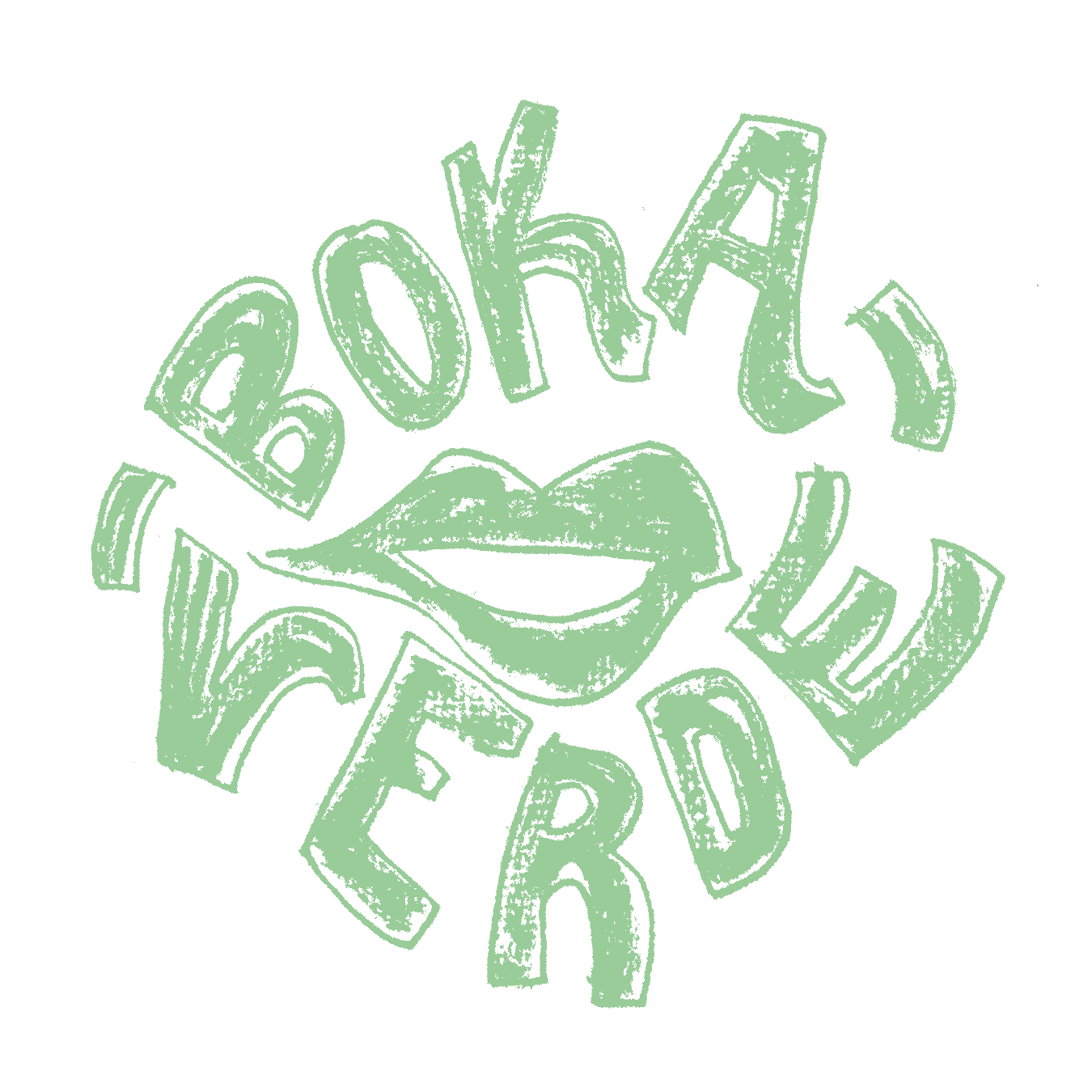
Naming and logo — This is how BokaVerde was born, a well-rounded name (in every sense of the word). Because the rebellious part here is not the design: it’s the idea: not to offer “just another option,” but to change the rules of the game (hence the K in the name): Why add one vegan option to any menu, when you can make an entire vegan menu that everyone loves?
For the logo, we placed the mouth at the center—that sacred place of gastronomic pleasure—with lips that draw a smile, evoking that sublime moment of savoring a good dish: the simple satisfaction of eating well. And we arranged the brand around it, as if each letter were the petal of a flower.
We use the color green, which connects with the natural, the sustainable, and the healthy, while orange adds vitality, appetite, and energy. Together, they form a fresh and stimulating color code that whets the appetite even before the first bite.
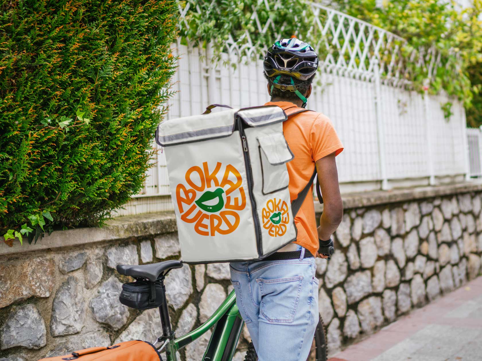
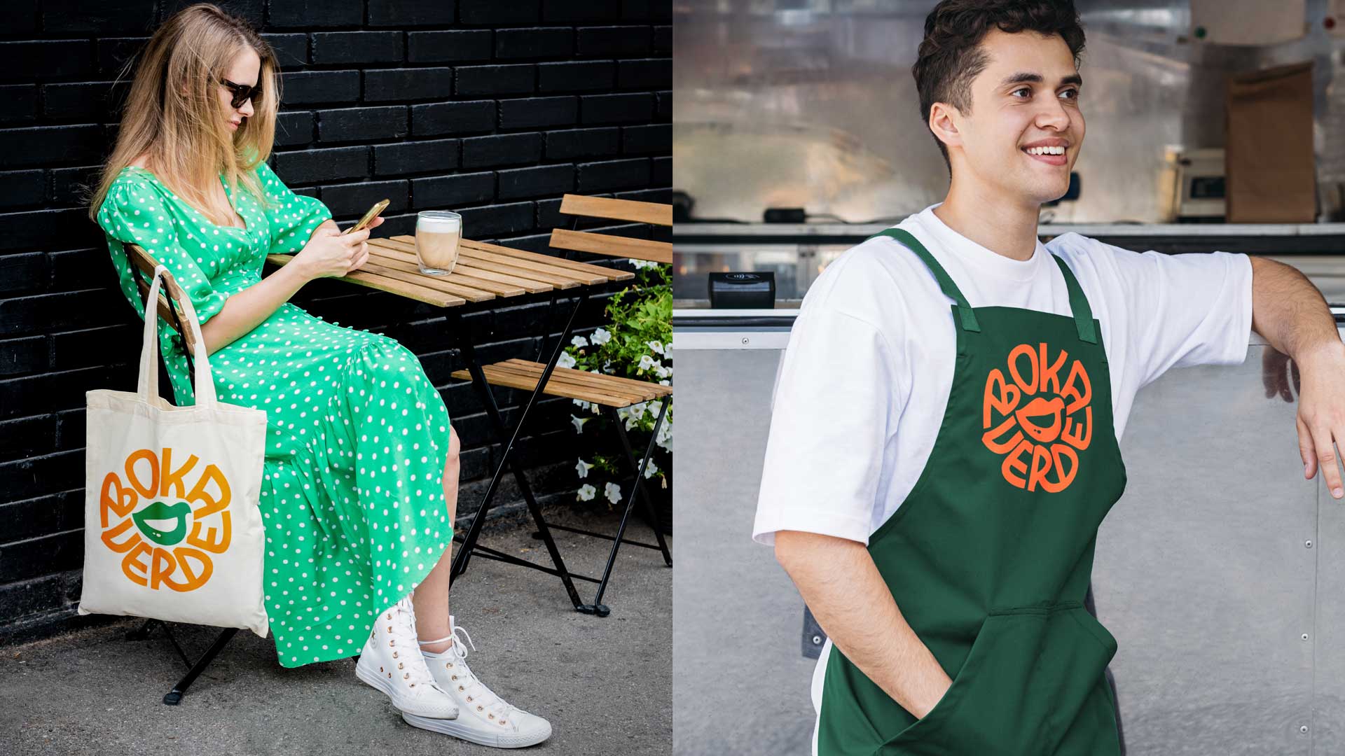
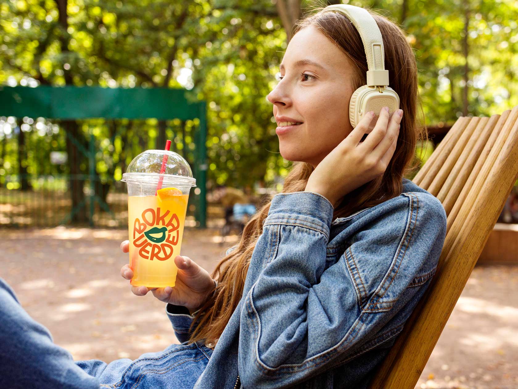
Packaging —— What would a good meal be without good packaging? BokaVerde’s packaging isn’t just functional — to carry, heat, and serve — it’s also the brand’s spokesperson at every office desk, coworking space, or home dining table. We created a clean, straightforward design that conveys the brand’s purpose: the promise of a healthy, flavorful meal, ready to enjoy with no excuses.
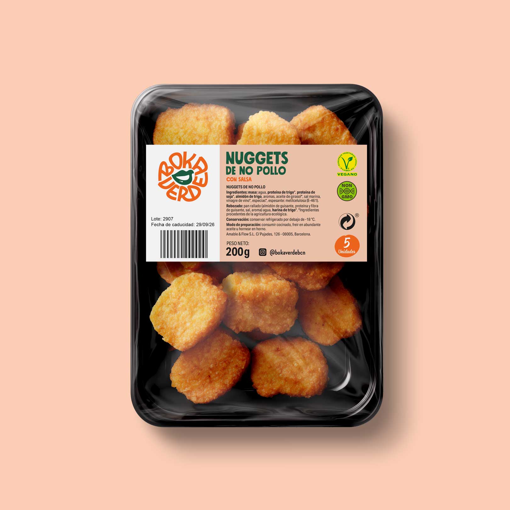
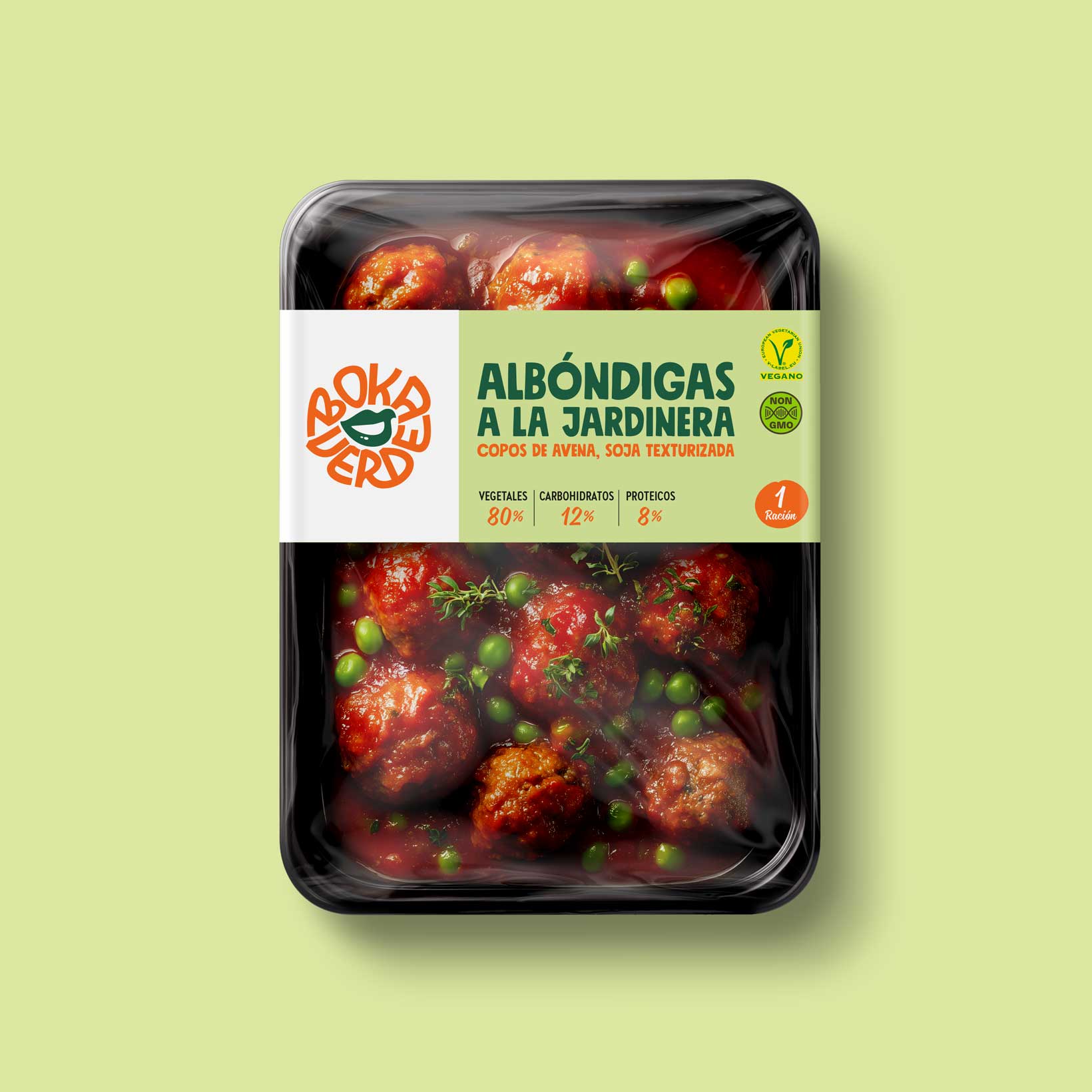
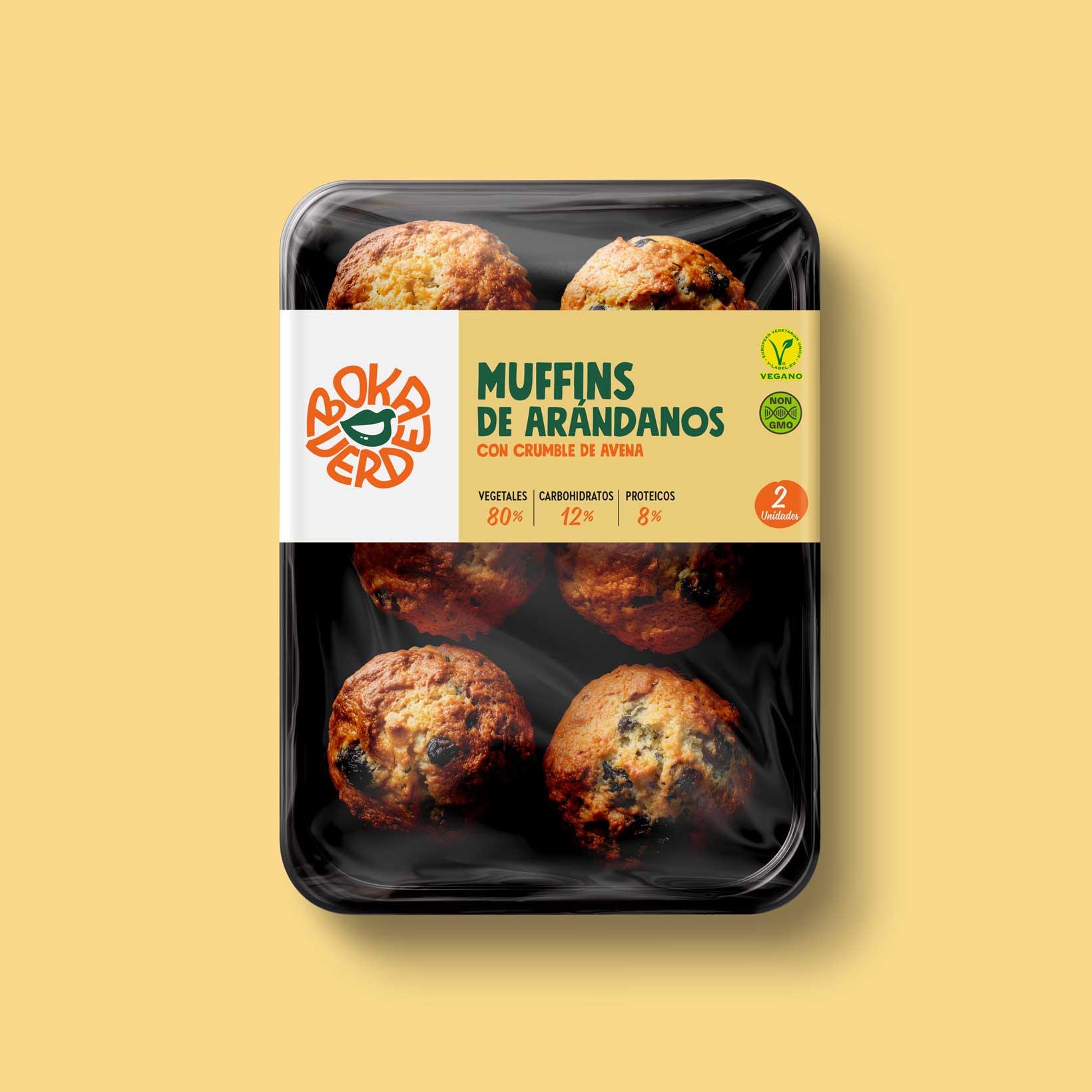
The result —— A brand as round as its dishes. With a memorable naming, a logo that blossoms in every application, and packaging that communicates what it holds (and much more). At Vibranding, we’ve enjoyed cooking up the ingredients of this project —naming, brand, and packaging— as much as customers will enjoy eating their meals.
Because yes: eating vegan is delicious — and even contagious. And if you don’t believe it, just take a bite and see how a smile appears on your face.


| Cookie | Duration | Description |
|---|---|---|
| ARRAffinity | This cookie is set by websites that run on Windows Azure cloud platform. The cookie is used to affinitize a client to an instance of an Azure Web App. | |
| cookielawinfo-checbox-analytics | 11 months | This cookie is set by GDPR Cookie Consent plugin. The cookie is used to store the user consent for the cookies in the category "Analytics". |
| cookielawinfo-checbox-functional | 11 months | The cookie is set by GDPR cookie consent to record the user consent for the cookies in the category "Functional". |
| cookielawinfo-checkbox-advertisement | 1 year | The cookie is set by GDPR cookie consent to record the user consent for the cookies in the category "Advertisement". |
| cookielawinfo-checkbox-necessary | 11 months | This cookie is set by GDPR Cookie Consent plugin. The cookies is used to store the user consent for the cookies in the category "Necessary". |
| cookielawinfo-checkbox-performance | 11 months | This cookie is set by GDPR Cookie Consent plugin. The cookie is used to store the user consent for the cookies in the category "Performance". |
| PHPSESSID | session | This cookie is native to PHP applications. The cookie is used to store and identify a users' unique session ID for the purpose of managing user session on the website. The cookie is a session cookies and is deleted when all the browser windows are closed. |
| viewed_cookie_policy | 11 months | The cookie is set by the GDPR Cookie Consent plugin and is used to store whether or not user has consented to the use of cookies. It does not store any personal data. |
| wp-wpml_current_language | 1 day | Web language |
| Cookie | Duration | Description |
|---|---|---|
| player | 1 year | This cookie is used by Vimeo. This cookie is used to save the user's preferences when playing embedded videos from Vimeo. |
| sp_landing | 1 day | This cookie is set by the provider Spotify. This cookie is used to implement audio content from spotify on the website. It also helps in collecting information on user interaction with this audio content. |
| sp_t | 1 year | This cookie is set by the provider Spotify. This cookie is used to implement audio content from spotify on the website. It also helps in collecting information on user interaction with this audio content. |
| Cookie | Duration | Description |
|---|---|---|
| _ga | 2 years | This cookie is installed by Google Analytics. The cookie is used to calculate visitor, session, campaign data and keep track of site usage for the site's analytics report. The cookies store information anonymously and assign a randomly generated number to identify unique visitors. |
| _gat_UA-79013542-1 | 1 minute | Google Analytics |
| _gcl_au | 3 months | This cookie is used by Google Analytics to understand user interaction with the website. |
| _gid | 1 day | This cookie is installed by Google Analytics. The cookie is used to store information of how visitors use a website and helps in creating an analytics report of how the website is doing. The data collected including the number visitors, the source where they have come from, and the pages visted in an anonymous form. |
| vuid | 2 years | This domain of this cookie is owned by Vimeo. This cookie is used by vimeo to collect tracking information. It sets a unique ID to embed videos to the website. |