


Related works

Bundaberg
Tastes like the sea

Iruela
Popular premium
Borges Natura
Something new
Golden Anuaria 2018 Best Packaging
IPA Awards Selection 2017 Best Innovation in Packaging
The essence of this product is its shape: an ovoid reusable bottle which vitalizes the liquids it contains. Unifying the brand’s form made this a comprehensive job.
Besides tweaking the logo, the managers of the Californian company Vitbot asked us to rebuild their identity, redo their packaging, restyle their website, and rethink their communication strategy.
A message for everyone — The first piece that had to fit was the brand message. Did it want to continue preaching to the converted? Or did it want the general public to understand that the shape of a bottle is crucial to the state of the water it contains?
And, above all, did it account for the fact that, thanks to that ovoid design inspired by the forms of nature, they had achieved a highly appealing product? Fortunately, they were aware of all that.
We removed a superfluous spiral that failed to bring anything to their logo and slightly adjusted the edges of the logotype to give it natural geometry. Then we went on to redo their packaging.
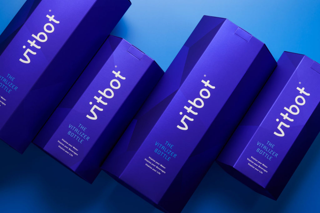
Special packaging — There are many options in the reusable water bottle market: some are for hiking and camping, others are more urban, some are for sports and there are even a few that restructure water. However, there is no brand that vitalizes water as well as looking good. Vitbot, with its design, the characteristics of its bottles and product variants, could indeed offer just that.
Such uniqueness had to be conveyed in the packaging. We wanted the bottle to take centre stage. That’s why the bottle is held up on a base inside as well as outside the box. On a silver polyester we print a white ink gradient, a direct ink and a soft-touch effect. The finishes have a silky touch, the colours evoke the various tones of water at different depths and the overall result is that of an elegant and stylish product
that also vitalizes water so that its molecules recover their original hexagonal structure. Form and function in perfect harmony.
We had the special colaboration of Vanguard Grafic to print this meticulous pack.
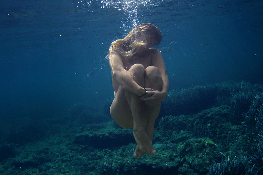
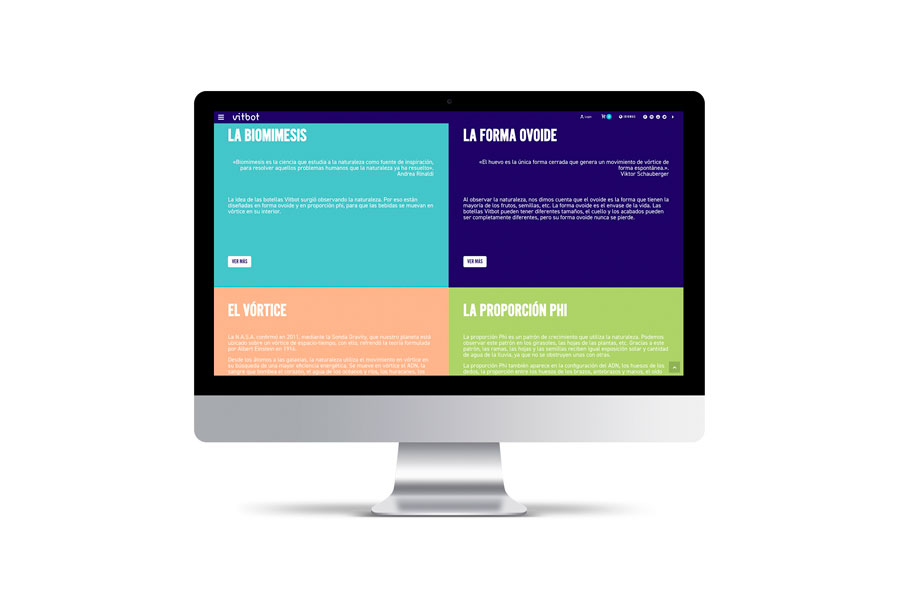
Online sales — For a product sold around the world, the window onto the global marketplace is of utmost importance. In addition to restyling the website design in order to bring it as far into the 21st century as its products and its brand (aligned with the concerns of a new generation of mindful consumers), we also defined the look of the images to be used. The result is a website containing elementary forms and suggestive images that convey serenity.
Not everyone practices meditation or yoga and is familiar with the sensations that can be achieved, but there is one sensation that everyone recognizes: the serenity you feel when floating in water. That calmness really is the same. That was the idea behind our solutions for the brand. Now everyone could understand the balance liquids achieve inside a Vitbot.
Connecting with the community — For the communication strategy, we established a first phase aimed at achieving brand awareness. The social media content mainly deals with lifestyle, the philosophy and values of the brand and, to a lesser extent, the products. Images of nature, natural geometry and the values of sustainability, ecological responsibility and self-awareness. Once again, we choose to convey the idea of peace and balance in order to reach the widest possible target.
| Cookie | Duration | Description |
|---|---|---|
| ARRAffinity | This cookie is set by websites that run on Windows Azure cloud platform. The cookie is used to affinitize a client to an instance of an Azure Web App. | |
| cookielawinfo-checbox-analytics | 11 months | This cookie is set by GDPR Cookie Consent plugin. The cookie is used to store the user consent for the cookies in the category "Analytics". |
| cookielawinfo-checbox-functional | 11 months | The cookie is set by GDPR cookie consent to record the user consent for the cookies in the category "Functional". |
| cookielawinfo-checkbox-advertisement | 1 year | The cookie is set by GDPR cookie consent to record the user consent for the cookies in the category "Advertisement". |
| cookielawinfo-checkbox-necessary | 11 months | This cookie is set by GDPR Cookie Consent plugin. The cookies is used to store the user consent for the cookies in the category "Necessary". |
| cookielawinfo-checkbox-performance | 11 months | This cookie is set by GDPR Cookie Consent plugin. The cookie is used to store the user consent for the cookies in the category "Performance". |
| PHPSESSID | session | This cookie is native to PHP applications. The cookie is used to store and identify a users' unique session ID for the purpose of managing user session on the website. The cookie is a session cookies and is deleted when all the browser windows are closed. |
| viewed_cookie_policy | 11 months | The cookie is set by the GDPR Cookie Consent plugin and is used to store whether or not user has consented to the use of cookies. It does not store any personal data. |
| wp-wpml_current_language | 1 day | Web language |
| Cookie | Duration | Description |
|---|---|---|
| player | 1 year | This cookie is used by Vimeo. This cookie is used to save the user's preferences when playing embedded videos from Vimeo. |
| sp_landing | 1 day | This cookie is set by the provider Spotify. This cookie is used to implement audio content from spotify on the website. It also helps in collecting information on user interaction with this audio content. |
| sp_t | 1 year | This cookie is set by the provider Spotify. This cookie is used to implement audio content from spotify on the website. It also helps in collecting information on user interaction with this audio content. |
| Cookie | Duration | Description |
|---|---|---|
| _ga | 2 years | This cookie is installed by Google Analytics. The cookie is used to calculate visitor, session, campaign data and keep track of site usage for the site's analytics report. The cookies store information anonymously and assign a randomly generated number to identify unique visitors. |
| _gat_UA-79013542-1 | 1 minute | Google Analytics |
| _gcl_au | 3 months | This cookie is used by Google Analytics to understand user interaction with the website. |
| _gid | 1 day | This cookie is installed by Google Analytics. The cookie is used to store information of how visitors use a website and helps in creating an analytics report of how the website is doing. The data collected including the number visitors, the source where they have come from, and the pages visted in an anonymous form. |
| vuid | 2 years | This domain of this cookie is owned by Vimeo. This cookie is used by vimeo to collect tracking information. It sets a unique ID to embed videos to the website. |