


Related works
Kynd
Doing their own thing
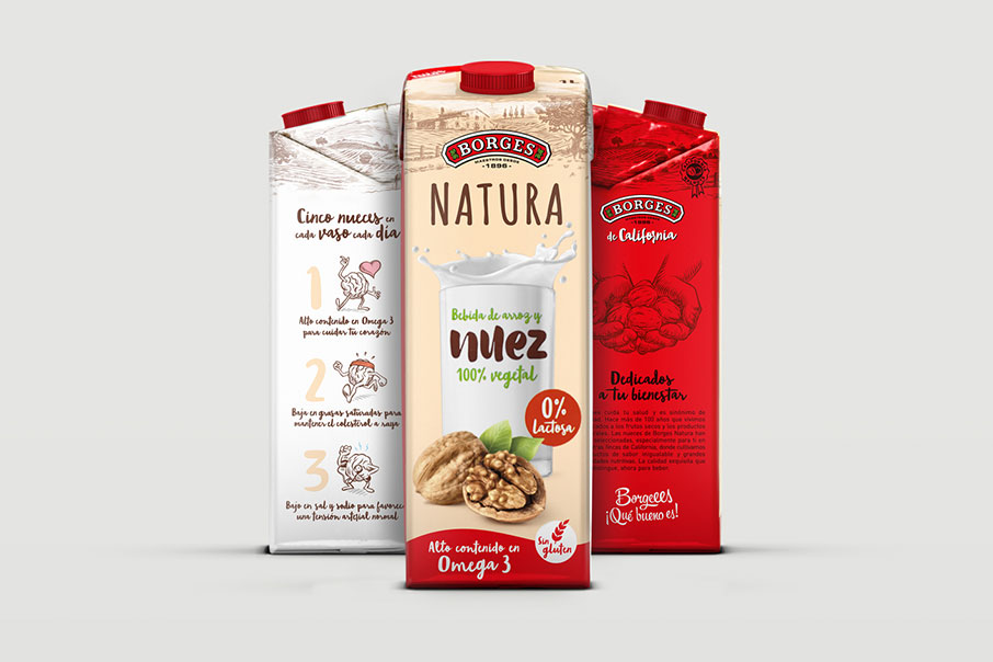
Borges Natura
Something new
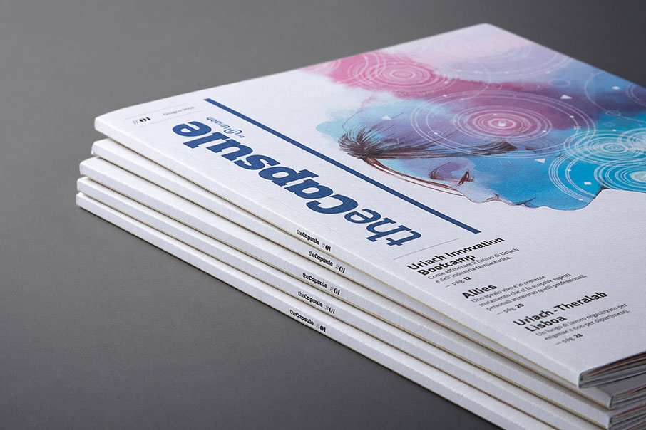
The Capsule by Uriach
Tell me more
Golden Award Muse Creativity 2021 Best Brand Identity
Selección Anuaria 2020 Award Best Corporate Identity Program
Branding
Logo design
Corporate identity
Graphic communication
Web design
Sales material
Our relationship with Young Folks came about through the social media, as many of them do nowadays. As well as through our mutual admiration for a job well done. Digital marketing and brand strategy cater to common concerns; this is why they must work together and offer an integrated service. Australia is no exception. That said, always with the ultimate aim of bonding with companies that have a different purpose, that want to change the rules of the game and help to build a better world with their own grain of sand.
In the breakneck-speed digital universe, brands that achieve immediate and powerful impact are the ones that will prevail and persist.
Let’s go online – Erin Morris from Young Folks asked us for a rebranding that would make them a cut above their competitors. Many companies in their sector spring up like mushrooms and attempt to compete by offering bargain-bin prices (by hiring cheap labour in other countries and standardising the service packages as if they were hiring an Internet connection). These companies that do not pursue a personalised and long-term relationship and service, like telephone operators, burn their customers when the latter need to take things to the next level. This is the niche in which Young Folks wants to position itself: a more mature client understands what it wants and already has enough experience to be able to appreciate and use quality work.
Objectives and strategy – In a greedy and competitive setting, brand strategy is of the essence. Young Folks aspires to a brand image that will not grow old, that talks to a more experienced and established audience that can appreciate a richer and more literary SEO, as well as well-executed and well-interpreted analytics. Or in other words, quite the opposite of a food truck churning out churros. Vibranding can relate to this approach totally, and we also understand the scenario perfectly. At this point we proposed a brand strategy that would enable them to continue to stand out in the frenetic and feverish rhythm of the social media while also grabbing the attention of potential clients with visual codes that create a bond between the brand and its ideal target.
The logo – On this occasion, we proposed a lettering with modern seriphs in which we joined the two parts of the name to merge it into one. It is a young graphic licence that affords it greater visual clout. In this way we keep things fresh, with a classic font that also denotes responsibility and rigour. The monogram – In an ideal world, brands and logotypes always have the same impact and visibility, regardless of the medium. However, things do not always go down like that in the digital world. Often times, identification in small spaces renders it necessary to seek solutions to get round this problem. Reducing a multiple-character logotype to two is the solution that we normally propose when we need to improve visibility or simply break the rhythm (social medium profile, avatar, bottom of a page, publications, etc.).
Complements and alternatives – Brand strategy does not live on logos alone, so we proposed a versatile graphic system extending visual codes, in which we evoke the newspaper grid style (revisiting the classics), affording it a fun and creative touch that says a lot about YF’s personality.
Colour — We rescued some of the colours already used by the brand that bring summer and vitality to mind. We already found them very cool but wanted to give them a splash of navy blue to play down the emotional side a little. Preserving the brand’s young essence, which (as its name so clearly says) is part of its personality, is the perfect combination, acknowledging the design and printing tradition and just the ingredient we need to give it that academic and mature touch we were seeking.
| Cookie | Duration | Description |
|---|---|---|
| ARRAffinity | This cookie is set by websites that run on Windows Azure cloud platform. The cookie is used to affinitize a client to an instance of an Azure Web App. | |
| cookielawinfo-checbox-analytics | 11 months | This cookie is set by GDPR Cookie Consent plugin. The cookie is used to store the user consent for the cookies in the category "Analytics". |
| cookielawinfo-checbox-functional | 11 months | The cookie is set by GDPR cookie consent to record the user consent for the cookies in the category "Functional". |
| cookielawinfo-checkbox-advertisement | 1 year | The cookie is set by GDPR cookie consent to record the user consent for the cookies in the category "Advertisement". |
| cookielawinfo-checkbox-necessary | 11 months | This cookie is set by GDPR Cookie Consent plugin. The cookies is used to store the user consent for the cookies in the category "Necessary". |
| cookielawinfo-checkbox-performance | 11 months | This cookie is set by GDPR Cookie Consent plugin. The cookie is used to store the user consent for the cookies in the category "Performance". |
| PHPSESSID | session | This cookie is native to PHP applications. The cookie is used to store and identify a users' unique session ID for the purpose of managing user session on the website. The cookie is a session cookies and is deleted when all the browser windows are closed. |
| viewed_cookie_policy | 11 months | The cookie is set by the GDPR Cookie Consent plugin and is used to store whether or not user has consented to the use of cookies. It does not store any personal data. |
| wp-wpml_current_language | 1 day | Web language |
| Cookie | Duration | Description |
|---|---|---|
| player | 1 year | This cookie is used by Vimeo. This cookie is used to save the user's preferences when playing embedded videos from Vimeo. |
| sp_landing | 1 day | This cookie is set by the provider Spotify. This cookie is used to implement audio content from spotify on the website. It also helps in collecting information on user interaction with this audio content. |
| sp_t | 1 year | This cookie is set by the provider Spotify. This cookie is used to implement audio content from spotify on the website. It also helps in collecting information on user interaction with this audio content. |
| Cookie | Duration | Description |
|---|---|---|
| _ga | 2 years | This cookie is installed by Google Analytics. The cookie is used to calculate visitor, session, campaign data and keep track of site usage for the site's analytics report. The cookies store information anonymously and assign a randomly generated number to identify unique visitors. |
| _gat_UA-79013542-1 | 1 minute | Google Analytics |
| _gcl_au | 3 months | This cookie is used by Google Analytics to understand user interaction with the website. |
| _gid | 1 day | This cookie is installed by Google Analytics. The cookie is used to store information of how visitors use a website and helps in creating an analytics report of how the website is doing. The data collected including the number visitors, the source where they have come from, and the pages visted in an anonymous form. |
| vuid | 2 years | This domain of this cookie is owned by Vimeo. This cookie is used by vimeo to collect tracking information. It sets a unique ID to embed videos to the website. |