


Related works

Iruela
Popular premium
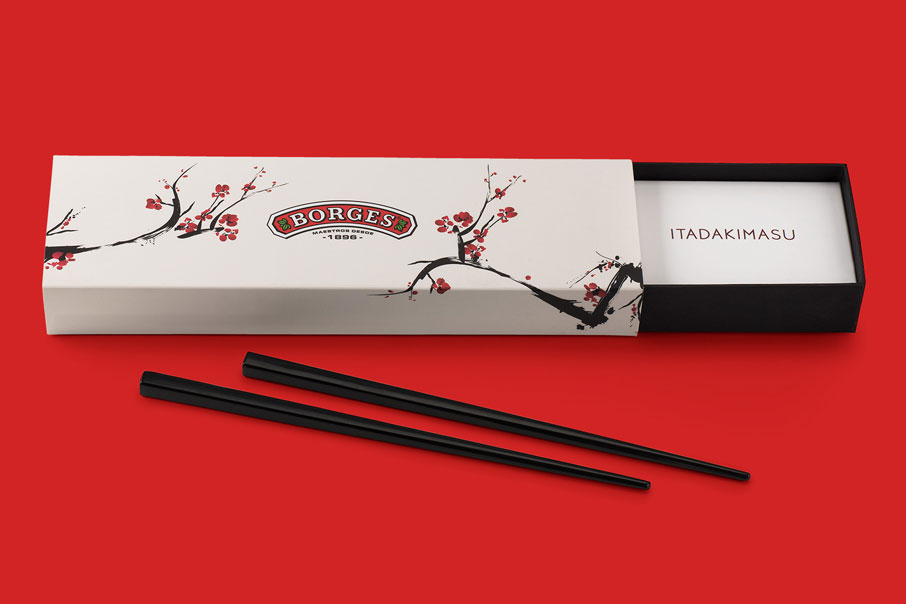
Borges Soja
Itadakimasu

Mushroom Forestry
Quality that grows
Branding
Logo design
Corporate identity
Visual communication
Illustration
Sales material
Web design
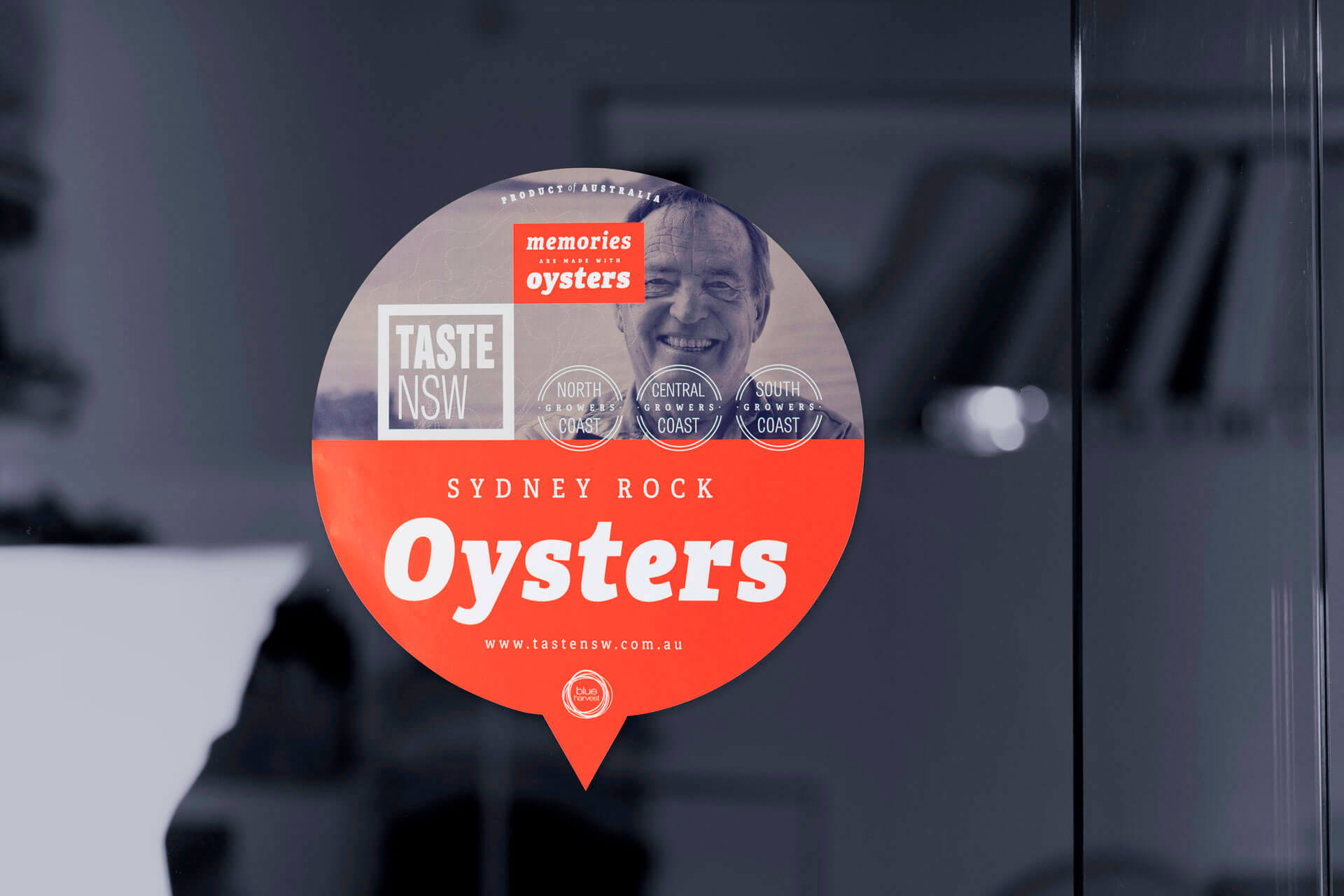
Setting — New South Wales, on the southern coast of Australia, has a long-standing aquaculture tradition. It is comprised mostly of oyster farms that are usually family concerns that produce a high-quality product that barely makes it beyond the confines of the local or tourist markets. Most of these bivalve farms do not have their own marketing department with the capacity to forge lasting relationships with major purchasers and therefore reach the entire Australian market. Or to put it another way: they need to publicise their quality products beyond their immediate environment.
Blue Harvest is an Australian marketing agency specialized in seafood that has taken on the role of introducing local producers to supermarket chains and mass consumption distributors. To do so, it creates clusters of aquafarmers with the same profile and thus be able to offer their products with a consistent and persuasive sales strategy.
You know that first impressions are lasting impressions. And when this is related to a brand it should convey, clearly and reliably, what the brand offers.
Oysters! — The star product of New South Wales is saccostrea glomerata, popularly known as the Sidney Rock Oyster, a genuine native Australian product also regarded by many as one of the world’s best oysters. In order to achieve this, Blue Harvest created an umbrella brand, Taste NSW, whose branding we take care of.
Attributes — The client proposed that we work with the tagline “Memories are made of oysters” (everyone recalls having visited New South Wales and eating oysters in the self-same farm that produces them). We used this to roll out a graphic identity based on concepts such as taste, territory, tradition, authenticity and premium nature.
The logotype highlights the words “Taste”, and the imagotype that complements it consists of the drawing of an oyster whose broken lines also make it look like a map. Product and source are visually united. Both elements are combined in different ways, depending on what we want to emphasise in each communication or medium: the product or its attributes; the logo or the tagline.
The corporate colour palette combines a striking and modern-looking red, a deep navy blue and (for photos) tones between sepia and bistre reminiscent of the oyster shell. It is a combination of contrasts. On the one hand, bold and vivid colours; on the other, photos that seem to have been taken from old newspapers. Tradition and modernity. A branding work to share the reality of an unprocessed artisanal product produced in a natural setting with everyone.
Media — The graphic identity of Taste NSW is being applied to its product catalogue, the cluster’s visual website, posters for public communication, point of sale material (stoppers, stand displays, stickers…) and, in the not too distant future, we will also be seeing it in new communication media.
| Cookie | Duration | Description |
|---|---|---|
| ARRAffinity | This cookie is set by websites that run on Windows Azure cloud platform. The cookie is used to affinitize a client to an instance of an Azure Web App. | |
| cookielawinfo-checbox-analytics | 11 months | This cookie is set by GDPR Cookie Consent plugin. The cookie is used to store the user consent for the cookies in the category "Analytics". |
| cookielawinfo-checbox-functional | 11 months | The cookie is set by GDPR cookie consent to record the user consent for the cookies in the category "Functional". |
| cookielawinfo-checkbox-advertisement | 1 year | The cookie is set by GDPR cookie consent to record the user consent for the cookies in the category "Advertisement". |
| cookielawinfo-checkbox-necessary | 11 months | This cookie is set by GDPR Cookie Consent plugin. The cookies is used to store the user consent for the cookies in the category "Necessary". |
| cookielawinfo-checkbox-performance | 11 months | This cookie is set by GDPR Cookie Consent plugin. The cookie is used to store the user consent for the cookies in the category "Performance". |
| PHPSESSID | session | This cookie is native to PHP applications. The cookie is used to store and identify a users' unique session ID for the purpose of managing user session on the website. The cookie is a session cookies and is deleted when all the browser windows are closed. |
| viewed_cookie_policy | 11 months | The cookie is set by the GDPR Cookie Consent plugin and is used to store whether or not user has consented to the use of cookies. It does not store any personal data. |
| wp-wpml_current_language | 1 day | Web language |
| Cookie | Duration | Description |
|---|---|---|
| player | 1 year | This cookie is used by Vimeo. This cookie is used to save the user's preferences when playing embedded videos from Vimeo. |
| sp_landing | 1 day | This cookie is set by the provider Spotify. This cookie is used to implement audio content from spotify on the website. It also helps in collecting information on user interaction with this audio content. |
| sp_t | 1 year | This cookie is set by the provider Spotify. This cookie is used to implement audio content from spotify on the website. It also helps in collecting information on user interaction with this audio content. |
| Cookie | Duration | Description |
|---|---|---|
| _ga | 2 years | This cookie is installed by Google Analytics. The cookie is used to calculate visitor, session, campaign data and keep track of site usage for the site's analytics report. The cookies store information anonymously and assign a randomly generated number to identify unique visitors. |
| _gat_UA-79013542-1 | 1 minute | Google Analytics |
| _gcl_au | 3 months | This cookie is used by Google Analytics to understand user interaction with the website. |
| _gid | 1 day | This cookie is installed by Google Analytics. The cookie is used to store information of how visitors use a website and helps in creating an analytics report of how the website is doing. The data collected including the number visitors, the source where they have come from, and the pages visted in an anonymous form. |
| vuid | 2 years | This domain of this cookie is owned by Vimeo. This cookie is used by vimeo to collect tracking information. It sets a unique ID to embed videos to the website. |