Poolside
Life is for drinking
Silver Award Muse Design 2021 Best Wine, Beer & Liquor Packaging

Branding
Logo design
Corporate Identity
Packaging
Visual Communication
Web design
A couple from California had a dream: Hard Seltzer Poolside. A drink for extracting the juice of life, a drink for a new public, a drink full of colour and with a little sparkle – in reality, with a little alcohol. This was the birth of this brand. Like a dream, like an exhalation, like vital intensity in a can.
In many brands, packaging is something more than the container of a product. In many brands, packaging is the best tool for branding.

We’re alive! – The soft drinks market has recently seen the irruption of a new category of drinks, halfway between refreshments and alcoholic drinks. These are hard seltzers, soft drinks with a touch of alcohol for consumers looking for a healthier alternative than traditional beer. The Poolside brand is born with the aim of consolidating itself in a niche as specific as that of youthful adults who are looking not only for this healthy drink but also for a certain sophistication and an aspirational brand they can identify with. As this is a new brand, the message had to be clear and unmistakeable at first sight for a very broad public: love at first sight.
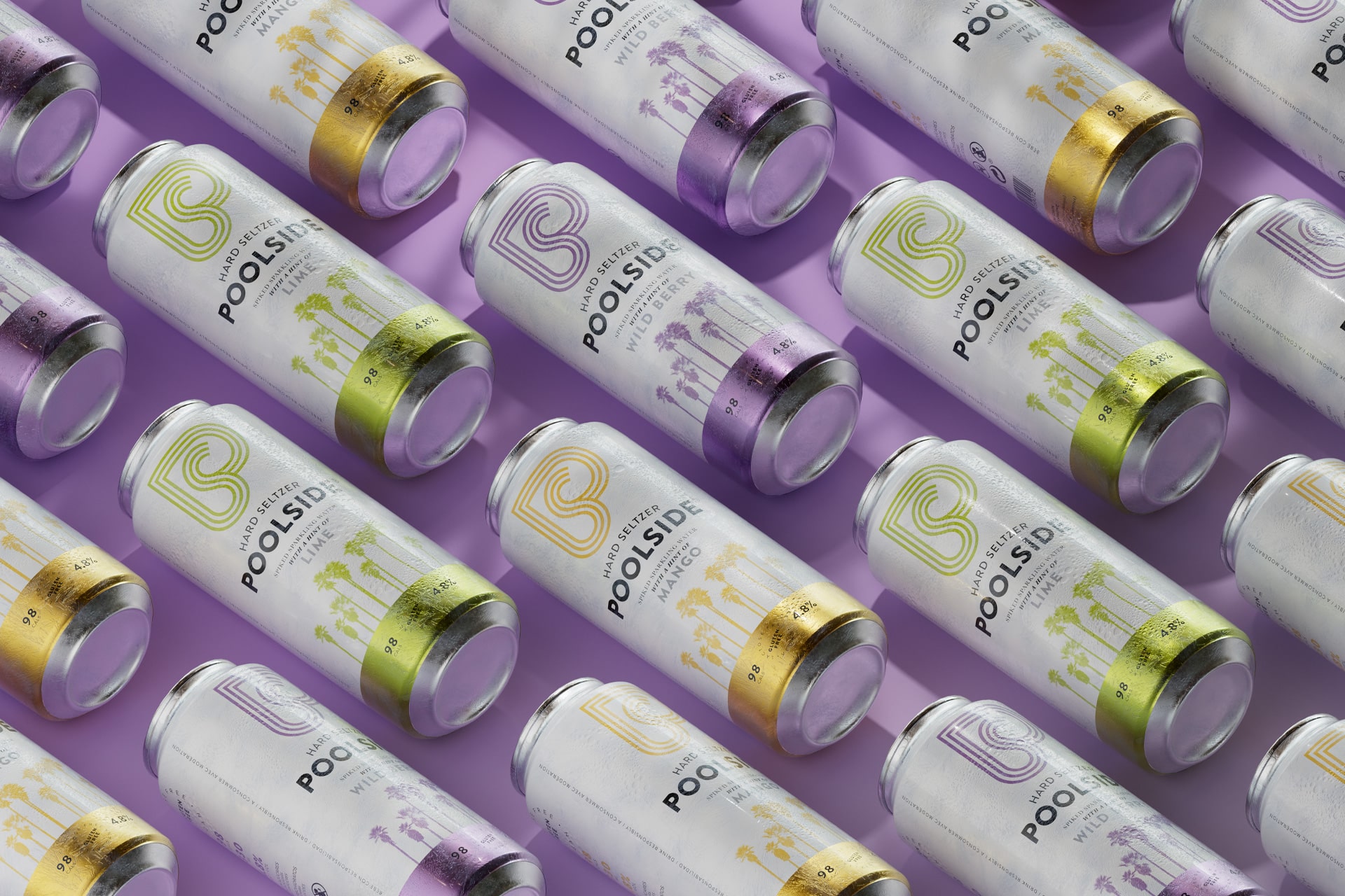
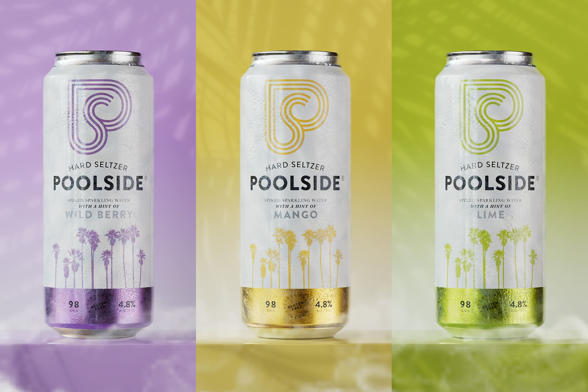
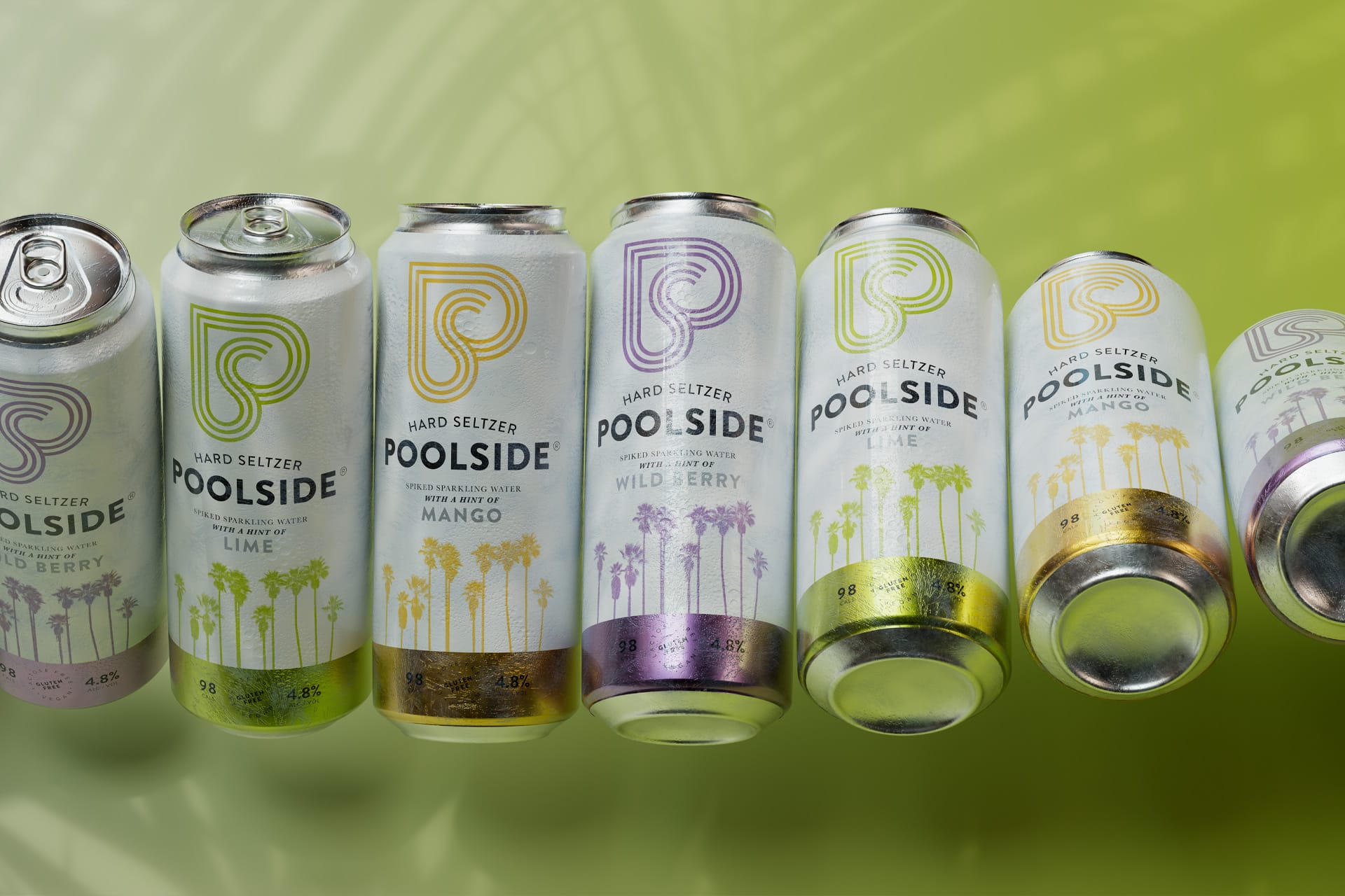
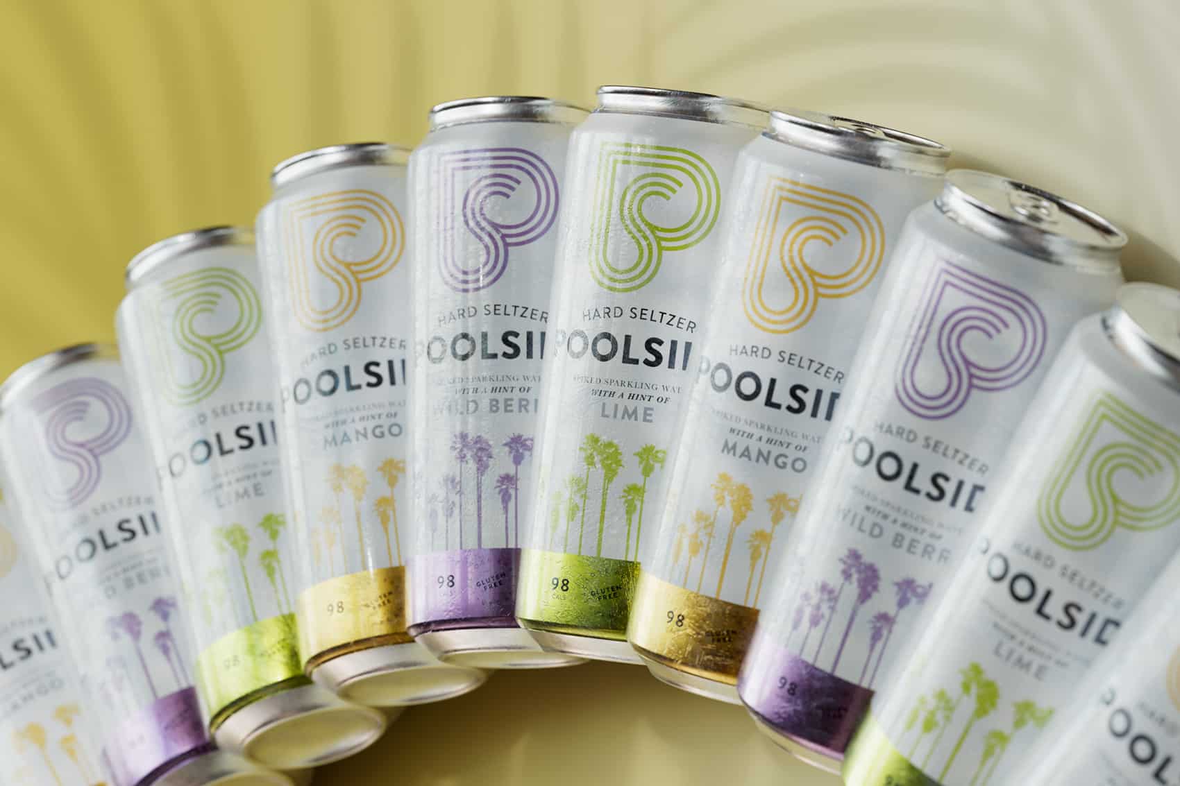
With a name like Poolside, which transports the brand to a setting that is summery, relaxed, fun, lively, festive, the choice of the different elements was already quite clear. We chose a simple, modern typography, attractive, youthful colours and fresh, evocative visual elements: palm trees, which not only carry us to the summer but also to the place of origin of the drink, the California beaches, and an imagotype based on a stylised ‘P’ formed by waves that allude to water, of both the sea and a pool. In addition, the ‘P’ also resembles a heart, a symbol of vitality, positivity, and of course love.

Hard seltzer is clear and life is intense – The composition is clean and bright. The categorisation by flavours is clearly marked: Lime, lime green; Mango, orange; Wild Berry, purple. The drink’s properties (calories, alcohol index, gluten free, natural aromas…) are presented very clearly and have a great presence, primarily because they are very important for seducing the public they are aimed at.
The secret of this packaging design is complicity with its public. To disembark in new markets (Spanish and European) with a new drink of a new category (a refreshing drink with alcohol and natural aromas), Poolside needed to connect with a very specific target public and to define clearly the moment of consumption. Both the typographies chosen, the chromatic palette and the images transport the consumer to this ideal, marvellous instant. Sophisticated leisure.
Chic enjoyment. Relaxation and distinction.
