Related works

Nayadel
Connections

APD
Brand visibility as solid as metal

La Cabana
Branding for toddlers
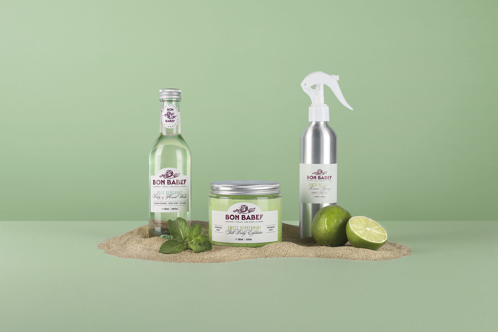
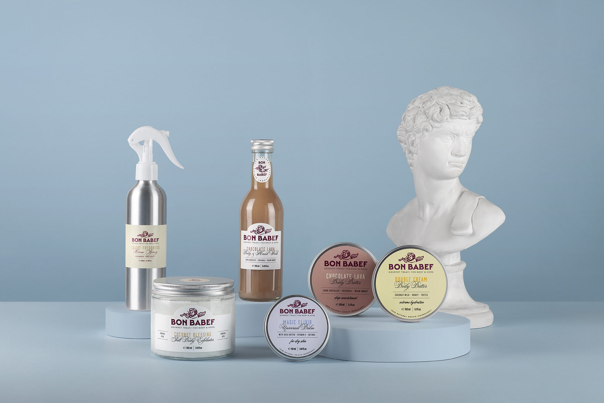
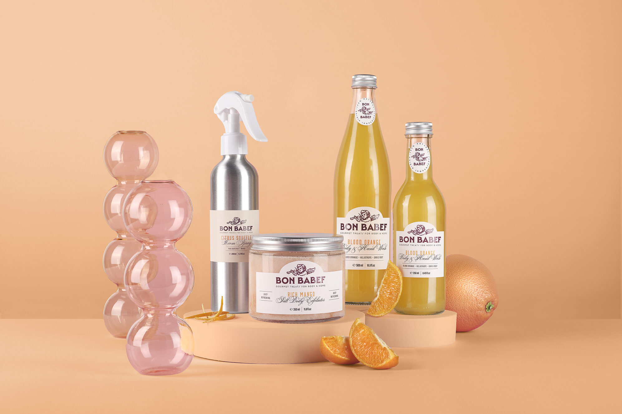
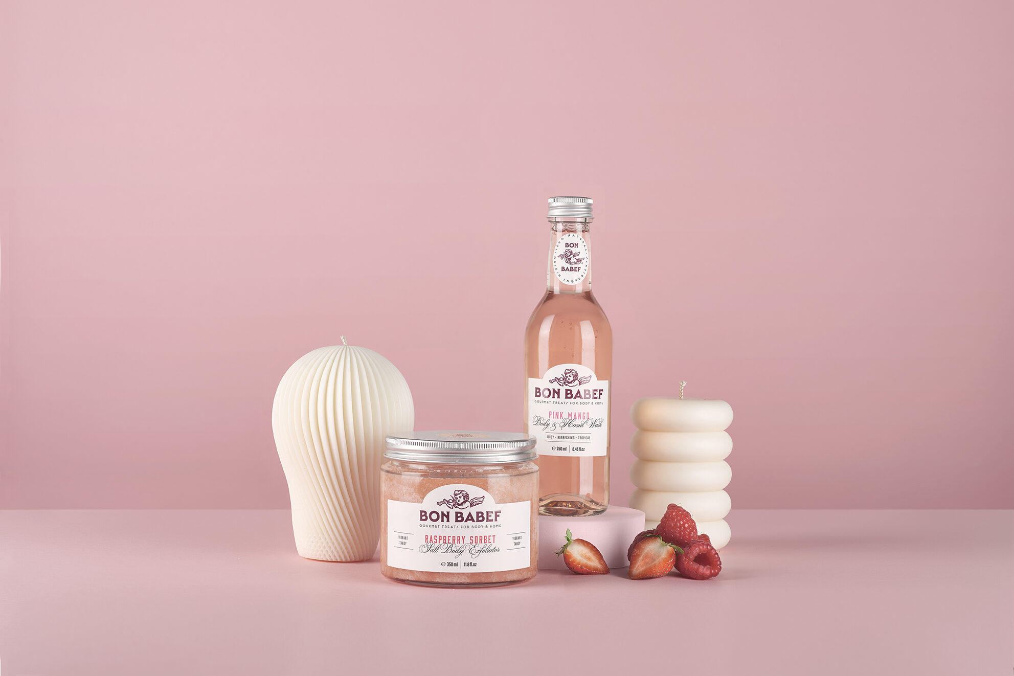
Daily life offers no respite. What if, at least, routine could have some indulgent pleasure? Bon Babef is just that: a spoonful of eco-friendly hedonism for long days and short showers. Because taking care of yourself is a way of loving yourself, and also a way of saving the planet. Natural ingredients, recyclable packaging, and zero guilt in the equation.
Building a brand like Bon Babef isn’t just about aesthetics — it’s about creating a whole universe that makes sense. Every decision, from the logo to the bottle, from the tone of voice to the graphic system, follows a clear and deliberate strategy. We approached branding as a sensorial and emotional experience, designed to connect from first glance to last drop. And packaging? It’s not just what holds the product — it’s the first way a brand speaks. When everything aligns — message, form, meaning — identity isn’t just seen. It’s felt.
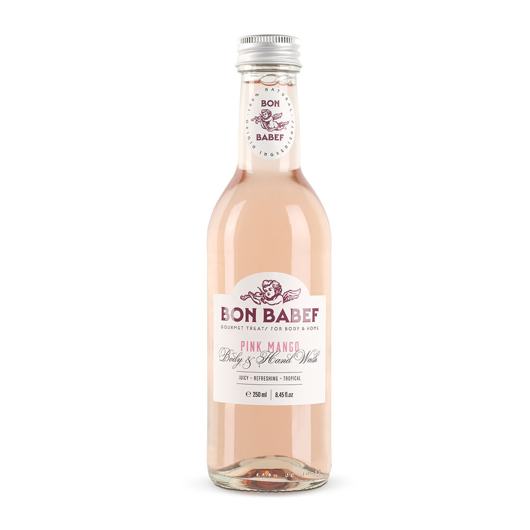
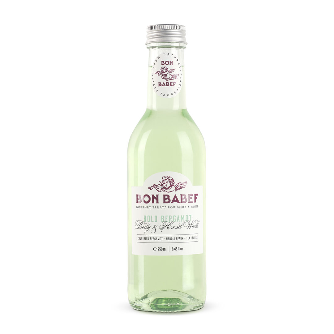
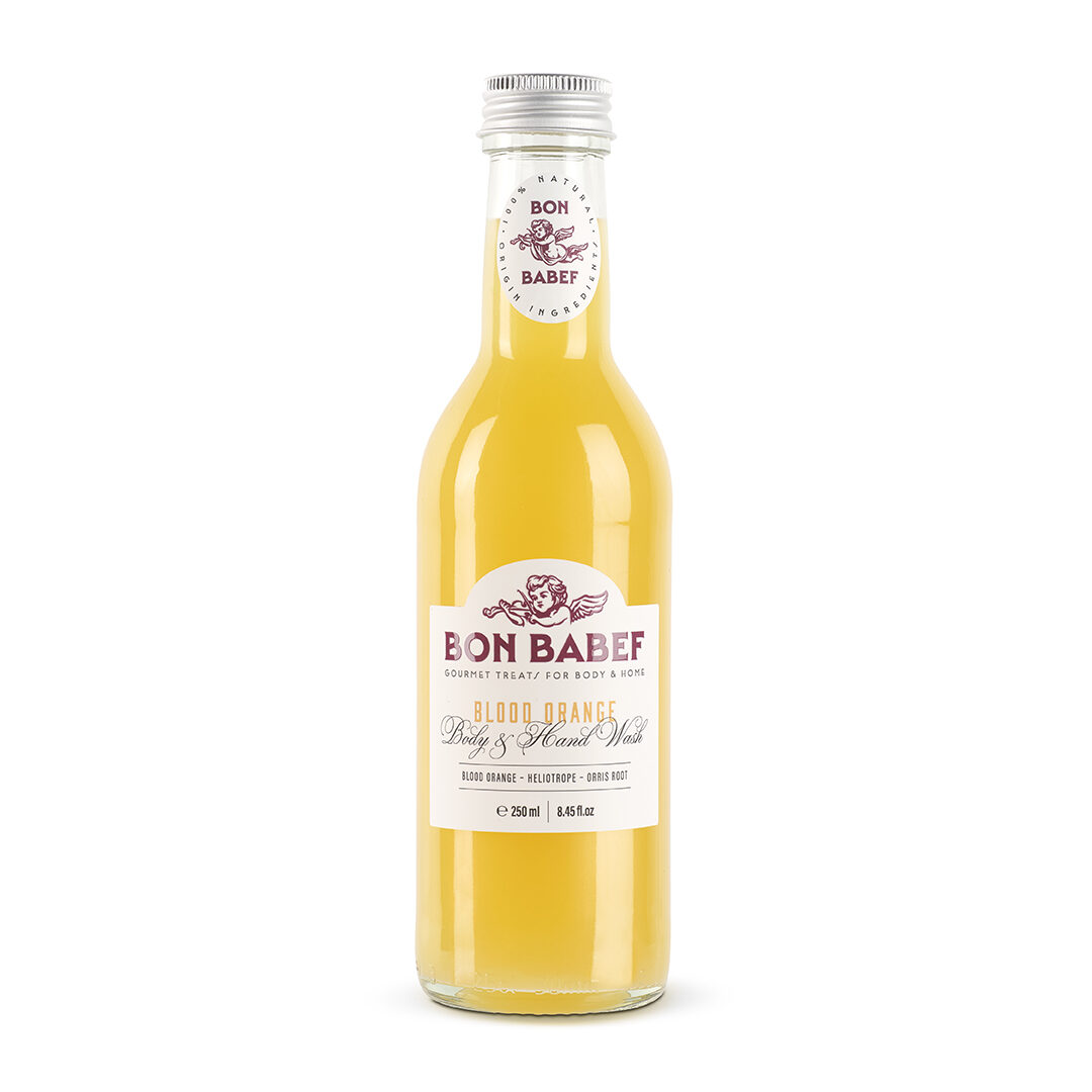
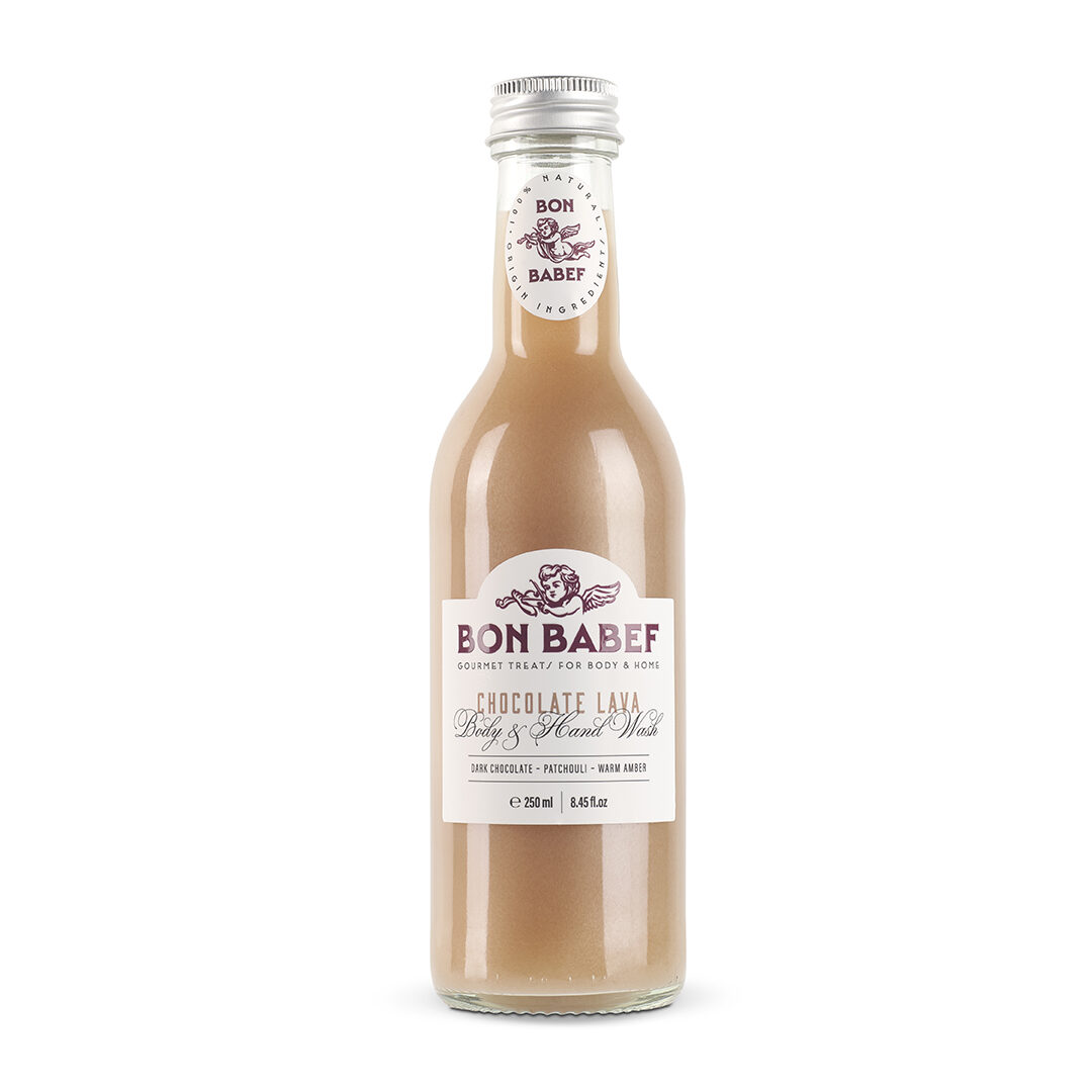
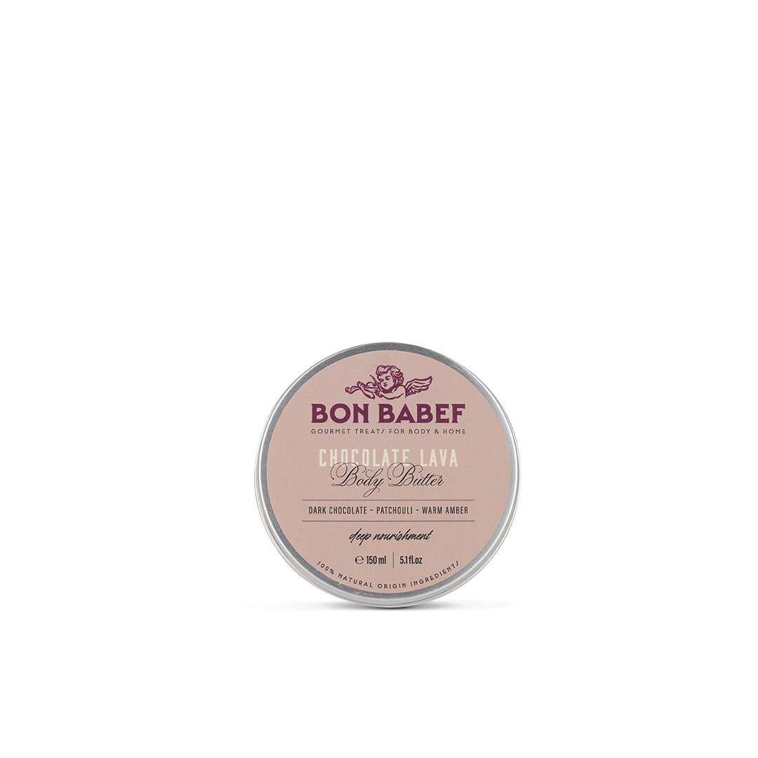
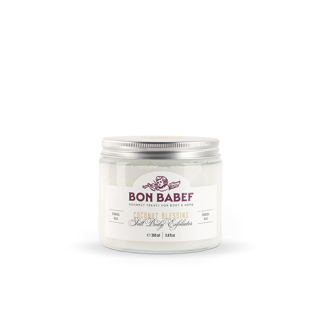
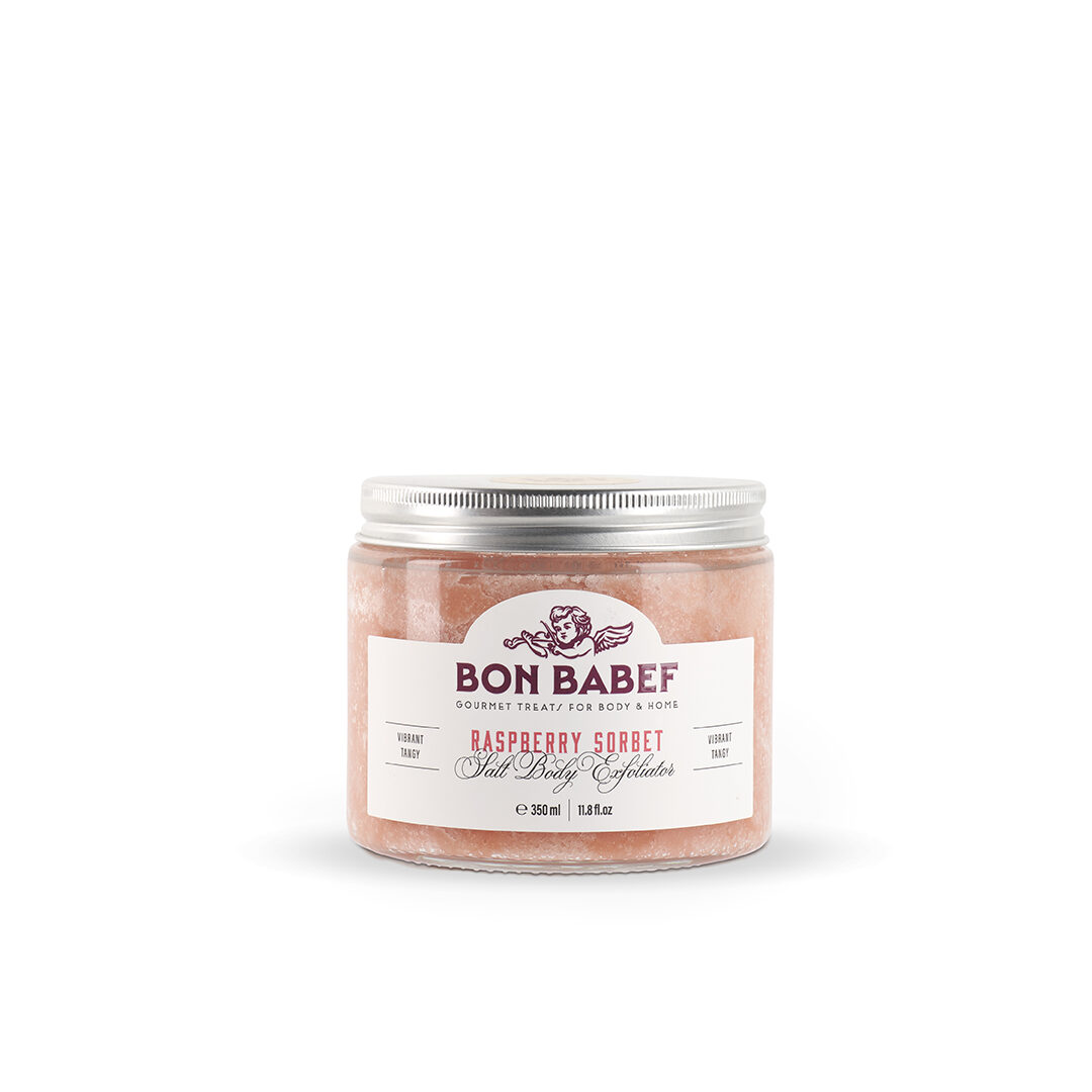
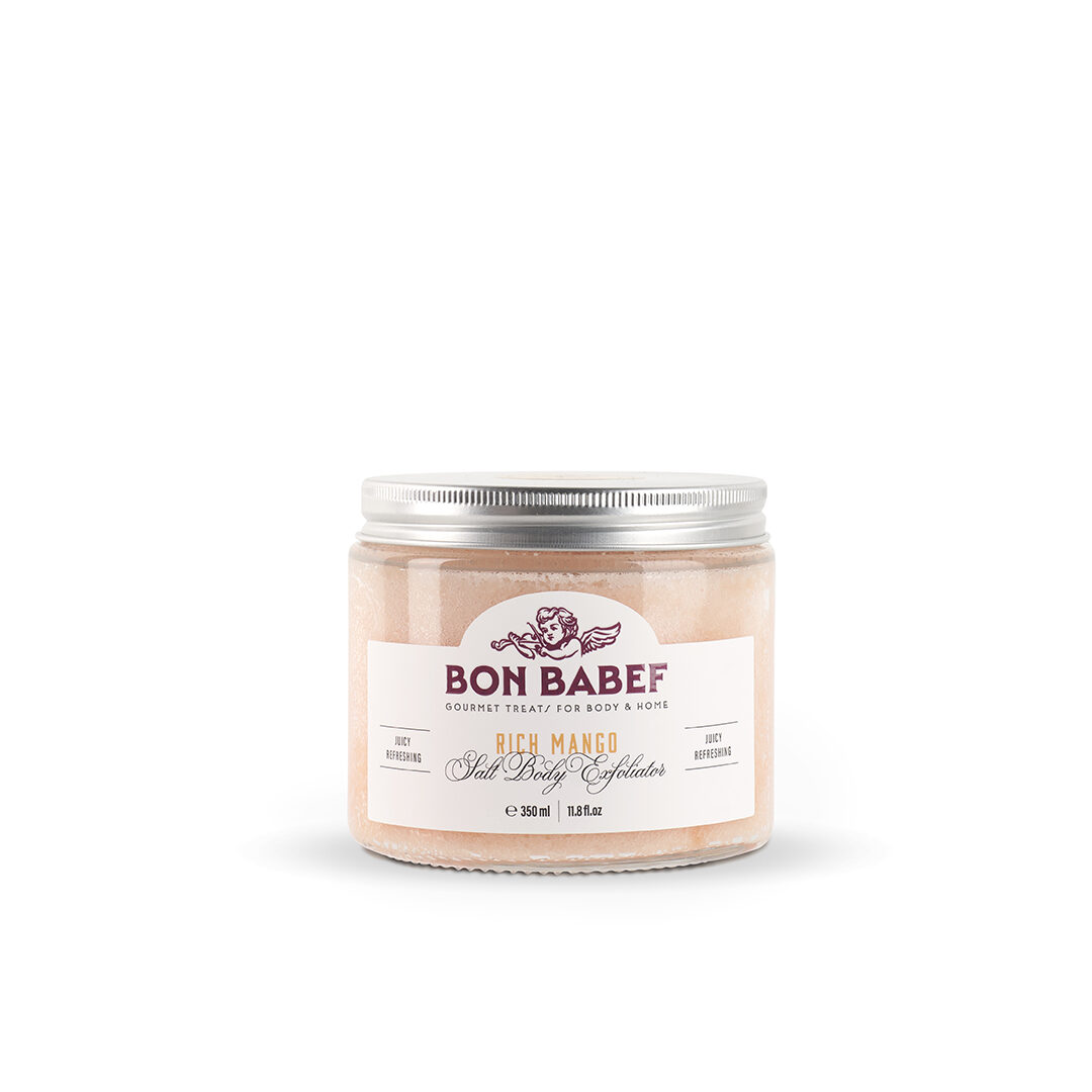
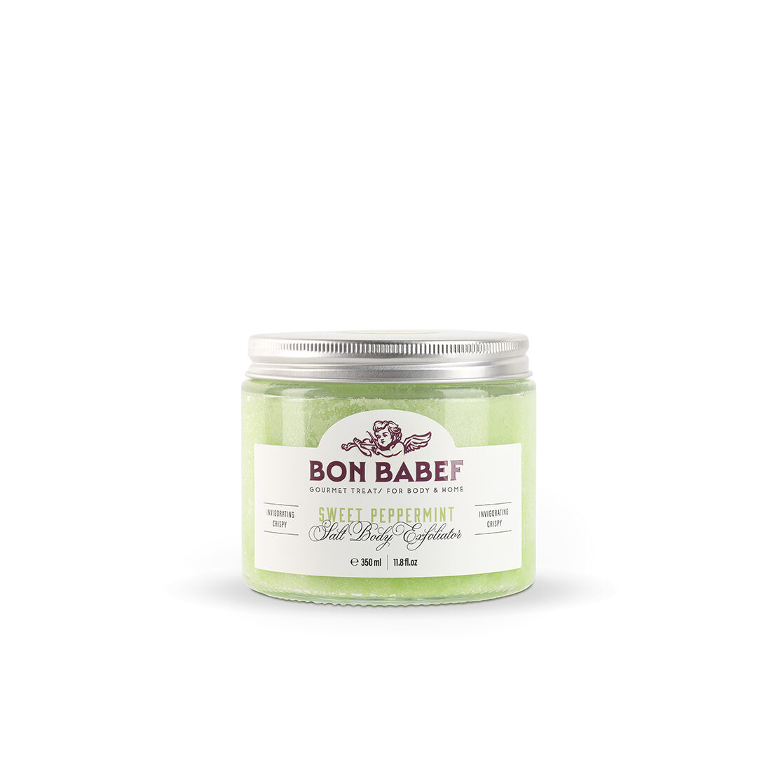
It’s not just scent. It’s attitude. — They asked us for a brand that smelled good. But not just like vanilla or lavender — it had to smell like purpose. Like something different. Like that moment you say, “I deserve this.” Bon Babef is a gourmet cosmetics store (think pâtisserie… but with lather instead of frosting), with a healthy obsession for natural ingredients and an unconditional love for the planet. And we were up for the challenge.
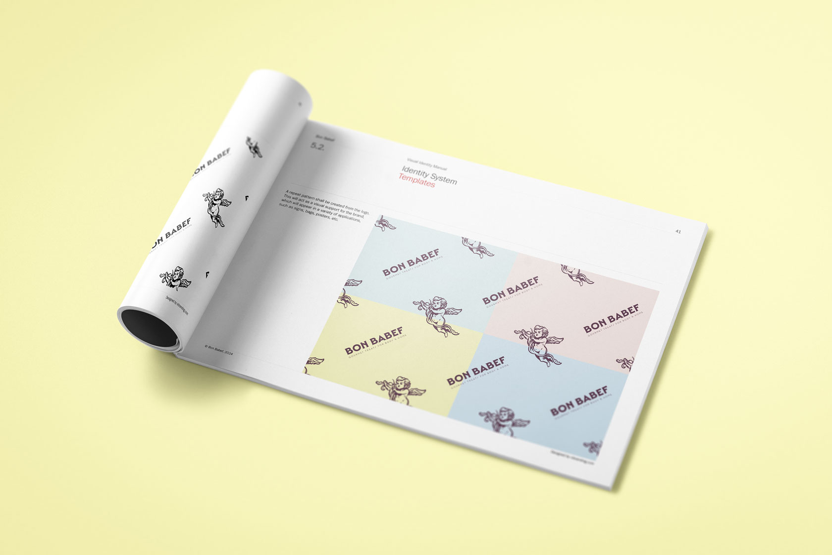
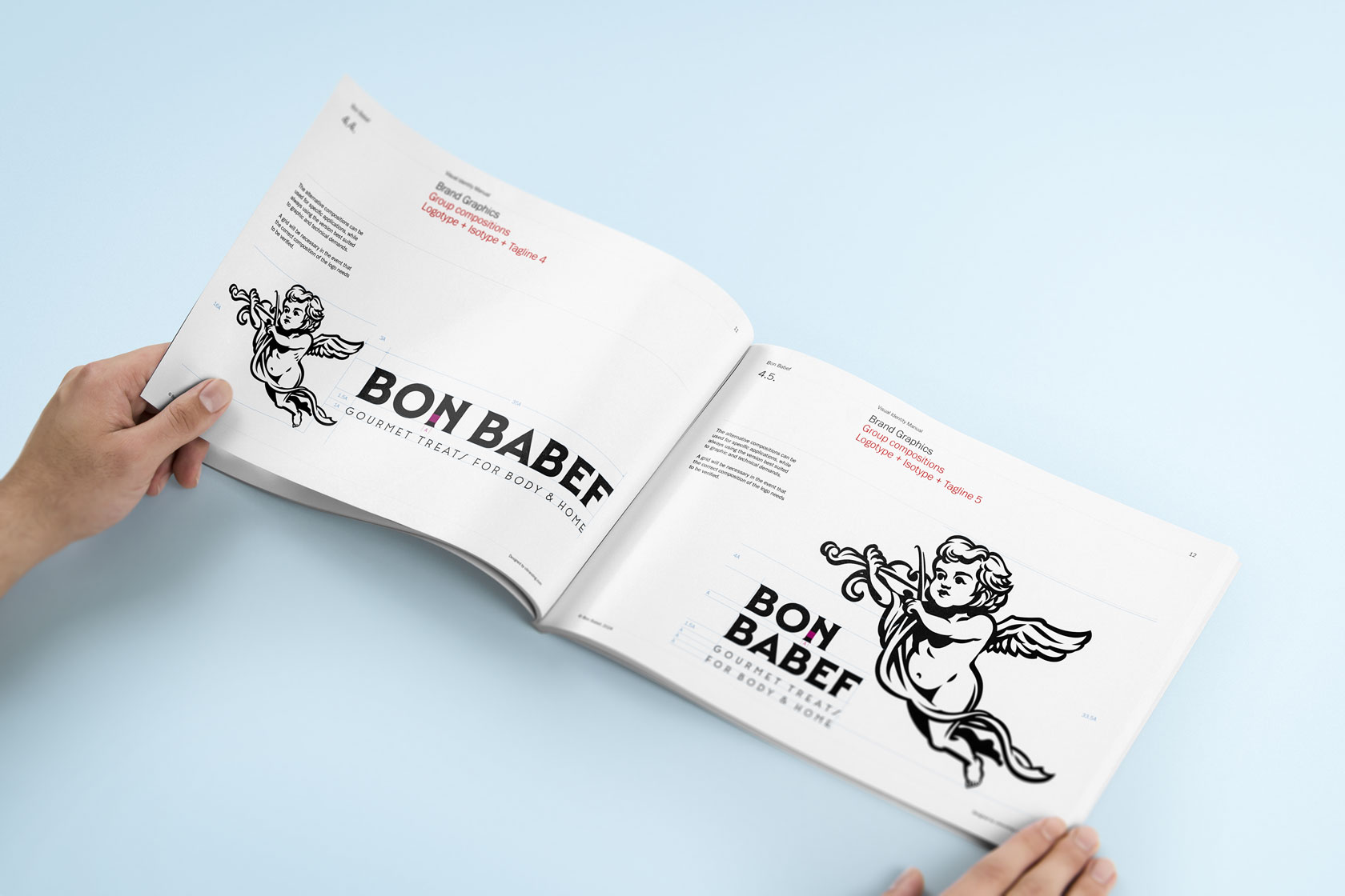
Love at first sight — The idea was born in the Olympus of well-considered indulgence. And that’s where we found our protagonist: a classically styled cherub who gives a face (and body, depending on the format) to this ode to everyday pleasure. We designed a modular identity system, able to adapt like a good serum: perfect for a small bottle or a big campaign. Bon Babef inherits the spirit of the bon vivant — someone who knows how to enjoy the good things in life with no regrets… and no parabens.
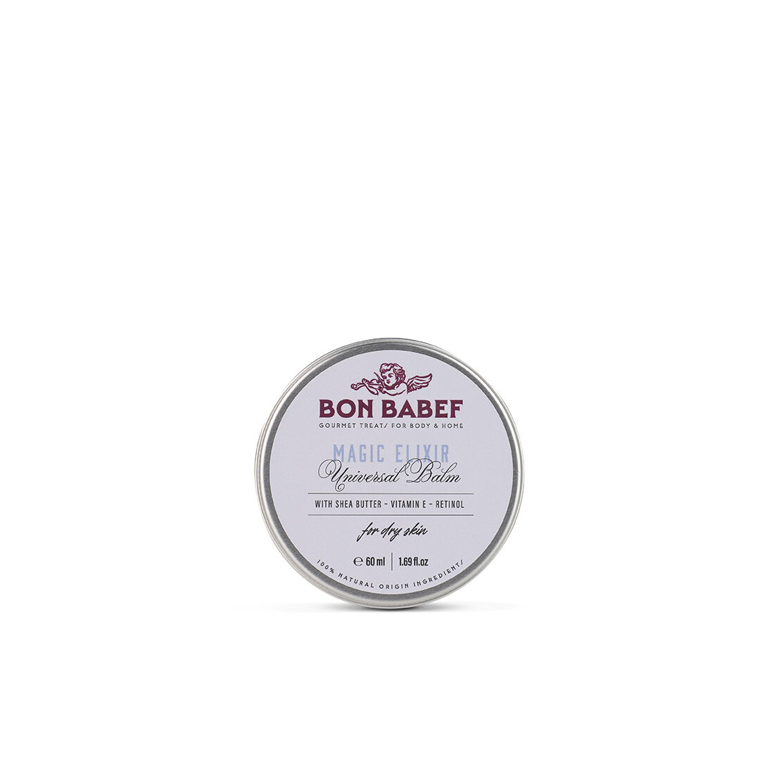
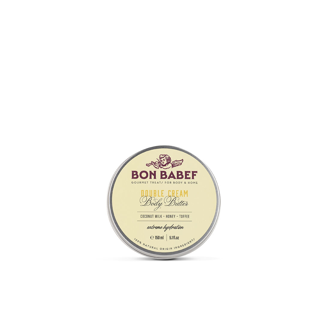
Elegance, written in every letter — Some shapes are felt before they’re read. We chose Mendl Serif Dusk Bold for its sophistication, for its Art Deco flair with geometric forms that fits the brand’s aesthetic like a silk glove. It has a flowing rhythm and a personality that dances between then and now — between classic luxury and modern comfort. A typeface that doesn’t just spell Bon Babef — it whispers it.
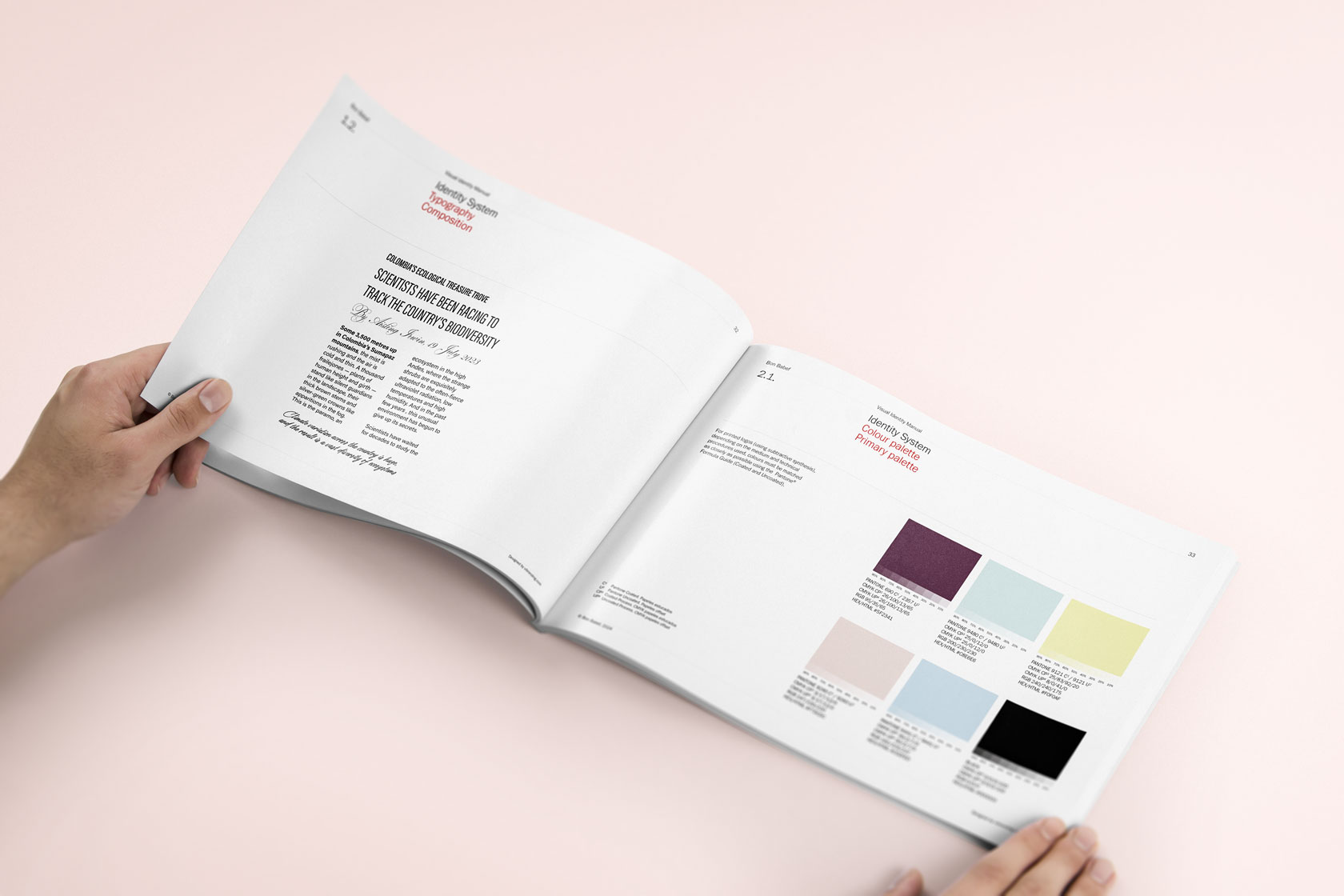
Packaging with a delicatessen touch – Designing the packaging was like dressing someone for an elegant dinner… but in a restaurant with sustainable cuisine and a minimalist interior design. We use color as a sensory navigation system (because yes, blue can also be a scent), and we opt for a modernist style that connects with the artisanal, the sensory, and the timeless. And let’s not kid ourselves: when your soap looks like a gourmet jam, the hardest thing is not to dip your spoon in.
Bon Babef has found its place not only on the bathroom shelf, but in the hearts of those who are looking for something more. A brand with soul, with body… and with a scent of commitment. And we? Happy as cherubs at the spa, for being part of a story that smells like a perfectly crafted recipe.
| Cookie | Duration | Description |
|---|---|---|
| ARRAffinity | This cookie is set by websites that run on Windows Azure cloud platform. The cookie is used to affinitize a client to an instance of an Azure Web App. | |
| cookielawinfo-checbox-analytics | 11 months | This cookie is set by GDPR Cookie Consent plugin. The cookie is used to store the user consent for the cookies in the category "Analytics". |
| cookielawinfo-checbox-functional | 11 months | The cookie is set by GDPR cookie consent to record the user consent for the cookies in the category "Functional". |
| cookielawinfo-checkbox-advertisement | 1 year | The cookie is set by GDPR cookie consent to record the user consent for the cookies in the category "Advertisement". |
| cookielawinfo-checkbox-necessary | 11 months | This cookie is set by GDPR Cookie Consent plugin. The cookies is used to store the user consent for the cookies in the category "Necessary". |
| cookielawinfo-checkbox-performance | 11 months | This cookie is set by GDPR Cookie Consent plugin. The cookie is used to store the user consent for the cookies in the category "Performance". |
| PHPSESSID | session | This cookie is native to PHP applications. The cookie is used to store and identify a users' unique session ID for the purpose of managing user session on the website. The cookie is a session cookies and is deleted when all the browser windows are closed. |
| viewed_cookie_policy | 11 months | The cookie is set by the GDPR Cookie Consent plugin and is used to store whether or not user has consented to the use of cookies. It does not store any personal data. |
| wp-wpml_current_language | 1 day | Web language |
| Cookie | Duration | Description |
|---|---|---|
| player | 1 year | This cookie is used by Vimeo. This cookie is used to save the user's preferences when playing embedded videos from Vimeo. |
| sp_landing | 1 day | This cookie is set by the provider Spotify. This cookie is used to implement audio content from spotify on the website. It also helps in collecting information on user interaction with this audio content. |
| sp_t | 1 year | This cookie is set by the provider Spotify. This cookie is used to implement audio content from spotify on the website. It also helps in collecting information on user interaction with this audio content. |
| Cookie | Duration | Description |
|---|---|---|
| _ga | 2 years | This cookie is installed by Google Analytics. The cookie is used to calculate visitor, session, campaign data and keep track of site usage for the site's analytics report. The cookies store information anonymously and assign a randomly generated number to identify unique visitors. |
| _gat_UA-79013542-1 | 1 minute | Google Analytics |
| _gcl_au | 3 months | This cookie is used by Google Analytics to understand user interaction with the website. |
| _gid | 1 day | This cookie is installed by Google Analytics. The cookie is used to store information of how visitors use a website and helps in creating an analytics report of how the website is doing. The data collected including the number visitors, the source where they have come from, and the pages visted in an anonymous form. |
| vuid | 2 years | This domain of this cookie is owned by Vimeo. This cookie is used by vimeo to collect tracking information. It sets a unique ID to embed videos to the website. |