

Related works
Borges Soja
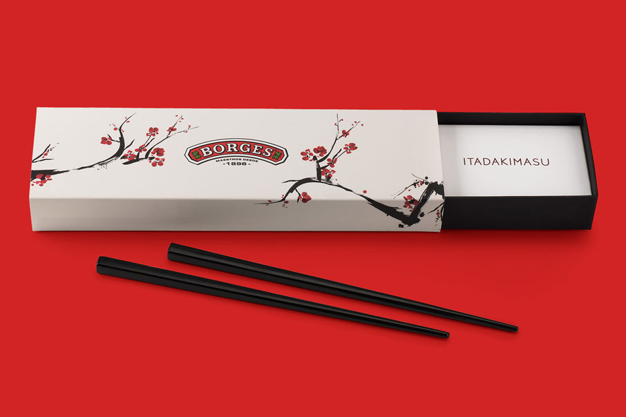
Itadakimasu

Mushroom Forestry
Quality that grows

Borges Delissimo's
Volare
Golden Award Muse Creativity 2021 Best Brand Identity
Branding
Brand architecture
Packaging
If there is one brand that is instantly recognisable on account of its logotype and its visual identity, then that brand is Chupa Chups. Its visual code is powerful, colourful, psychedelic, a bit motley… It is unique, as brands should be. And they came to us with this request: How can we continue to build our brand in the food products that we license? The answer was obvious: with imagination, relish and charm.
Brand architecture helps to diversify corporate identity. Branding is marvelous when it opens up new territories without losing its entity.
One of Chupa Chups’ business lines (as occurs with many mass-consumption brands) is product licensing. Licensed products need to have an independent visual code to stand out, while also fitting in with the brand’s visual corporate identity. It is a highly meticulous job of brand architecture that must take numerous factors into account; a complex briefing that calls for a great deal of creativity.
A brand’s pure essence — We were commissioned with creating the graphic criteria to ensure that any company with a Chupa Chups food product licence can develop their packaging and sales communication elements within a specific visual code. And the foundation for this visual code was a very simple idea: the actual Chupa Chups flavours.
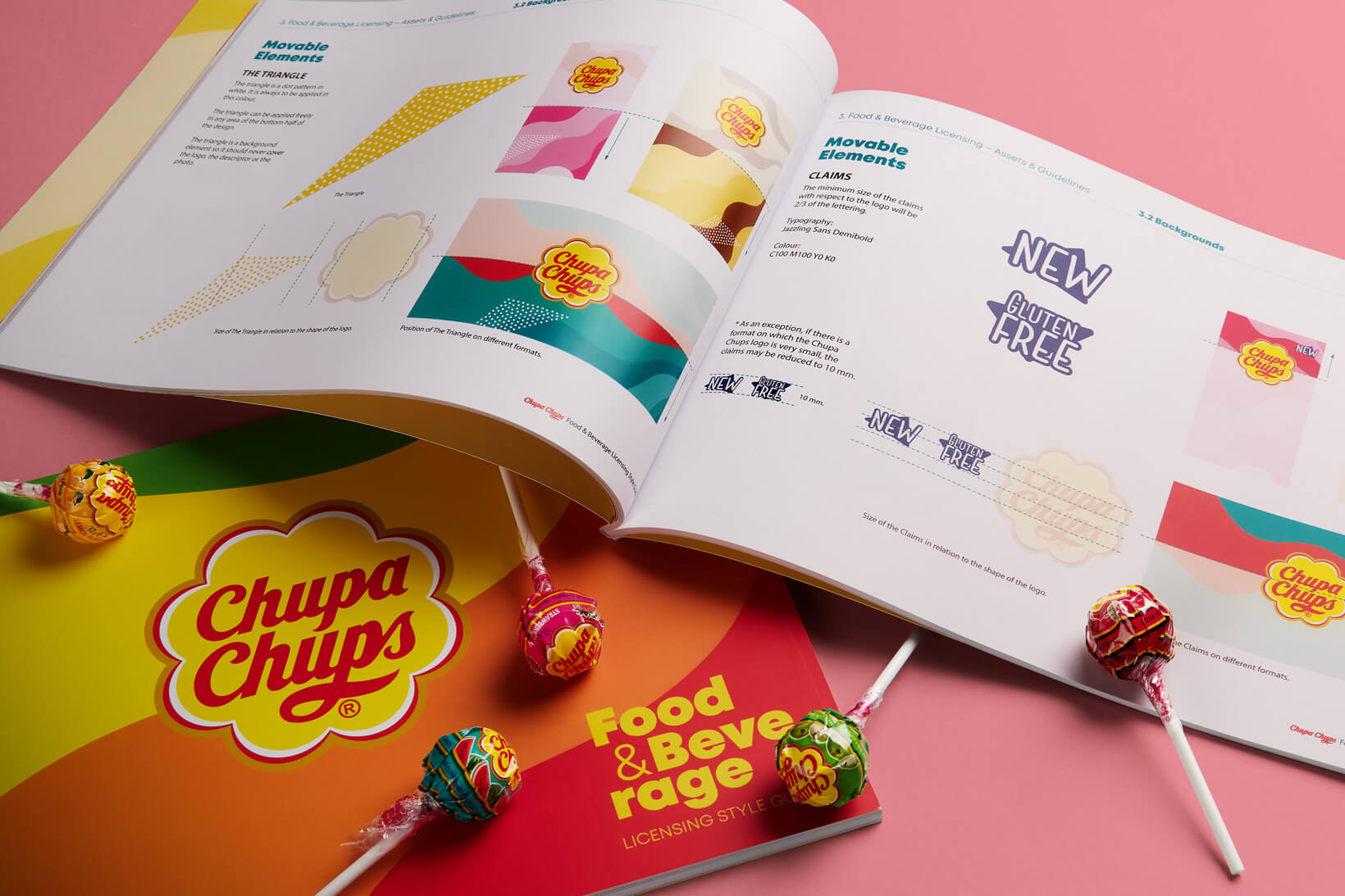
The flavour of a Chupa Chups is a very powerful element in the brand’s identity. The most powerful one? Possibly the most powerful one, together with its logotype. This is why the idea was to graphically represent this forcefulness of its flavours. This gave rise to the pattern that we created as a leitmotif in the brand architecture for this project. Waves of colours that represent the Chupa Chups flavours, peppered all over the place.
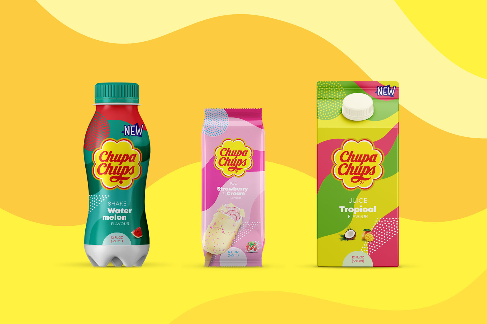
Defined flavours — Another one of Chupa Chups’ highly representative aspects is the combination of colours associated with each flavour. We maintained this concept in the new visual universe for the licenses and created some new codes, such as multi-flavour or tropical flavours. Since the added value offered by Chupa Chups to its licences is precisely the flavour, we wanted the latter to take all the limelight. In this way, the licensed product (an ice cream, cereals, a soft drink or muffins) is quickly recognised within the brand’s visual universe
We also established the complementary graphic elephants, typefaces and uses, flavour pictograms, the icons that we needed to complement the identity of the licensed designs…
All of this is described in a comprehensive brand book designed in accordance with the new visual identity and which contains all the key items for any designer or studio to create both packaging and communication and support elements for sales actions.
| Cookie | Duration | Description |
|---|---|---|
| ARRAffinity | This cookie is set by websites that run on Windows Azure cloud platform. The cookie is used to affinitize a client to an instance of an Azure Web App. | |
| cookielawinfo-checbox-analytics | 11 months | This cookie is set by GDPR Cookie Consent plugin. The cookie is used to store the user consent for the cookies in the category "Analytics". |
| cookielawinfo-checbox-functional | 11 months | The cookie is set by GDPR cookie consent to record the user consent for the cookies in the category "Functional". |
| cookielawinfo-checkbox-advertisement | 1 year | The cookie is set by GDPR cookie consent to record the user consent for the cookies in the category "Advertisement". |
| cookielawinfo-checkbox-necessary | 11 months | This cookie is set by GDPR Cookie Consent plugin. The cookies is used to store the user consent for the cookies in the category "Necessary". |
| cookielawinfo-checkbox-performance | 11 months | This cookie is set by GDPR Cookie Consent plugin. The cookie is used to store the user consent for the cookies in the category "Performance". |
| PHPSESSID | session | This cookie is native to PHP applications. The cookie is used to store and identify a users' unique session ID for the purpose of managing user session on the website. The cookie is a session cookies and is deleted when all the browser windows are closed. |
| viewed_cookie_policy | 11 months | The cookie is set by the GDPR Cookie Consent plugin and is used to store whether or not user has consented to the use of cookies. It does not store any personal data. |
| wp-wpml_current_language | 1 day | Web language |
| Cookie | Duration | Description |
|---|---|---|
| player | 1 year | This cookie is used by Vimeo. This cookie is used to save the user's preferences when playing embedded videos from Vimeo. |
| sp_landing | 1 day | This cookie is set by the provider Spotify. This cookie is used to implement audio content from spotify on the website. It also helps in collecting information on user interaction with this audio content. |
| sp_t | 1 year | This cookie is set by the provider Spotify. This cookie is used to implement audio content from spotify on the website. It also helps in collecting information on user interaction with this audio content. |
| Cookie | Duration | Description |
|---|---|---|
| _ga | 2 years | This cookie is installed by Google Analytics. The cookie is used to calculate visitor, session, campaign data and keep track of site usage for the site's analytics report. The cookies store information anonymously and assign a randomly generated number to identify unique visitors. |
| _gat_UA-79013542-1 | 1 minute | Google Analytics |
| _gcl_au | 3 months | This cookie is used by Google Analytics to understand user interaction with the website. |
| _gid | 1 day | This cookie is installed by Google Analytics. The cookie is used to store information of how visitors use a website and helps in creating an analytics report of how the website is doing. The data collected including the number visitors, the source where they have come from, and the pages visted in an anonymous form. |
| vuid | 2 years | This domain of this cookie is owned by Vimeo. This cookie is used by vimeo to collect tracking information. It sets a unique ID to embed videos to the website. |