

Related works
Chupa Chups
The expansion of a universe

Block
The incredible mutating logo
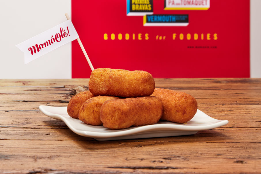
Mamá Olé
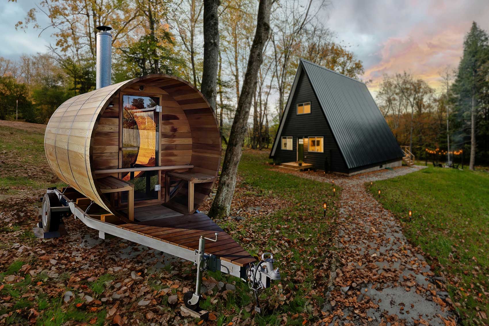
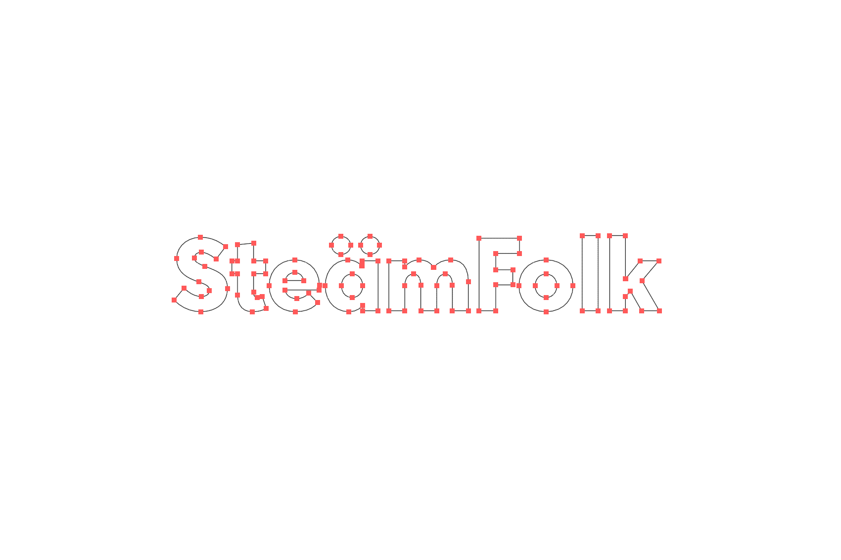
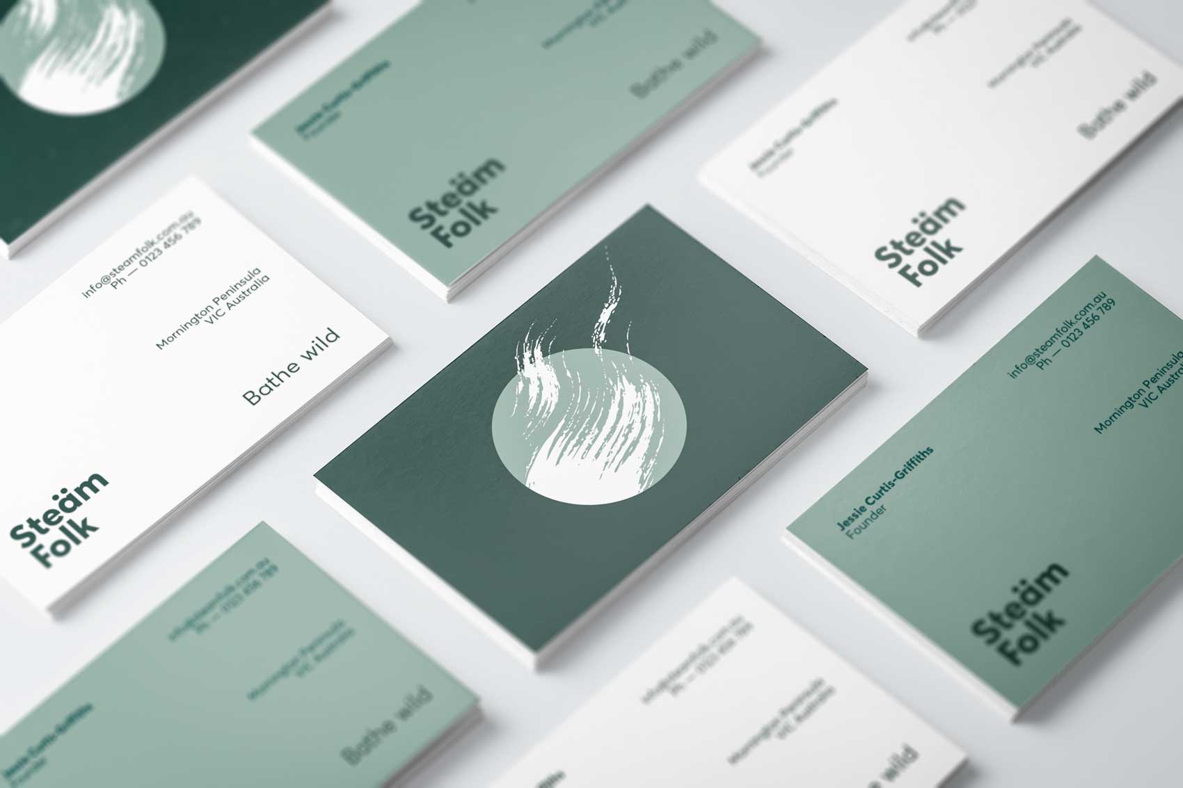
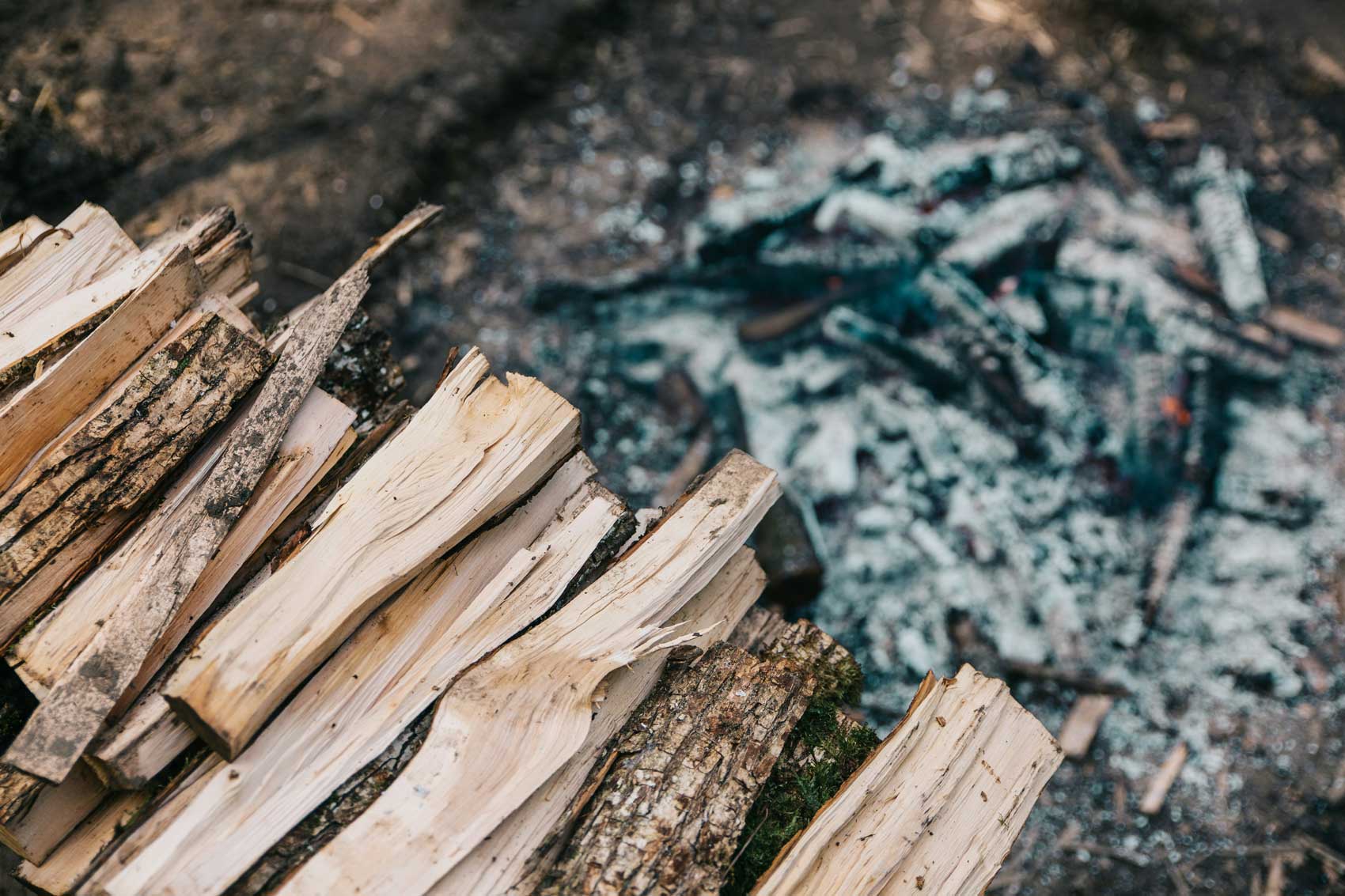
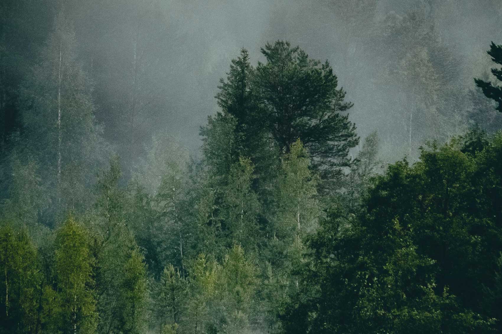
An antipodean journey
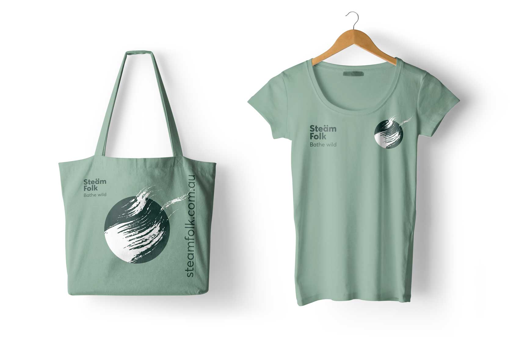
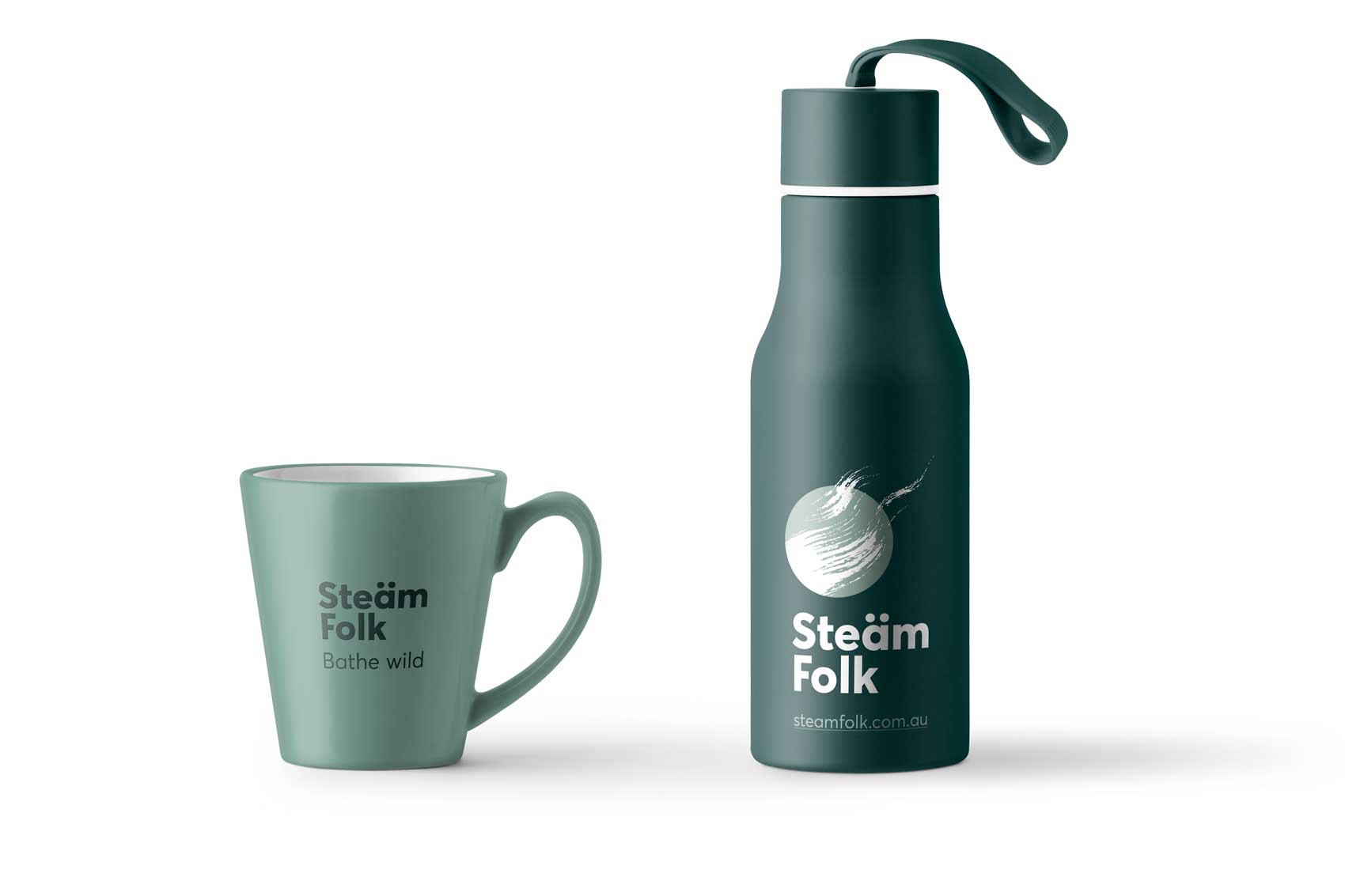
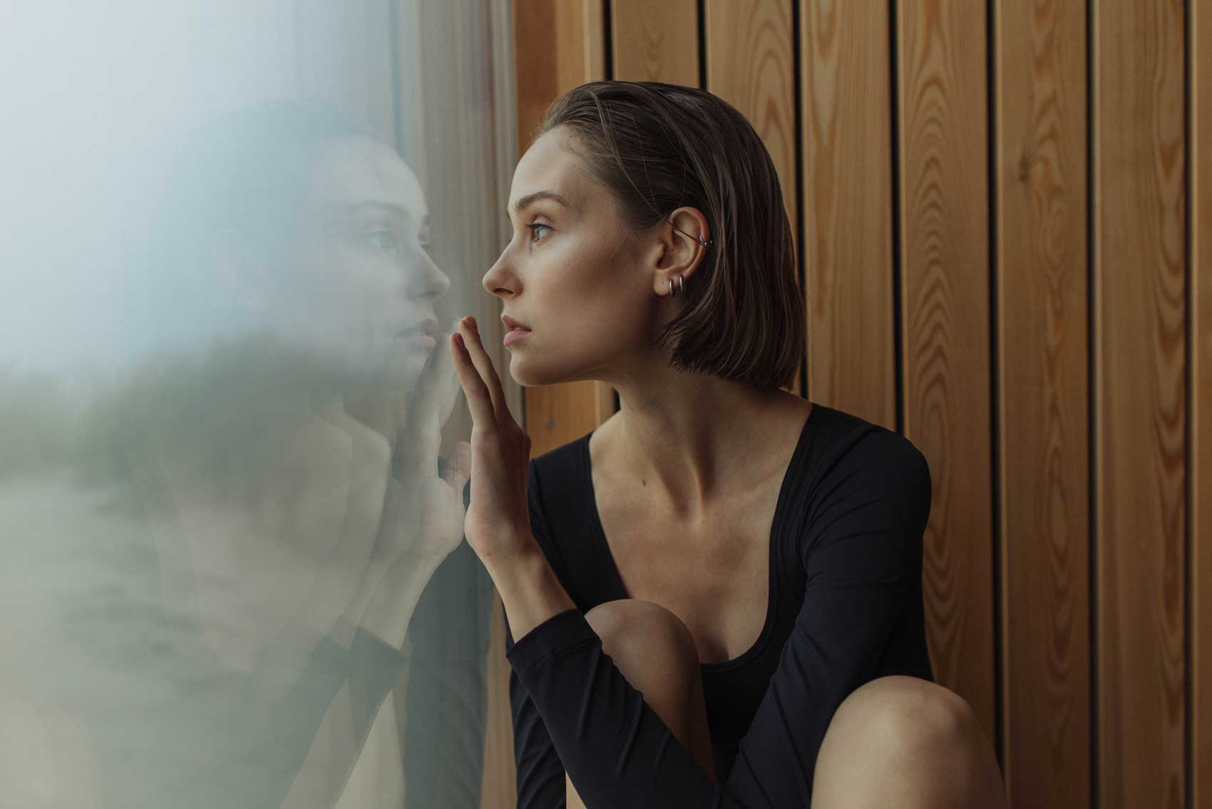
Can you imagine being in a sauna under the stars surrounded by nature while you drink wine with your friends? It sounds like a movie, or a plan straight out of Kardashian‑style, right? But in Australia, this amazing plan is real thanks to its founders, Jess and Scott. We had the pleasure of working previously with Jess on the branding of Mushroom Forestry. Together with her partner, Scott, they decided to venture into tourism in their own way. A much more glamorous and “wild” way.
For you to enjoy a weekend that’s ultra chic for your birthday, wedding, anniversary, getaway, or any other excuse. They take care of bringing this Scandinavian‑style sauna to your dream location. You just have to bring the wine and the friends.
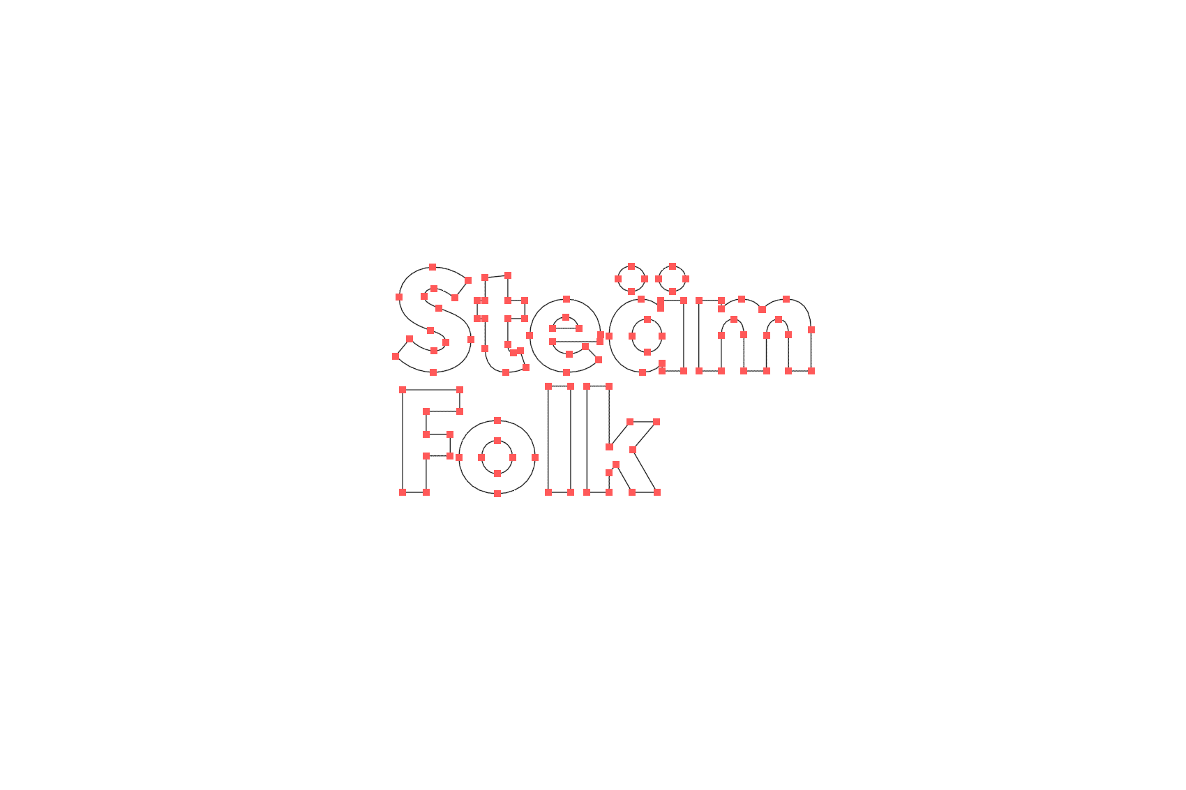
Through several exercises we found the Averta family, a typeface inspired by the historic Futura, Avenir or Century Gothic, created by the young Kostas Bartsokas, bringing a more expressive and versatile approach.
| Cookie | Duration | Description |
|---|---|---|
| ARRAffinity | This cookie is set by websites that run on Windows Azure cloud platform. The cookie is used to affinitize a client to an instance of an Azure Web App. | |
| cookielawinfo-checbox-analytics | 11 months | This cookie is set by GDPR Cookie Consent plugin. The cookie is used to store the user consent for the cookies in the category "Analytics". |
| cookielawinfo-checbox-functional | 11 months | The cookie is set by GDPR cookie consent to record the user consent for the cookies in the category "Functional". |
| cookielawinfo-checkbox-advertisement | 1 year | The cookie is set by GDPR cookie consent to record the user consent for the cookies in the category "Advertisement". |
| cookielawinfo-checkbox-necessary | 11 months | This cookie is set by GDPR Cookie Consent plugin. The cookies is used to store the user consent for the cookies in the category "Necessary". |
| cookielawinfo-checkbox-performance | 11 months | This cookie is set by GDPR Cookie Consent plugin. The cookie is used to store the user consent for the cookies in the category "Performance". |
| PHPSESSID | session | This cookie is native to PHP applications. The cookie is used to store and identify a users' unique session ID for the purpose of managing user session on the website. The cookie is a session cookies and is deleted when all the browser windows are closed. |
| viewed_cookie_policy | 11 months | The cookie is set by the GDPR Cookie Consent plugin and is used to store whether or not user has consented to the use of cookies. It does not store any personal data. |
| wp-wpml_current_language | 1 day | Web language |
| Cookie | Duration | Description |
|---|---|---|
| player | 1 year | This cookie is used by Vimeo. This cookie is used to save the user's preferences when playing embedded videos from Vimeo. |
| sp_landing | 1 day | This cookie is set by the provider Spotify. This cookie is used to implement audio content from spotify on the website. It also helps in collecting information on user interaction with this audio content. |
| sp_t | 1 year | This cookie is set by the provider Spotify. This cookie is used to implement audio content from spotify on the website. It also helps in collecting information on user interaction with this audio content. |
| Cookie | Duration | Description |
|---|---|---|
| _ga | 2 years | This cookie is installed by Google Analytics. The cookie is used to calculate visitor, session, campaign data and keep track of site usage for the site's analytics report. The cookies store information anonymously and assign a randomly generated number to identify unique visitors. |
| _gat_UA-79013542-1 | 1 minute | Google Analytics |
| _gcl_au | 3 months | This cookie is used by Google Analytics to understand user interaction with the website. |
| _gid | 1 day | This cookie is installed by Google Analytics. The cookie is used to store information of how visitors use a website and helps in creating an analytics report of how the website is doing. The data collected including the number visitors, the source where they have come from, and the pages visted in an anonymous form. |
| vuid | 2 years | This domain of this cookie is owned by Vimeo. This cookie is used by vimeo to collect tracking information. It sets a unique ID to embed videos to the website. |